


Professional Practice: Identity
Branding Exercise for Level 2 Ba (Hons) Graphic Design degree
Branding Exercise for Level 2 Ba (Hons) Graphic Design degree
Scenario
You have graduated from University and along with other experienced designers have decided to form a new dynamic graphic design company. Individually you have worked successfully on many design briefs. Your reputation is growing and there is an increasing need for you to establish a professional identity for the collective that will also act as a vehicle to showcase all your work.
You have graduated from University and along with other experienced designers have decided to form a new dynamic graphic design company. Individually you have worked successfully on many design briefs. Your reputation is growing and there is an increasing need for you to establish a professional identity for the collective that will also act as a vehicle to showcase all your work.
The Brief
- Design and produce a whole identity manifested in the form of a range of printed publications and a website for your design company. This MUST include a business card, a letterhead and a website.
- The identity must be an innovative and highly creative design solution that will work expertly across media to produce a consistent brand and have a strong visual presence.
- The identity and design should allude to your collective ethos and promote your cultural ambitions.
The Outcome
Here are a selection of promotion items from The Cabinet Of Curiosities. We looked for interesting items that would be creative and memorable, while still relating to the Victorian aesthetic of the company.
Here are a selection of promotion items from The Cabinet Of Curiosities. We looked for interesting items that would be creative and memorable, while still relating to the Victorian aesthetic of the company.
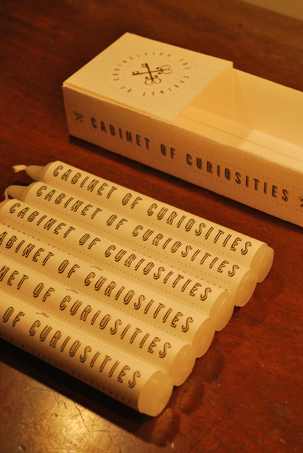
Candles
We created candles in branded packaging as we wanted to stick to the Victorian aesthetic of the company. In the Victorian era candles were the main light source and so we decided this would be an ideal item to use for advertising the brand.
We created candles in branded packaging as we wanted to stick to the Victorian aesthetic of the company. In the Victorian era candles were the main light source and so we decided this would be an ideal item to use for advertising the brand.


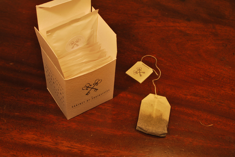
Tea
We used tea as a promotional item due to its importance in the Victorian era. Tea could be found in practically every home, and was widely traded through out the period. We agreed that tea was still an integral part of life today, especially in Britain. We then realised that a lot of people have a cup of tea at their desk whilst they work, and thought that creating branded tea bags and box would advertise our product well and the item wouldn't just be thrown away as soon as it was received.
We used tea as a promotional item due to its importance in the Victorian era. Tea could be found in practically every home, and was widely traded through out the period. We agreed that tea was still an integral part of life today, especially in Britain. We then realised that a lot of people have a cup of tea at their desk whilst they work, and thought that creating branded tea bags and box would advertise our product well and the item wouldn't just be thrown away as soon as it was received.
Chewing Gum
We found in our research that the first chewing gum was manufactured and sold at the beginning of the Victorian period and, although it did not resemble the same form as we know it today, the majority of its development happened with in the era.
We also chose to create branded chewing gum, as we wanted to demonstrate to the recipient that, although we follow a vintage aesthetic, we are able to come up with 'fresh' and innovative ideas.

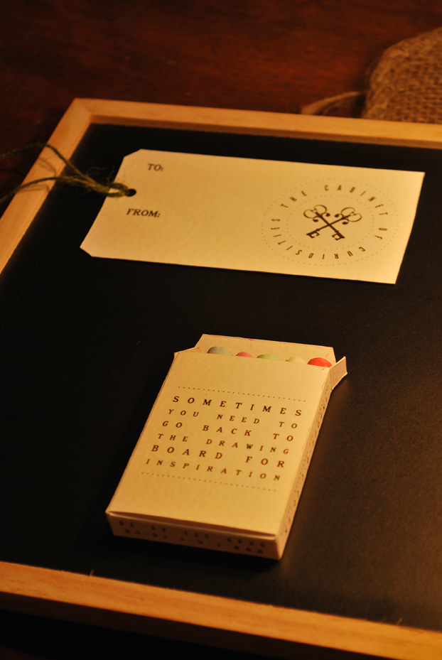
Chalkboard & Chalk
We decided to create a branded chalk board as part of our promotional items for a few reasons. Firstly, chalkboards where a common place item in Victorian schools and were used as the main writing tool for teachers to instruct students. Another reason we decided to create a branded chalk board was because we wanted to create interaction between the recipient and our product, which would in turn involve the recipients colleagues and friends, thus increasing the reach of our advertising.
We decided to create a branded chalk board as part of our promotional items for a few reasons. Firstly, chalkboards where a common place item in Victorian schools and were used as the main writing tool for teachers to instruct students. Another reason we decided to create a branded chalk board was because we wanted to create interaction between the recipient and our product, which would in turn involve the recipients colleagues and friends, thus increasing the reach of our advertising.


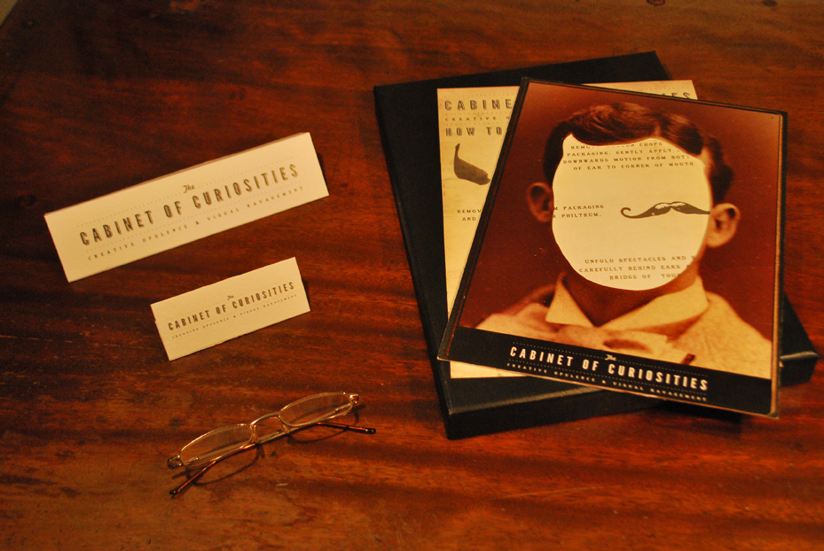
The 'Cabinet Kit'
We decided to produce a 'Cabinet Kit', a box of items that could be used by the recipient to make themselves look like a Victorian gentleman. We included a stick on moustache and mutton chops, a pair of glasses and a face surround that we thought would generate a fun element to our branding at the same time as spreading our brand through interactive items that could be shared with others. We included instructions in the kit for the user to follow, also designed so that the aesthetics tied in with the Victorian theme.
We decided to produce a 'Cabinet Kit', a box of items that could be used by the recipient to make themselves look like a Victorian gentleman. We included a stick on moustache and mutton chops, a pair of glasses and a face surround that we thought would generate a fun element to our branding at the same time as spreading our brand through interactive items that could be shared with others. We included instructions in the kit for the user to follow, also designed so that the aesthetics tied in with the Victorian theme.


Cabinet Cards
Cabinet cards and 'Carte de Visite' were items that were used by people during the Victorian era as an early form of business card. They consisted of a photograph of the person on the front, and details of the person on the back. We liked this idea and drew inspiration from it for our own versions of business cards. We found images of various Victorian gentlemen and superimposed our face onto the image, printing on the reverse the details you would usually find on a business card.
Cabinet cards and 'Carte de Visite' were items that were used by people during the Victorian era as an early form of business card. They consisted of a photograph of the person on the front, and details of the person on the back. We liked this idea and drew inspiration from it for our own versions of business cards. We found images of various Victorian gentlemen and superimposed our face onto the image, printing on the reverse the details you would usually find on a business card.

Letterhead and Compliment Slip

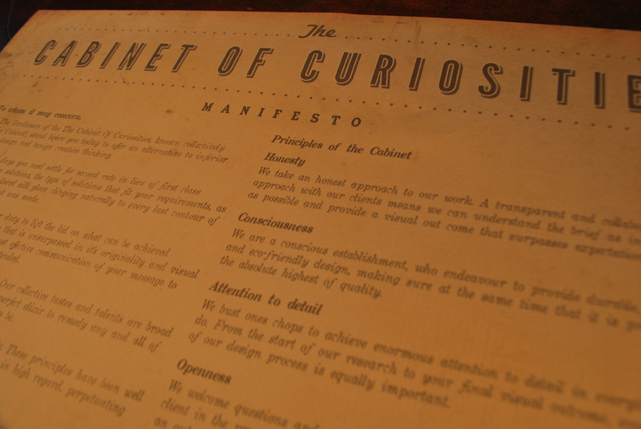
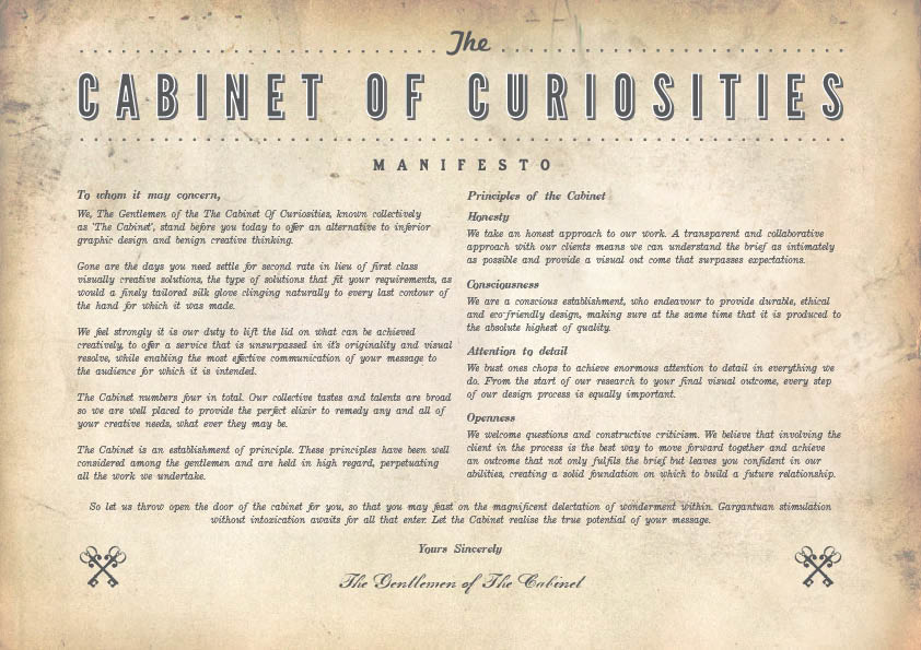
Manifesto
For the aesthetic of our manifesto, we drew inspiration from old texts, such as the 'Magna Carta' and the 'Domesday Book'. For the writing style we used the 'Declaration of the Rights of Man and of the Citizen' as a guide.
For the aesthetic of our manifesto, we drew inspiration from old texts, such as the 'Magna Carta' and the 'Domesday Book'. For the writing style we used the 'Declaration of the Rights of Man and of the Citizen' as a guide.
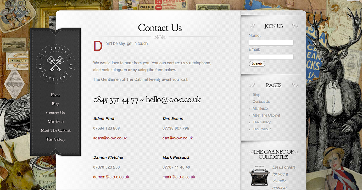
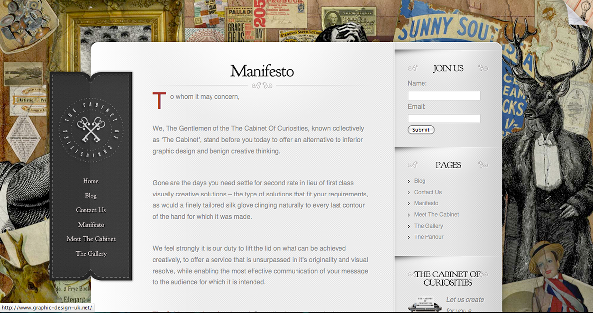
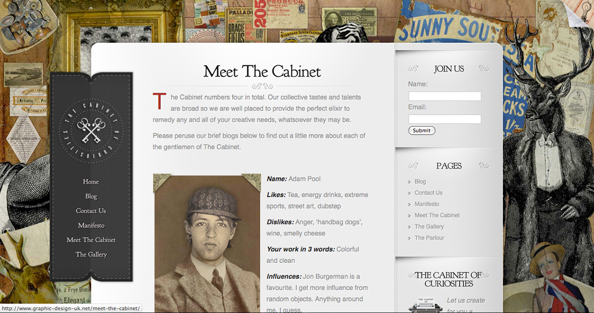
The Website
We built our website using word press, as one of our team was experienced in it, and we determined it would give us the best options from a design point of view, as well as being a way of differing us from the competition. We all contributed to each aspect, splitting the design up into tasks for each member of the group.
The website is found at www.c-o-c.co.uk
Home Page

Contact Us
Manifesto
Meet The Cabinet
The Gallery


