Note: This is part of my Final Major Project for my Pre-Degree course. I am currently looking for feedback on this work so any comments would be GREATLY appreciated. Comments on how to improve this set of fonts or thoughts in general will help me out in a big way. Thank you in advance
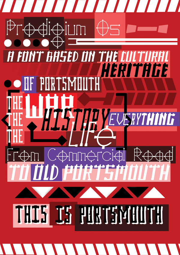
Prodigium Os is a font family composed of three distinct styles. Underachievement, Drugs and Obesity. The name Prodigium Os is somewhat of a homage to helvetica in that it is a latin translation of "Port Mouth".
The typestyles themselves are based on architectural forms and objects around Portsmouth and the names are in part inspired by the Boris Johnson quote about the area where he said:
"Here we are in one of the most depressed towns in Southern England, a place that is arguably too full of drugs, obesity, underachievement and Labour MP's"

Underachievement is a font style based on a small dilapidated church's windows round the corner from one of the major shopping centers. The name underachievement is given because the horizon line around which this church is located is dotted with tower blocks and other large buildings asserting their presence around the area. An area which is in a decidedly more run down state of affairs.
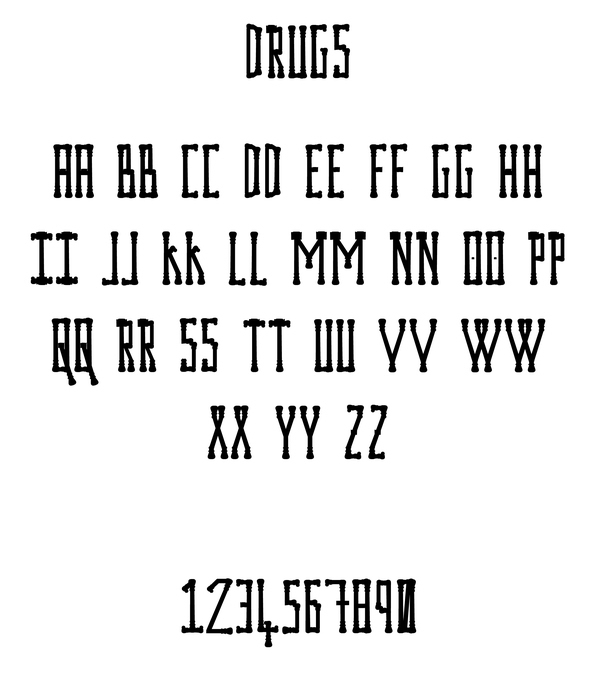
Drugs takes it's form from a lamp post outside the Guildhall in Portsmouth. The name is drawn as a parallel with its psychadelic resulting form. To me it reminiscent of the pomp and ornament style of the victorian era, which is no surprise as the lamp posts themselves come from a victorian era.
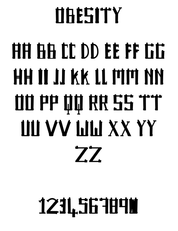
Obesity is a typeface that takes its form from a statue of a soldier with a gatling gun. Statues of memorial can be found all over Portsmouth, the link to obesity was a testament to the nature of Portsmouth. The idea that Portsmouth as a city grew fat off of war, if ever a city was guilty of war profiteering it's Portsmouth.
