PREPOSTEROUS NUTS
Packaging Design
Packaging Design
The name I chose for my label design project is Preposterous literally. The concept behind the name comes from the word “nut” itself. The word preposterous also made me think ofother words like pompous, which means to be stuck-up or snooty. This relation between words then led to my characters. I wanted to use my talents as an illustrator to portray characters that would reek of sophistication and class.
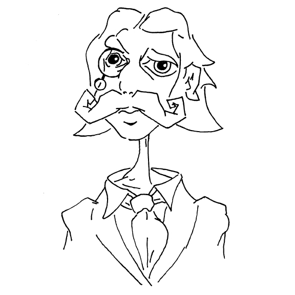
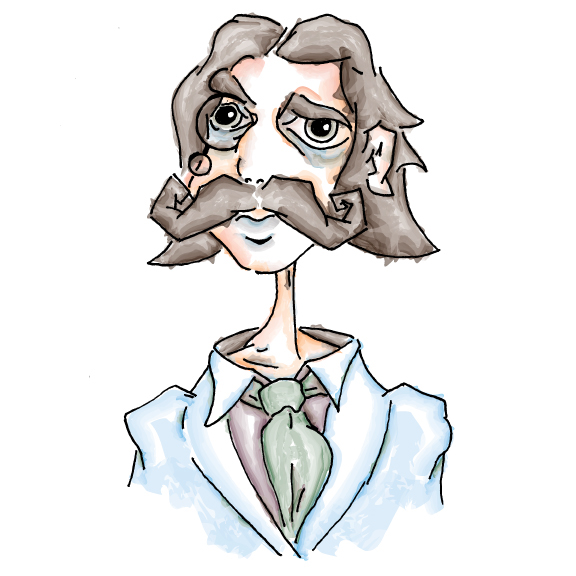
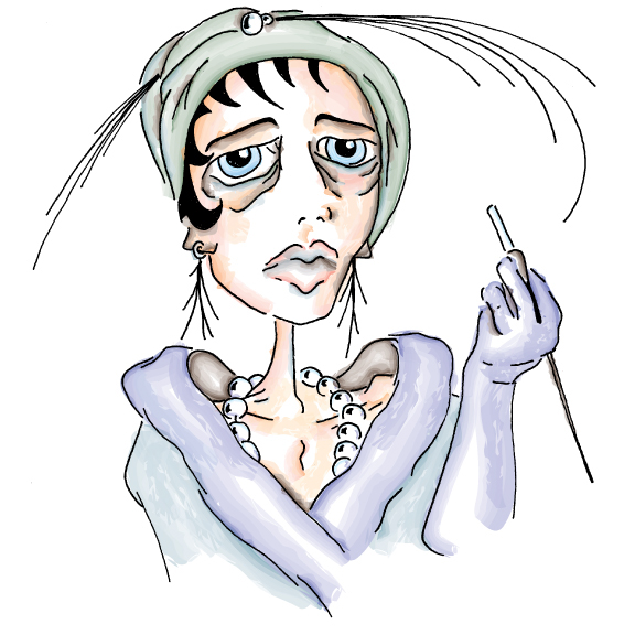
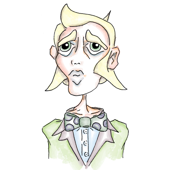
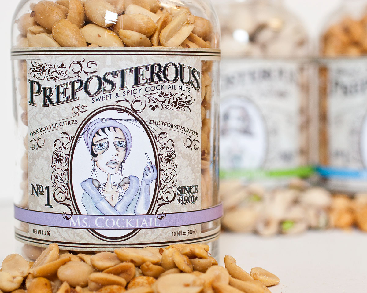
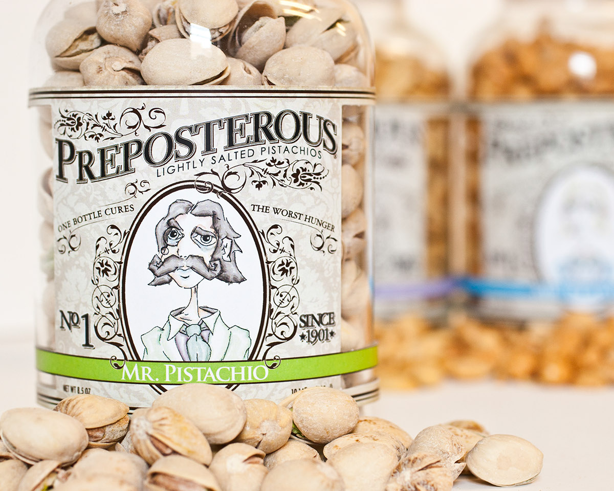
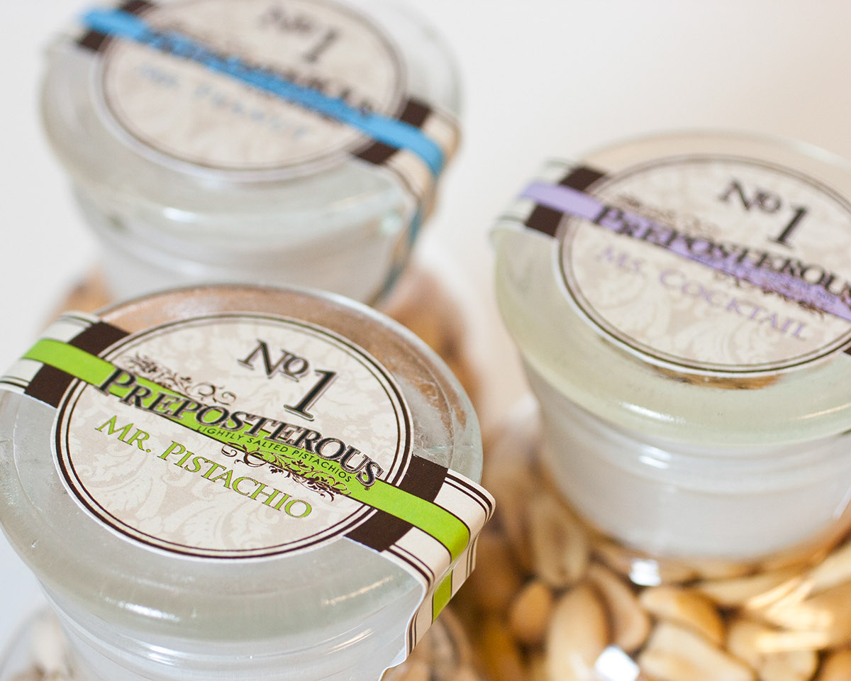
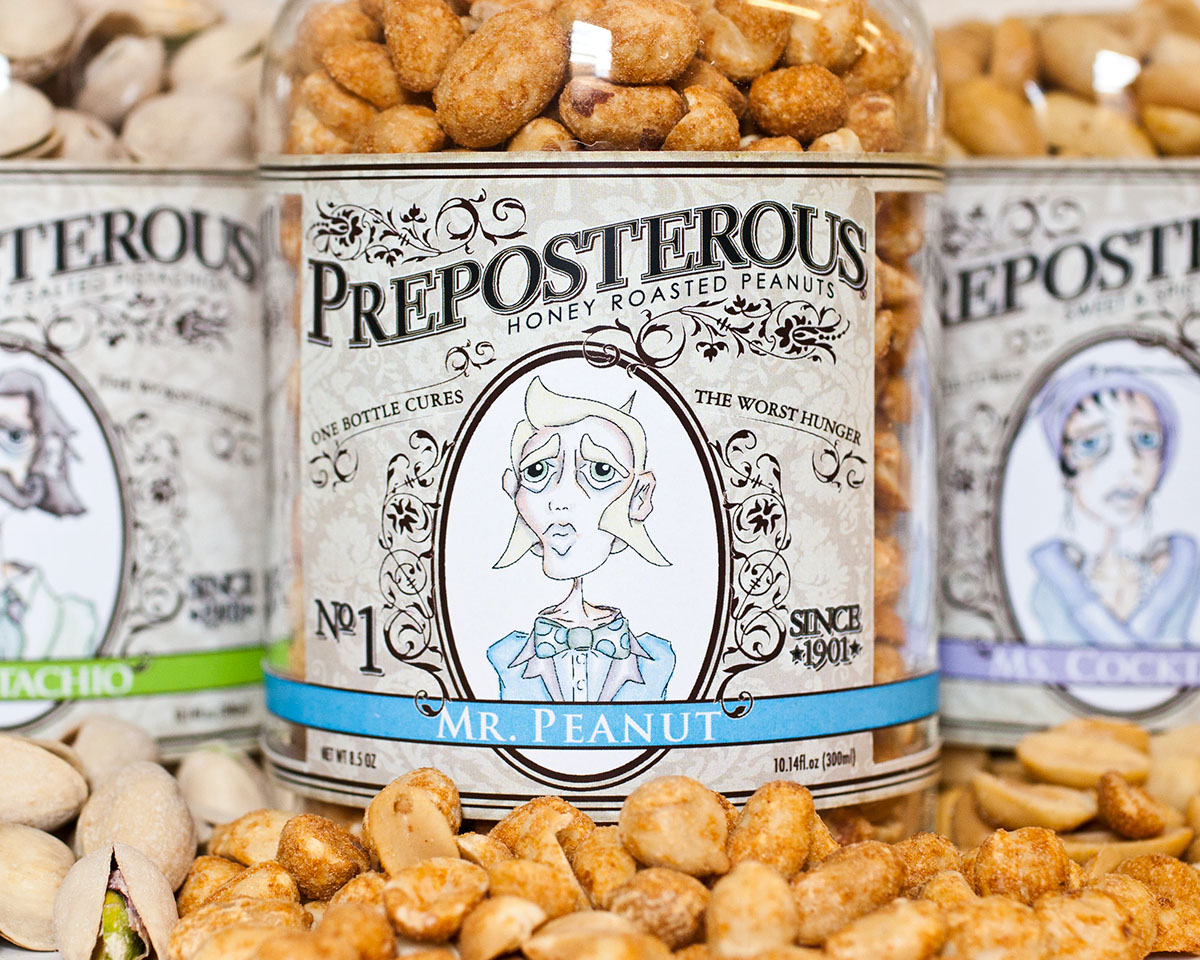
The first of the three was Mr. Pistachio. His ridiculous mustache and monocle are what make him so preposterous. The band on his label is also a green tint, which is reminiscent of the green appearance of a pistachio. This would help consumers easily identify with this particular kind. The next character is Ms. Cocktail. She would be on the packaging that contained cocktail nuts. She is adorned in rich clothing and has a pearl necklace to portray asense of wealth. Her band would is purple for the simple fact that it is another color besides green. The third character is Mr. Peanut. He is the youngest of the three and flaunts his muttonchops proudly. His label is blue.
After researching some existing packaging I decided that my product would be displayed in a glass container.
This type of packaging makes the product easy to see. Furthermore, it goes with the label style. I derived most of my inspiration from old images of medicine bottles. So it would only make sense that my label contents would mimic this same genre.
Overall, I amextremely pleased with the final outcome of my design. It has been an evolving process for thebetterment of the entire project. I look forward to mocking each label up. Enjoy...