
PROJECT DESCRIPTION


"Identity lies at the very core of culture, and it is the key to our understanding of self. Culture encompasses language, traditions, beliefs, morals, laws, social behavior, and the art of community. Understanding culture is imperative in avoiding identity crisis and rootlessness and its a prerequisite for the effective shaping of identities and communication. Yet, everywhere in our shrinking world, we can witness increased homogenization, erosion of indigenous culture, the emergence of nonplaces (uniform airports, generic shopping malls), and the advancement of what theorists are calling serial monotony... Aware of the advancing threat of monoculture, can the worlds identity designers help conserve and revive those things that make human culture distinct and unique? Can we mind the historical depth of individuality and breadth of multiculturalism to bring new gems of identity to light? Is there still time to avoid losing our sense of who we are, where we come from, where we belong, and why these distinctions are so important?"
~ Peters, L. Robert. (2005). Worldwide Identity.

Logo Concept
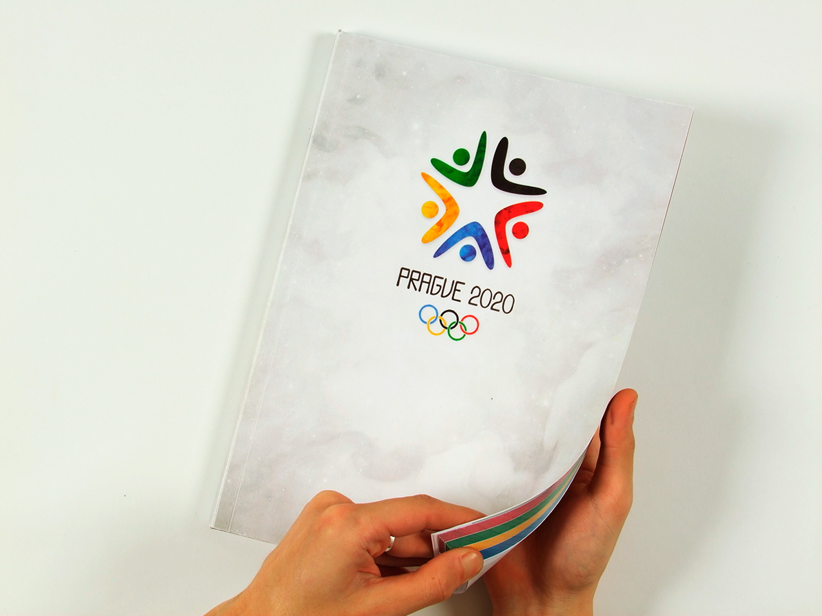
I chose the star as a symbol for Prague and "reach for the stars" as a concept behind the visual identity. The final logo, is the concept in it’s purest form using the bare minimum of marks to communicate what it needs to. It was intentionally designed to be read in different ways. On the most obvious level it is a star, the symbol I chose to carry the concept to the viewer. If you look closer you realize the star is made up of five figures (depicted by arms and head) who can be interpreted as ‘reaching up’ (for the stars of course), hugging together, or even raising their arms in victory as if they just finished a race. And lastly the shapes of the figures serve as visual arrows, directing the eye towards the centre of the star from whichever direction the viewer may approach it; thereby communicating togetherness, coming together, oneness which are all big elements of the Olympics.
Pictograms
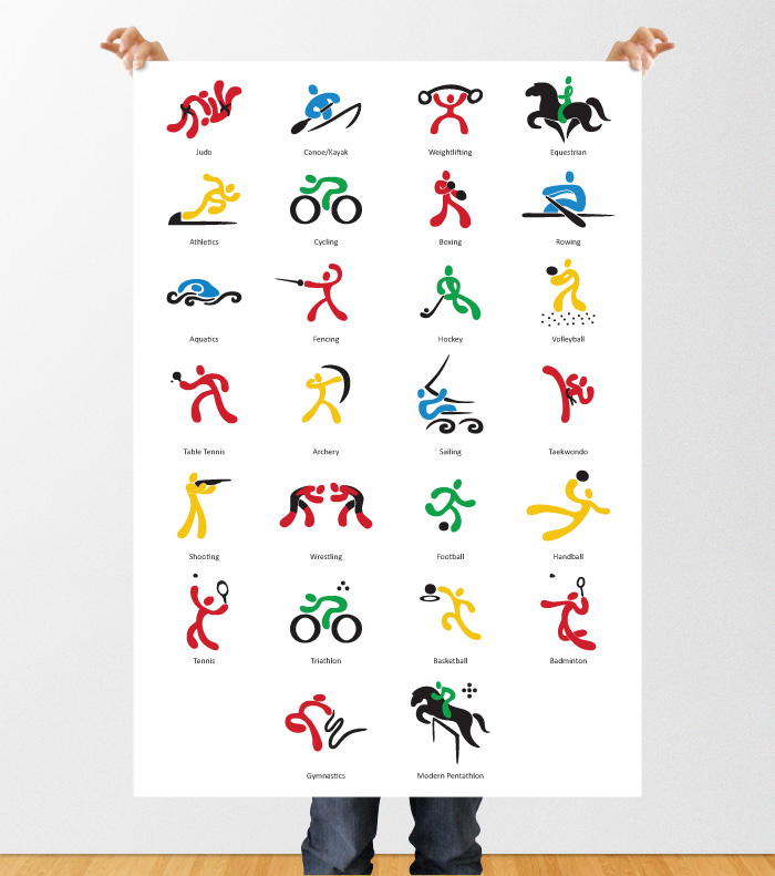
The Figure
coloured (colour scheme taken from the logo design; the colour is determined according to the sport type such as field sports, track sports, aquatic sports, outdoor sports, indoor sports etc.)
Style
smooth, rounded and friendly like the logo
inspiration: Keith Haring & Change 4 Life campaign
Body Characteristics
slightly exaggerated round hands and feet (which actually was inspired by the mascot’s hands and feet and creates good continuity)
Sport Accessory
black; and not touching the figure if possible (this should be a supporting element which helps represent the sport)


Olympic Medals
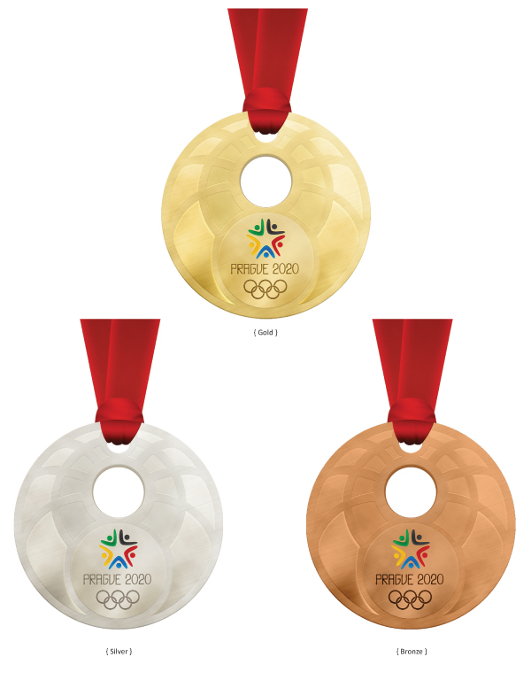
For the medal design I wanted to somehow incorporate the raised arms and head, of the figure I had used in the Prague 2020 logo, into the medal designs. I came up with a few variations on this idea but felt that it wasn’t quite strong enough on its own and I didn’t want to have too much visual repetition. The secret ingredient came in the form of revisiting the designs inspired by Prague's Astronomical clock and applying them to the medal design, while still trying to preserve the original idea of the figure reaching for the star (from the logo). Further key inspiration came from previous medal designs: Nagano (which was the only medal to use a splash of colour to highlight their logo ... I recreated that in my design), Torino (which breaks the conventional circle by using a ‘donut’ shape instead in the middle of the medal through which the ribbon is woven. I recreated this feature as well but used two circles instead of one. The bigger hole to act as the head of the figure reaching for the stars. The smaller hole is for the ribbon and also meant to symbolize the star being reached for), and lastly Vancouver (in terms of the texture and finish of the medals).
For the medal design I wanted to somehow incorporate the raised arms and head, of the figure I had used in the Prague 2020 logo, into the medal designs. I came up with a few variations on this idea but felt that it wasn’t quite strong enough on its own and I didn’t want to have too much visual repetition. The secret ingredient came in the form of revisiting the designs inspired by Prague's Astronomical clock and applying them to the medal design, while still trying to preserve the original idea of the figure reaching for the star (from the logo). Further key inspiration came from previous medal designs: Nagano (which was the only medal to use a splash of colour to highlight their logo ... I recreated that in my design), Torino (which breaks the conventional circle by using a ‘donut’ shape instead in the middle of the medal through which the ribbon is woven. I recreated this feature as well but used two circles instead of one. The bigger hole to act as the head of the figure reaching for the stars. The smaller hole is for the ribbon and also meant to symbolize the star being reached for), and lastly Vancouver (in terms of the texture and finish of the medals).
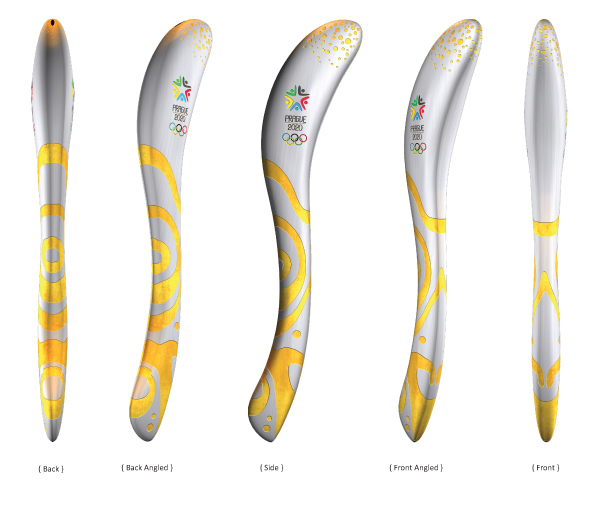
Olympic Torch
I worked on the medals and the torch consecutively, and like with the medal design, my first approach was to try incorporate the star symbol of the logo into the design. And, once again, this did not prove to be very effective. I went back to my image collection of primary research and took inspiration from various stone patterns and metal work found on the buildings of Prague. This essentially created the based of the design, the golden marks that and wrapped around and engraved onto the torch.
2D Concept, Art Direction: Ladi
3D Execution: Leo Cross
2D Concept, Art Direction: Ladi
3D Execution: Leo Cross
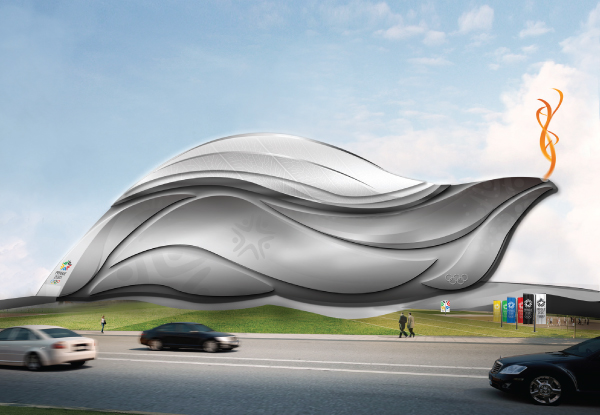
Olympic Stadium Concept Design
The concept behind the stadium is inspired by a linden tree lead taken from the Legend of Libuse from Czech mythology. The roof is meant to be retractable, and glass-like with a veiny leaf texture on it. The wavy shapes that make up the stadium are supported by an inner foundation layer which they protrude out of. This is only a concept, not a completed design proposal.
The concept behind the stadium is inspired by a linden tree lead taken from the Legend of Libuse from Czech mythology. The roof is meant to be retractable, and glass-like with a veiny leaf texture on it. The wavy shapes that make up the stadium are supported by an inner foundation layer which they protrude out of. This is only a concept, not a completed design proposal.

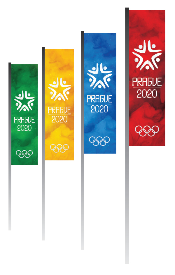
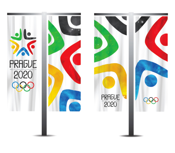
{Promotional banners}

Mascot Concept Design
Another concept design, this time for the mascot which uses the silver lion (the national symbol of the Czech Republic, from the coat of arms) with a golden mane. I intentionally wanted to try apply a more mature feel to the design since most mascots are very child-oriented. Nonetheless I think I would need to revisit this, for it to be judged complete and no longer just a concept.
Another concept design, this time for the mascot which uses the silver lion (the national symbol of the Czech Republic, from the coat of arms) with a golden mane. I intentionally wanted to try apply a more mature feel to the design since most mascots are very child-oriented. Nonetheless I think I would need to revisit this, for it to be judged complete and no longer just a concept.


