Portsmouth/London/12
University of Portsmouth London Show
University of Portsmouth London Show
This project was about producing a vibrant cohesive visual set of elements for the University of Portsmouth - BA (Hons) Graphic Design - London Show 2012. The initial angled shape mark and modular concept was decided as a whole course, in the direction of how we would represent ourselves. We than began with several rigorous silk screen tests with coloured paper and inks. As well as metallic inks. This allowed us to initially see what worked well and what did not.
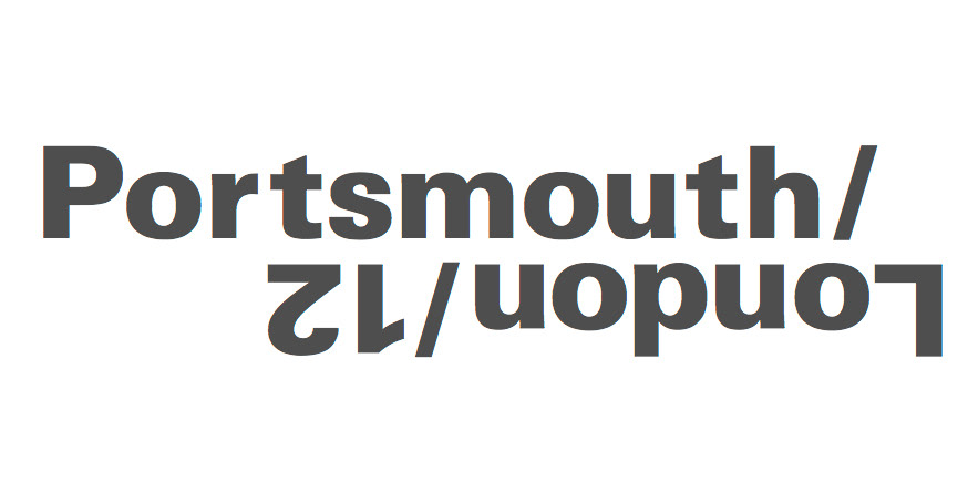
After this testing period, I was tasked with designing the invites and poster for the show. I came up with the conceptual layout and design for both, and printed the items with James Taylor. The Invite concept was to allow it to be read in two ways for effective reading. Whilst at the same time being exciting. The invite was printed in a 3 layer silk screen, on grey board, to produce the finished over print effect. I also created the Portsmouth - London typography to create a definable aspect to the work.
I wanted the poster to be a lot more striking than the invites, so I played with large scale typography to allow a clear message to be read, whilst keeping structure and hierarchy. We also overprinted with several different colours related to our show to create an exciting but unified visual product.