In June 2013 Kazakhstan based menswear company, Piccadilly, requested a redesign of their logo. Their brief was to follow closely their initial use of the London street sign, and also incorporate values of style, gentry fashion and the aspects of Piccadilly that may be appropriate to achieve the end goal. The process needed to evoke tradition and modern feels in one, to make the branding a little more durable in years to come.
The following boards are the process taken to achieve this end.
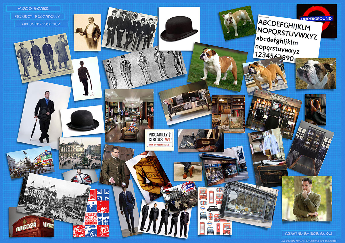
Stage one: Create a mood board to feel the flavour of the client's needs.

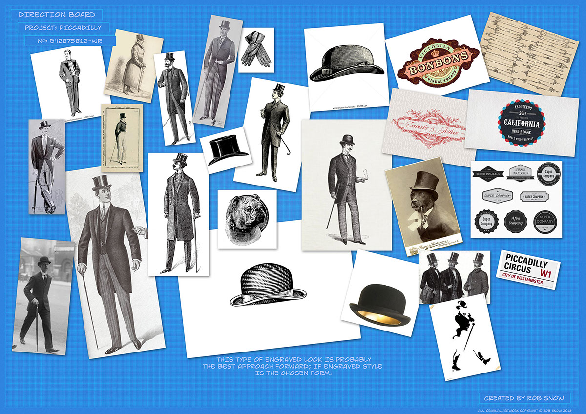
Stage two: Develop a board soley from items gained during the research that sparked some inspiration to the design process.

Stage three: The client was specific about the colours, though there was some need to look into vintage colours and muted London (UK) styles. this was achieved by some research into Kuler's library. Looking for complimentaary and suitable swatches.
Stage four: Once the client had given feedback on the research process, a set of objectives were laid out for the following development. These were formed around a liking toward engraving images of the turn of the century, as well as symbols of the upper class and Victoriana.

Stage five: After some reseaarch the original typeface for the London road signs were found (Transport Medium), and from there, two approaches were formed in rough logotype development. First was to make a modern, but unique logotype using this font, the second was to explore other typefaces that would compliment the vintage engraving suggestion.
To draw some modern aspects into the tradition serif typeface, there were two elements that were cut, and sans-serif ements were placed in. These, like the one above took on the colour of the "W1" red of the street sign, and the "Piccadilly line" blue of the underground map.
To make the modern original typeface unique, the second 'L' was raised to create an identity aspect.

Stage six: Once the typefaces were deterimed an iconic image was set forth to the drawing baord. Many attempts were made to look at the full length and half length figure in fine apparel, but by chance, an idea popped up that became the final solution.

Stage seven: The client was very pleased with the chosen solution, but wished to see variations. So a set of possible alternatives were made that incorporated the same notions and basic set up.
After some discussion, the client reverted back to the original.

Several aspects were put into place to colour the logo effectively, but it was always stated that the main final logo used the black of the road sign and the two prominent Union Jack colours (which by coincidence feature as the Piccadilly line colour and the road sign red).
To satisfy possible conflicts in usage with the main colours, a set of alternatives was created to give possibility.

This board shows the finer details involved in setting the elements together. Above is the alternate horizontal logo that was also requested.

Board showing how the logo was designed and measured.

Mock-up of the proposed and accepted business card design.

The final logo!


