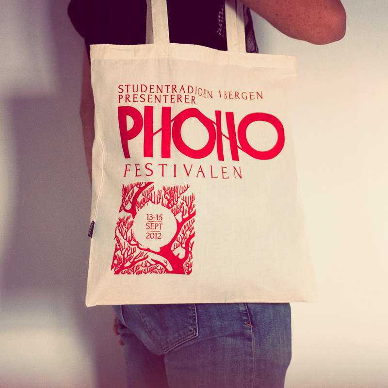
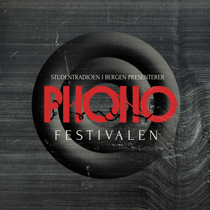
The Phono festival is a major yearly music happening, presented by the Bergen student radio. It was a joy to be selected as the designer for the 2012 edition of the festival, even more so since I'm an old radio geek myself!
The festival prides itself on digging up great, new acts that few others have heard of, and putting them next to established artists and big names.
The festival prides itself on digging up great, new acts that few others have heard of, and putting them next to established artists and big names.
This project won Gold at Visuelt 2013. Visuelt is the largest awards ceremony in Norway covering the field of design.
Let's look at some of the process first!
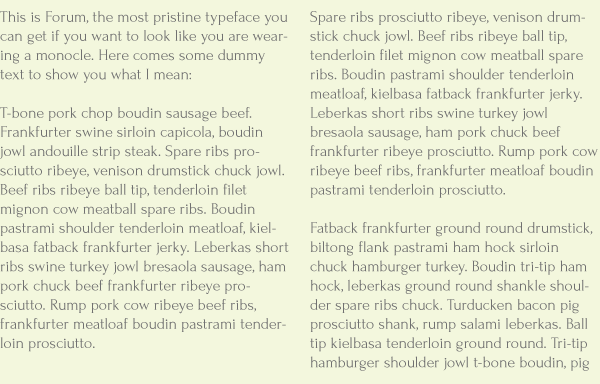
One of my starting points was that I wished to mix together two looks - a very old school, opera ticket style, with a modern, intricate, super detailed design aesthetic. I quickly found Forum, a great typeface by Denis Masharov to solidify one end of that spectrum.
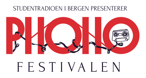
With Forum as the main typeface, it's important for the logotype and other stuff to go nuts in the opposite direction. Let me present a stroll (or scroll, if you will) through the last part of the logotype process:
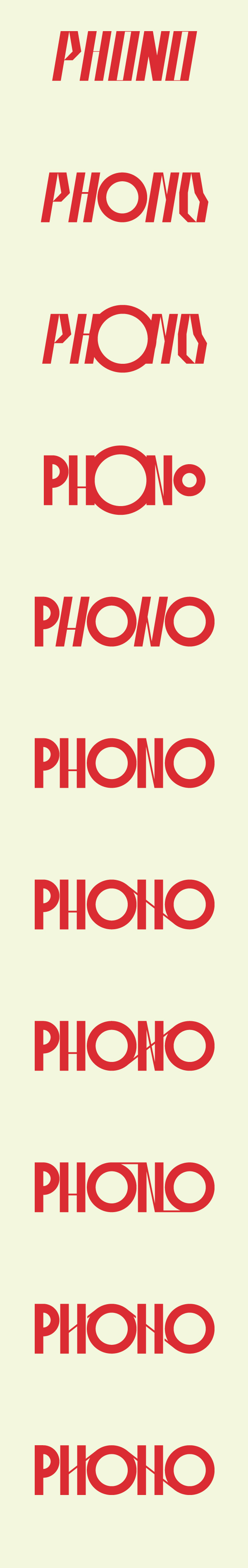
And there you have the final version, with the glossy treatment. Wham.

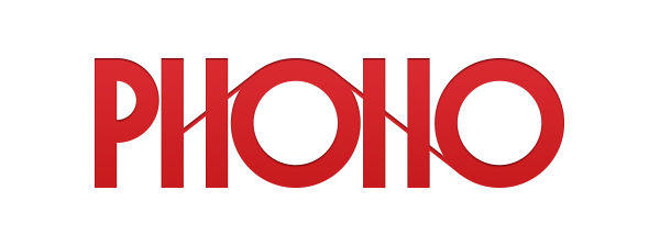
Crazy logo offshoot #1
Crazy logo offshoot #2
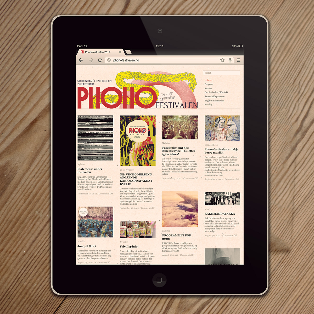
One of the first things to be officially released was the website. I based the layout on a design from WPShower, that I tweaked to fit.
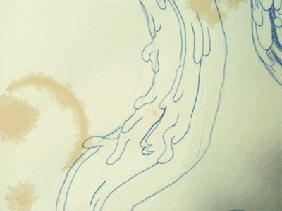
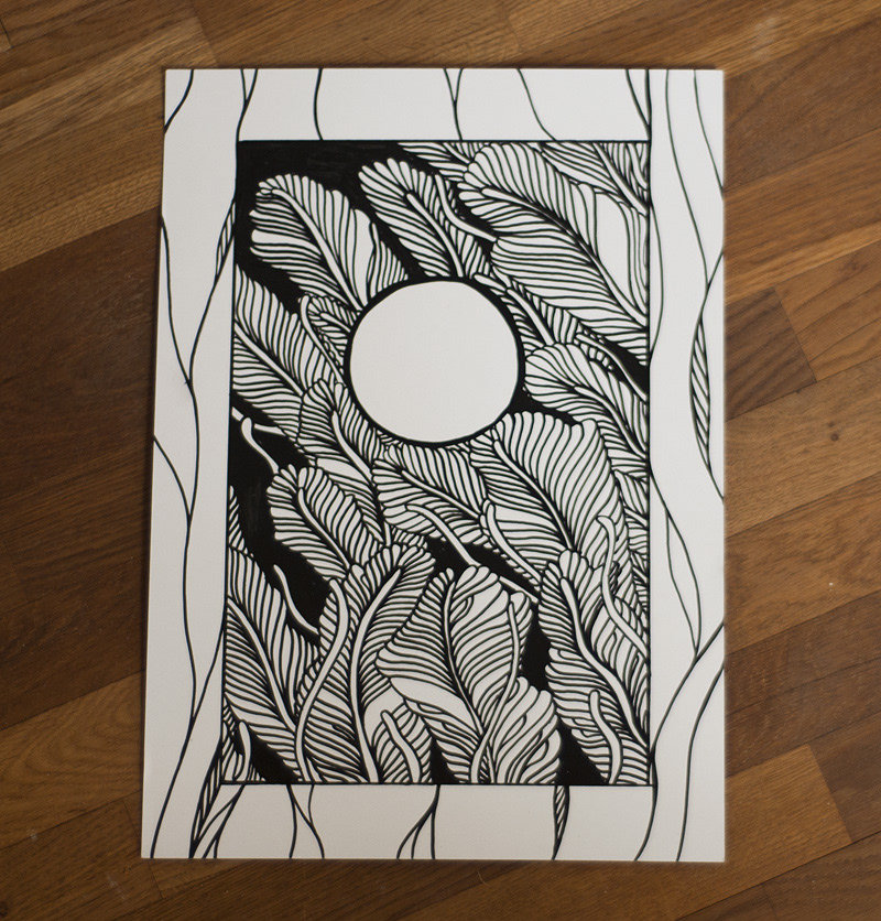
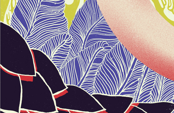
Then it came time to do the teaser poster, to be released months ahead of the festival itself. I started making a series of technique studies, to really nail the style I was going for. You can actually buy the originals, if you want.


Poster time. Crunch time. Time to get awesome.
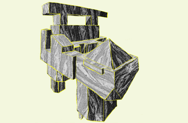
These are pieces of the process, lots of them went unused. Lots of ugly stuff, in other words.
These are pieces of the process, lots of them went unused. Lots of ugly stuff, in other words.
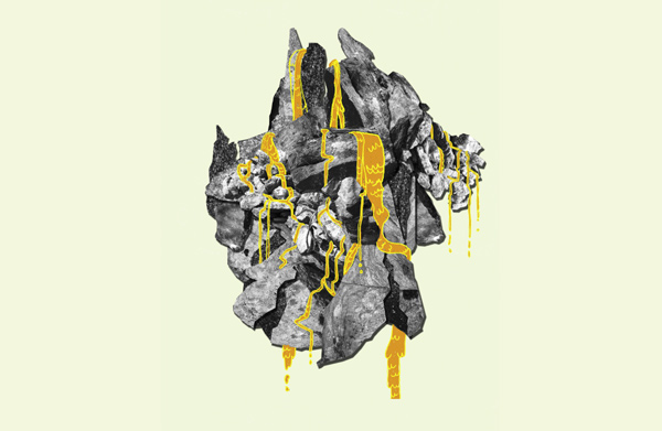


And BOOM. There it is.

Teaser poster, released in the spring

Main poster