Concept for rebranding. Adding more colour to the packaging, using only the basic graphic elements necessary for the packaging communication – phone name, product picture, standard logotypes, and the Sony Ericsson symbol.


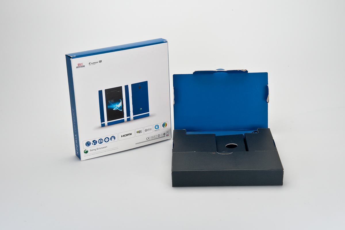
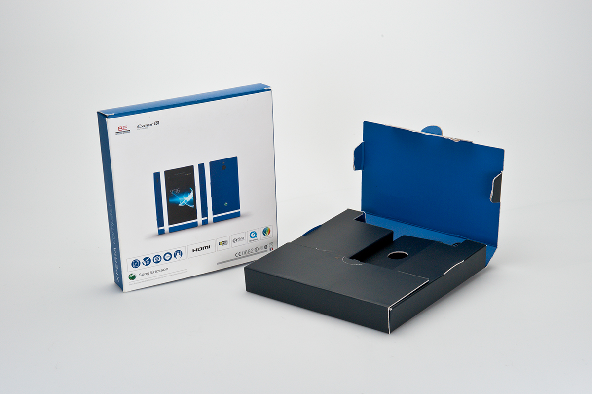
Flat box design. Used for the Xperia NXT series. The goal was to make the packaging volume as small as possible, at the same time as the diplay area was as large as possible. The box contained a full kit – phone, headset, HDMI cable, charger, and user manuals. We also wanted to emphasize the iconic design of the phone. The packaging was very low cost.

The Happy box. Adding fun and surprise to the opening experience for an entry level phone, without adding cost. We only changed the cutter guide to create a face and hands from the lid and the dust flaps.

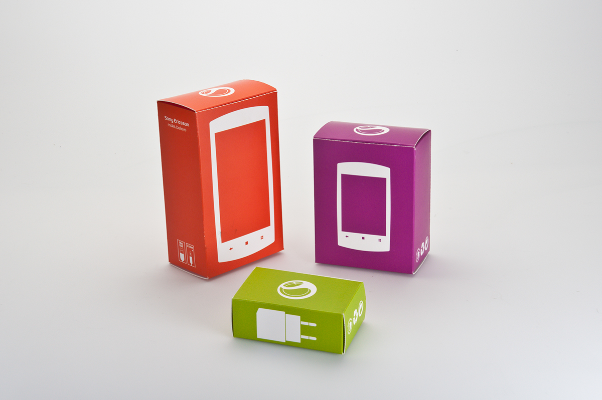
The Modular box concept. The idea was to eliminate as many logistical obstacles as possible, e.g. a very accurate product picture, and text that needs to be translated. Each box is printed in one solid colour only. The sizes are "modular" in a way that makes it possible to have only one master pack, and bundling accessories without putting them into the phone packaging.
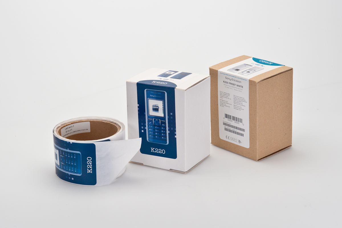
Two versions of an atempt to create a very inexpensive phone packaging for entry level phones. The packaging is optimized in siza and dimensions, to fill an EU pallet with as many items as possible. All boxes are made from brown corrugated cardboard, and the idea was to print the artwork for each product in a label printer at the assembly line.

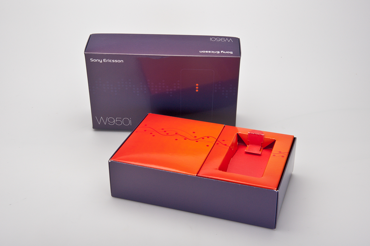
The Box-in-box. The idea was to give a hint of the phone's core features in the 3D room on the front of the packaging. The backside was a grid containing in depth information about the features. All of this without any written information, due to the very complex translation logistics.


The X5 packaging. This box was made exclusively for the Purity phone, with a see through display.


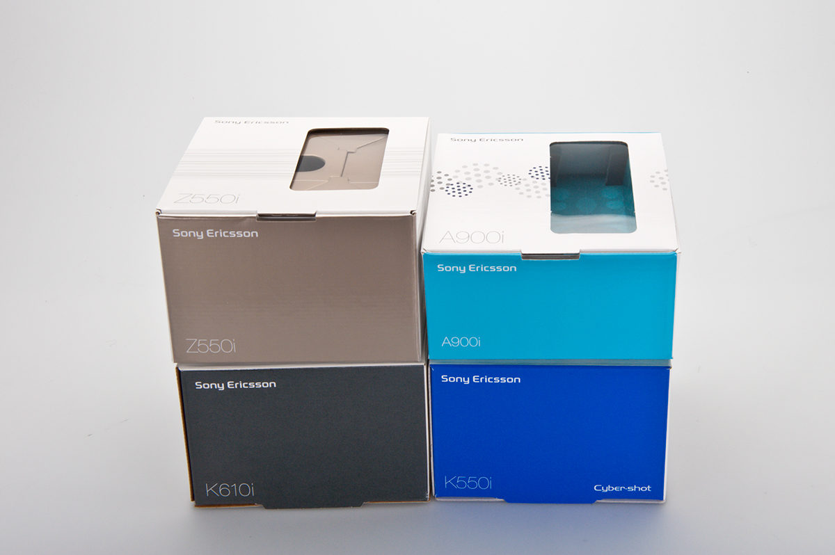
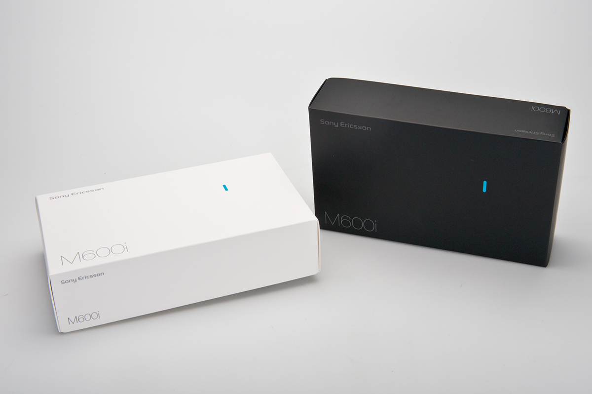
The original Sony Ericsson packaging. This was developed at the time of the merger between Sony Mobile and Ericsson Mobile Communications. The idea was to highlight the new brand colour and the "liquid identity" symbol. The first few products had the symbol on the front of the packaging, with a product picture on the back.

The Sony Ericsson brand version 2.0 introduced a range of colours, on order to give the brand a warmer impression. Some of those colours are here applied to one of the accessories.

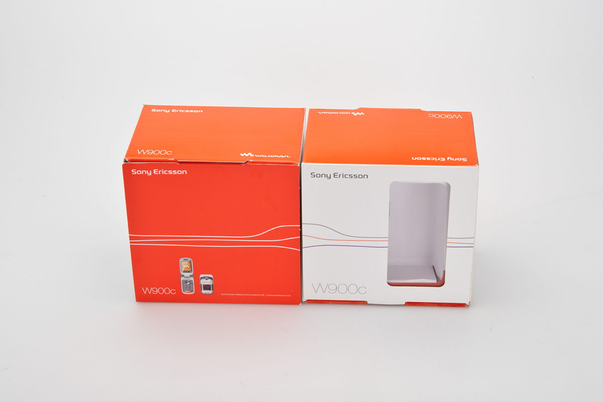
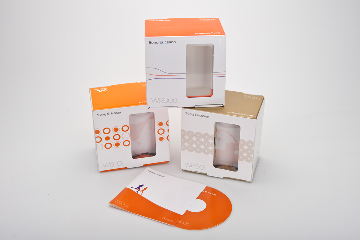
These are examples of how we made the packaging design go hand in hand with the design of the products, before v2.0 of the Sony Ericsson brand. The square boxes were made for mid and entry level products, while the large rectangular boxes were used for high end products. Initially we were required to show the products through a plastic window.