
Packaging
You judge a book by its cover and the Product by its Packaging
Guide: Mr. Apsaran Raja
You judge a book by its cover and the Product by its Packaging
Guide: Mr. Apsaran Raja
This course was a Group assignment with two designers, one communication and the other an Industrial designer working on packaging of a product for two target groups.
My team mate was Mr. Sombuddha Mahapatra, You can view his Portfolio Here
My team mate was Mr. Sombuddha Mahapatra, You can view his Portfolio Here

The logo done by Sombuddha
Need: There is always a consistent amount of consumption of ice creams, and so it demands an interesting packaging. Our main aim was to create an exclusive, top of the line ice cream brand and its packaging. The Need area includes the problems faced by users during consumption or transit and also to add a certain amount of fun aspect to the whole experience. We termed the same as a “break-away” from routine and an “instrument for creating new experiences” which in turn become memories. Therefore the need was to create an innovative and interactive packaging.
Mood Board

Attributes: Fun, Break away, Indulge and Interactive.
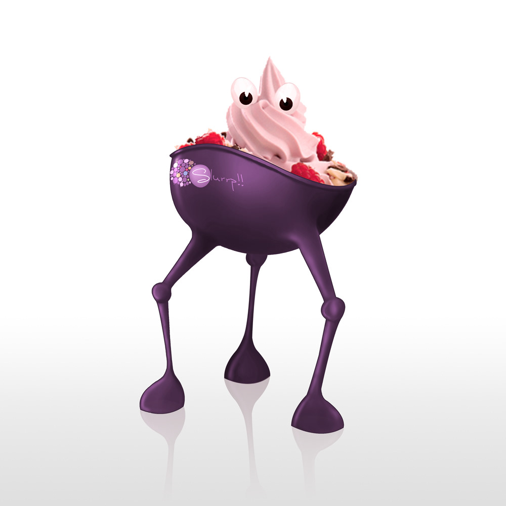
We named it the slurrrp Monster.
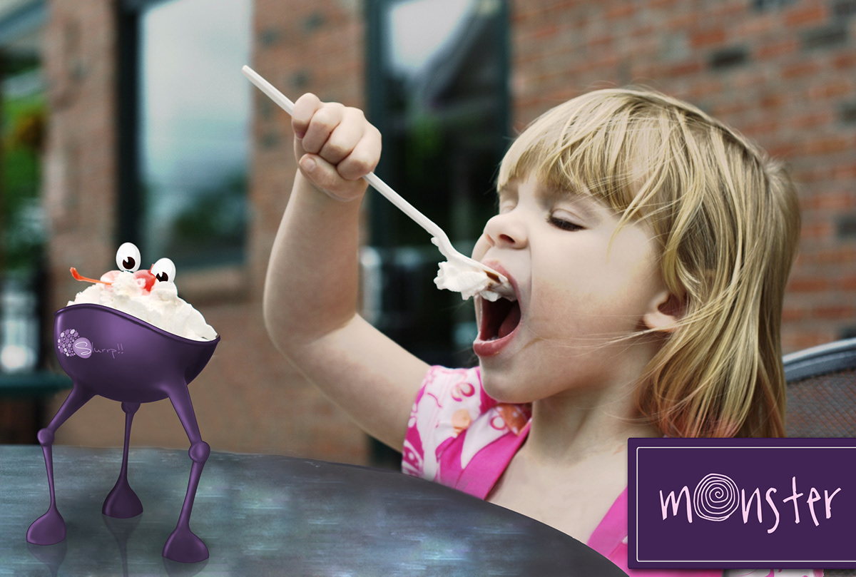
Ice cream cups... just got more delightful
Image courtesy: Photos of Gabriella by James, elwoodicious.com
Image courtesy: Photos of Gabriella by James, elwoodicious.com
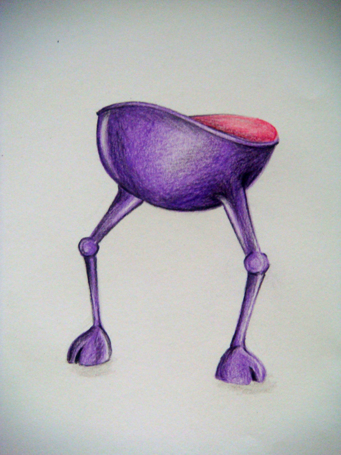
Initial monster.
Take away package.
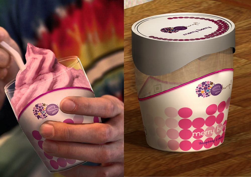
For Product:
For graphics and name:
For graphics and name:

Scaled up for family packs.

