photo: Nikola Zelmanović
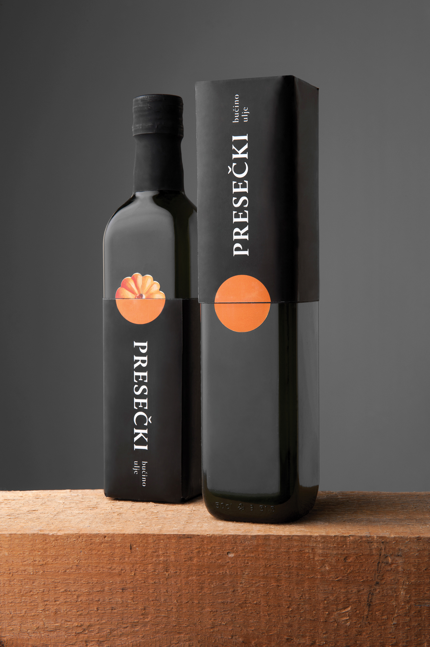
The manufacturer is small and uses "standard" bottles which are also used by other similar producers. To distinguish itself from others the packaging, while unopened, serves as a lid that camouflages the bottle's shape. The primary brand identity is abstract - an orange circle mimicking the pumpkin which becomes apparent when the packaging is opened. The lid can then be used as a pad for oil drippings. Black is used to enhance the oil's character.
All the necessary information about the product are found on the rear label.
Both the packaging and the visual identity have a dual character.
The identity confronts the abstract with the figurative while the packaging is both an aesthetical and functional complement.
All the necessary information about the product are found on the rear label.
Both the packaging and the visual identity have a dual character.
The identity confronts the abstract with the figurative while the packaging is both an aesthetical and functional complement.

This is a result of a 7-day long, packaging design workshop that took place in Varaždin, as part of Špancirfest festival. The workshop's aim was to connect local manufacturers of indigenous products with designers to get products that build the region's identity as a brand. The work has received the Golden bra Award 2012 at Magdalena - International Festival of Creative Communication in the category packaging design.


