PF Regal Swash Pro
Copyright ©2010-2012
Designer: Panos Vassiliou
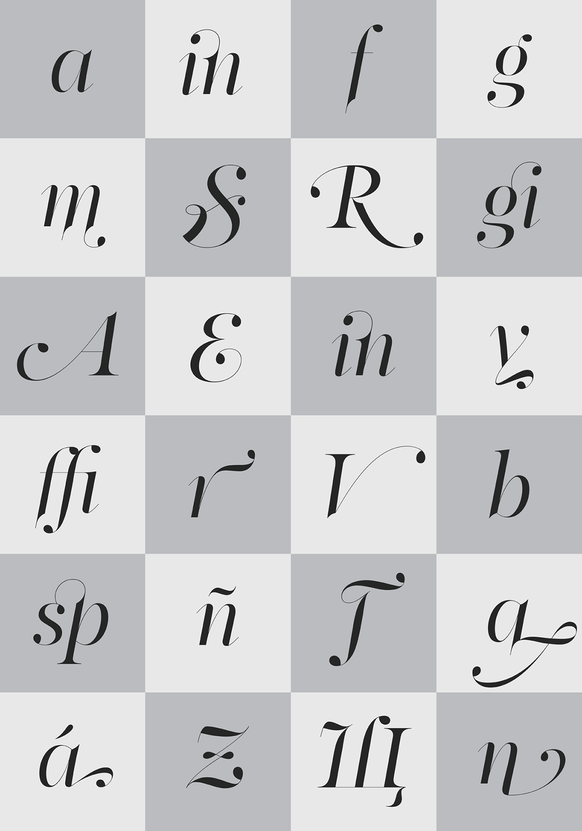
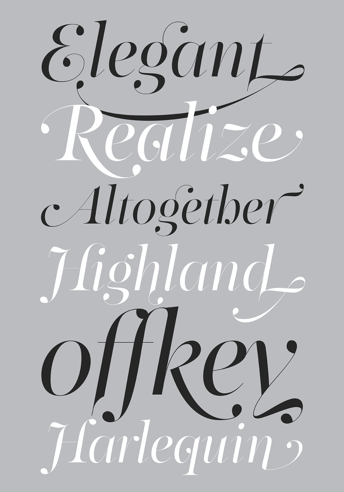
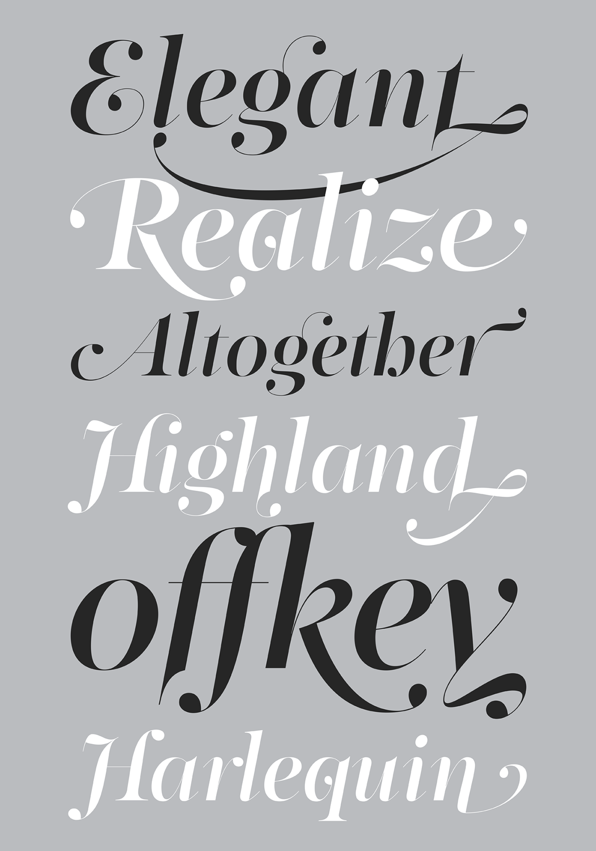
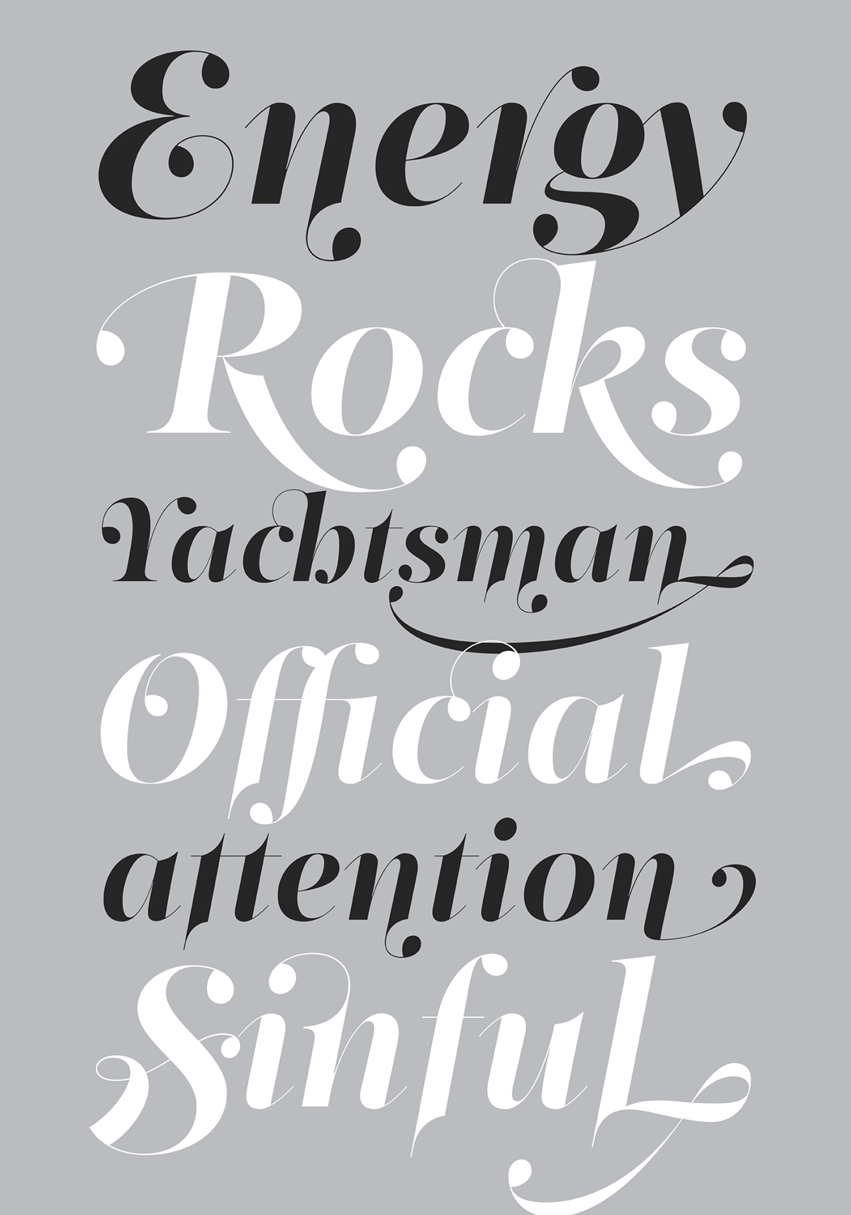
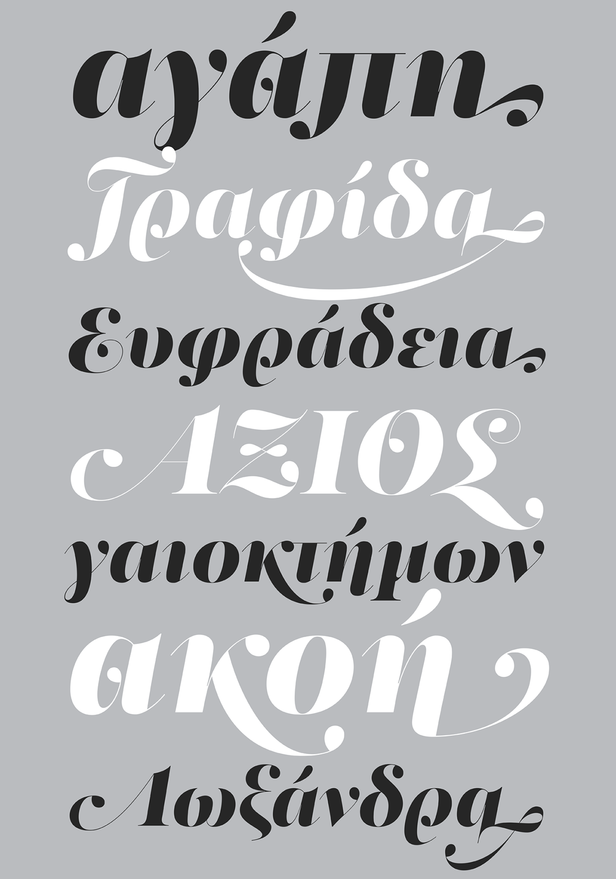
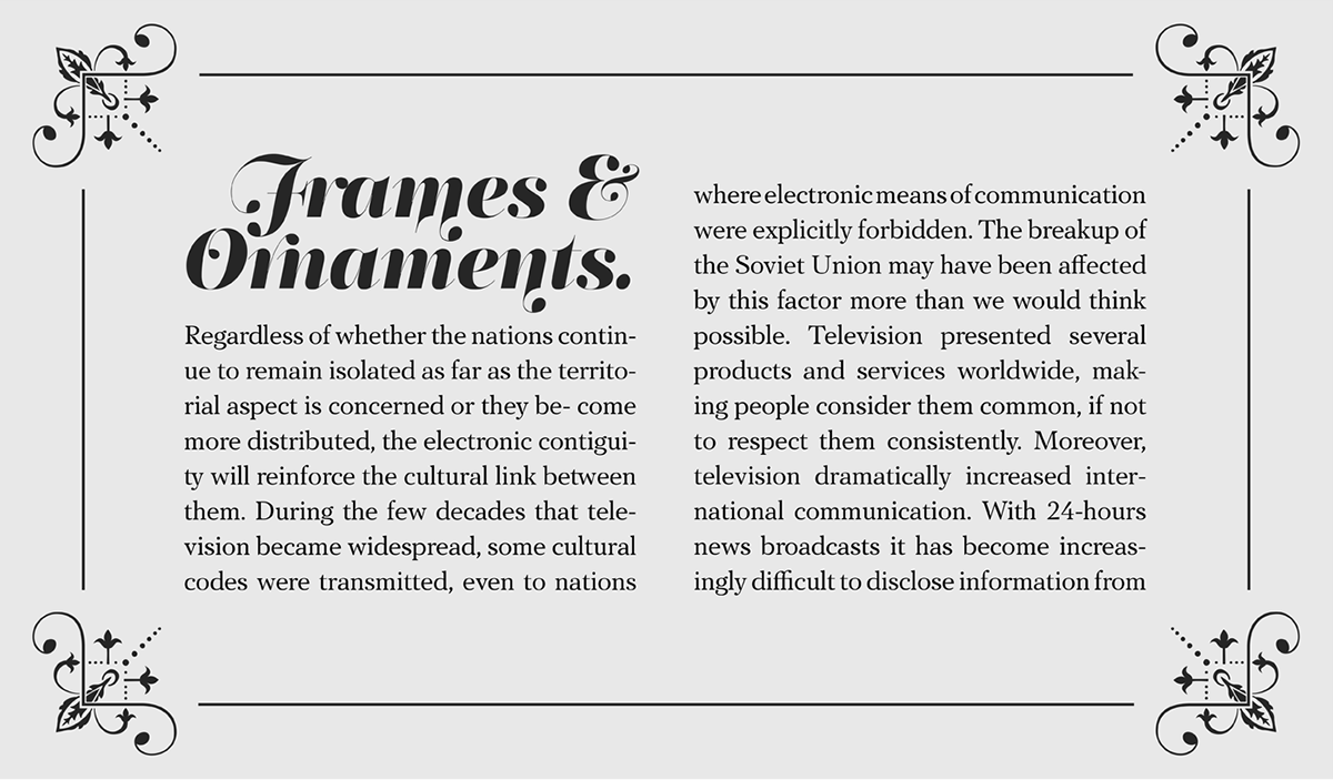
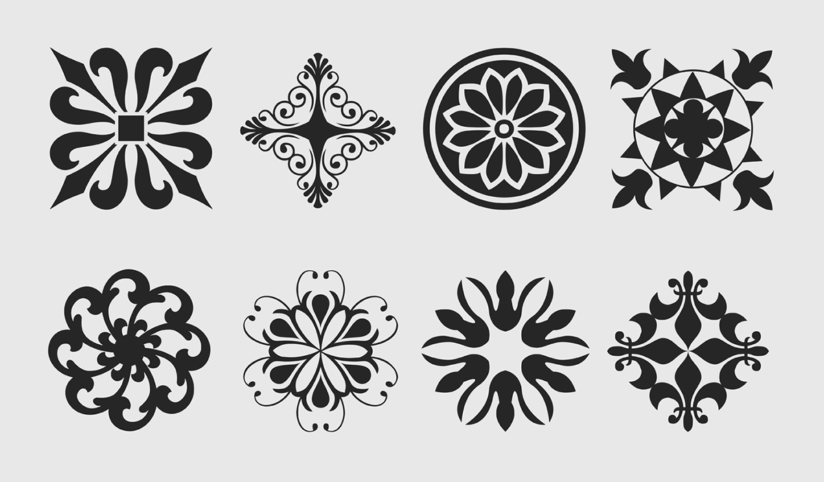
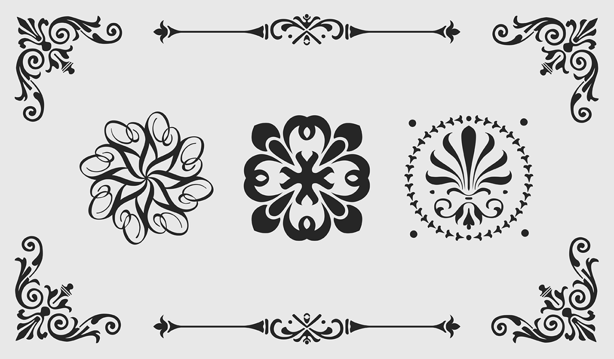
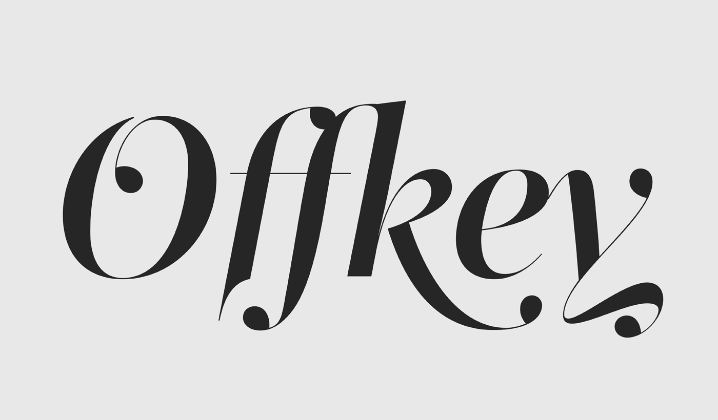
The objective of this project was to design a new typeface series for Grazia magazine. First published in 2010, Regal was later revamped and redesigned for commercial use, evolving into a type system with five related superfamilies. According to the brief, this typeface had to be elegant, luxurious, sexy, vibrant, reflect the female sensitivity and take into consideration a modern woman who is more proud, more connected, more spontaneous, open-minded and eager to try a whole host of new products and services. Targeting this consumption-wise and well-educated woman, required a typeface that is not strictly based on classic forms, but incorporates several distinct elements that express a modern woman’s personality and the products she consumes. In that respect, a whole series of 5 related superfamilies was designed, which not only emphasize femininity but also reflect both the romantic as well as the dynamic side of the female personality. For that matter, elegant curvy details were introduced in order to create a link to the female figure; teardrop terminals which reflect a woman’s sensitivity; pronounced quirks on upper and lower arms for her eyelashes; high-contrast, sharp corners at thinning terminals for her high heels; alternate glyphs for the woman who prefers to express her individuality -rather than slavishly follow trends- by using various accessories which can dramatically change her appearance; elegant endings and long curves to reflect her predisposition to dream; bell-shaped serifs with an inward rather than outward direction which recall streamlined seventies fashion. This series of typefaces is diverse in its construction as it consists of five related superfamilies i.e. text, display, finesse, swash and stencil. There is a variety of weights which range from regular to ultra black for each one of the five families. These families share common attributes but they differ in content according to each one’s usage. The whole superfamily type system is comprised of 47 weights with an average of 898 glyphs per weight. It supports simultaneously Latin, Cyrillic and Greek and comes with many alternate glyphs.
AWARDS
Copyright ©2010-2012
Designer: Panos Vassiliou
The objective of this project was to design a new typeface series for Grazia magazine. First published in 2010, Regal was later revamped and redesigned for commercial use, evolving into a type system with five related superfamilies. According to the brief, this typeface had to be elegant, luxurious, sexy, vibrant, reflect the female sensitivity and take into consideration a modern woman who is more proud, more connected, more spontaneous, open-minded and eager to try a whole host of new products and services. Targeting this consumption-wise and well-educated woman, required a typeface that is not strictly based on classic forms, but incorporates several distinct elements that express a modern woman’s personality and the products she consumes. In that respect, a whole series of 5 related superfamilies was designed, which not only emphasize femininity but also reflect both the romantic as well as the dynamic side of the female personality. For that matter, elegant curvy details were introduced in order to create a link to the female figure; teardrop terminals which reflect a woman’s sensitivity; pronounced quirks on upper and lower arms for her eyelashes; high-contrast, sharp corners at thinning terminals for her high heels; alternate glyphs for the woman who prefers to express her individuality -rather than slavishly follow trends- by using various accessories which can dramatically change her appearance; elegant endings and long curves to reflect her predisposition to dream; bell-shaped serifs with an inward rather than outward direction which recall streamlined seventies fashion. This series of typefaces is diverse in its construction as it consists of five related superfamilies i.e. text, display, finesse, swash and stencil. There is a variety of weights which range from regular to ultra black for each one of the five families. These families share common attributes but they differ in content according to each one’s usage. The whole superfamily type system is comprised of 47 weights with an average of 898 glyphs per weight. It supports simultaneously Latin, Cyrillic and Greek and comes with many alternate glyphs.
AWARDS
* Red Dot Design Awards 2012: Grand Prix
*German Design Awards 2014: Nominee
*German Design Awards 2014: Nominee
* HiiiBrand Awards 2013: Silver
* Communication Arts Annual Competition 2012: Winner
* Creative Review Type Annual 2011: Winner
* European Design Awards 2011: Finalist
* EBGE Awards 2011: Finalist
* Granshan Awards 2010: Excellence Award
* Communication Arts Annual Competition 2012: Winner
* Creative Review Type Annual 2011: Winner
* European Design Awards 2011: Finalist
* EBGE Awards 2011: Finalist
* Granshan Awards 2010: Excellence Award