PF DIN Display® Pro
Copyright ©2002-2005
Designer: Panos Vassiliou
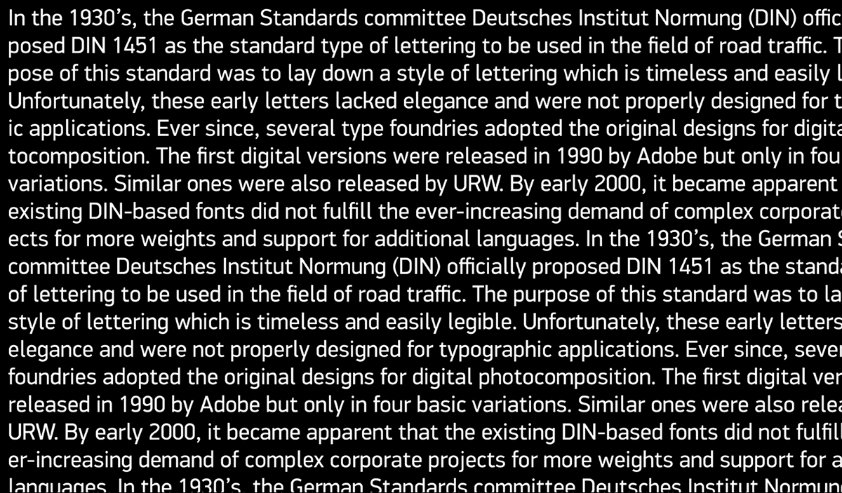
DIN Display retains PF DIN Text’s basic characteristics but it shines with its sharper corners and contemporary look. Apart from its distinct and robust display squarish nature which is equally suitable for print as well as web projects, it performs amazingly well in small sizes delivering a clean and stylish body text.
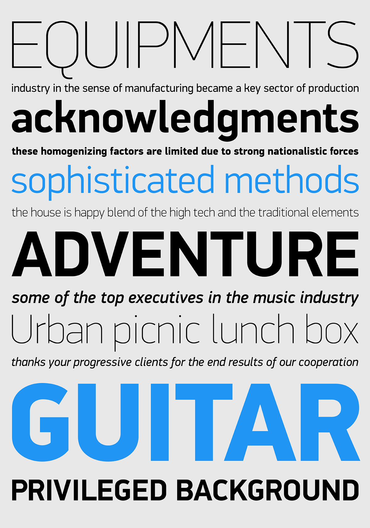
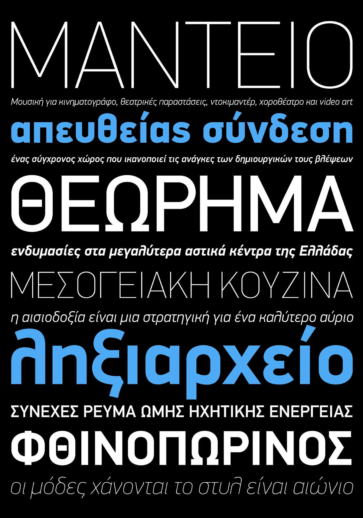
Completed in 2002 along with the other families of the PF DIN series, it was first released and published in Parachute’s award-winning 2003 typeface catalog. It has been used successfully in magazines, award-winning corporate applications and packaging in diverse fields such as music, fashion, technology, visual arts. The ‘Pro’ series offers more weights, multilingual support and opentype features in all styles. Specifically, this superfamily supports simultaneously Latin, Greek and Cyrillic, while each one of its 15 weights contains 1197 glyphs and 20 opentype features. The latest DIN Display version 3.0 has been enhanced with new glyphs such as the German capital sharp s, Russian rouble, Ukrainian Hryvnia, Azeri and Kazakh letterforms, kerning and enhanced language support in all family variations. Additionally, every font in this superfamily has been completed with 270 copyright-free symbols, some of which have been proposed by several international organizations. This is a set of very useful daily symbols for packaging, branding and advertising. Symbols for public areas, environment, transportation, computers, fabric care and urban life.
Completed in 2002 along with the other families of the PF DIN series, it was first released and published in Parachute’s award-winning 2003 typeface catalog. It has been used successfully in magazines, award-winning corporate applications and packaging in diverse fields such as music, fashion, technology, visual arts. The ‘Pro’ series offers more weights, multilingual support and opentype features in all styles. Specifically, this superfamily supports simultaneously Latin, Greek and Cyrillic, while each one of its 15 weights contains 1197 glyphs and 20 opentype features. The latest DIN Display version 3.0 has been enhanced with new glyphs such as the German capital sharp s, Russian rouble, Ukrainian Hryvnia, Azeri and Kazakh letterforms, kerning and enhanced language support in all family variations. Additionally, every font in this superfamily has been completed with 270 copyright-free symbols, some of which have been proposed by several international organizations. This is a set of very useful daily symbols for packaging, branding and advertising. Symbols for public areas, environment, transportation, computers, fabric care and urban life.