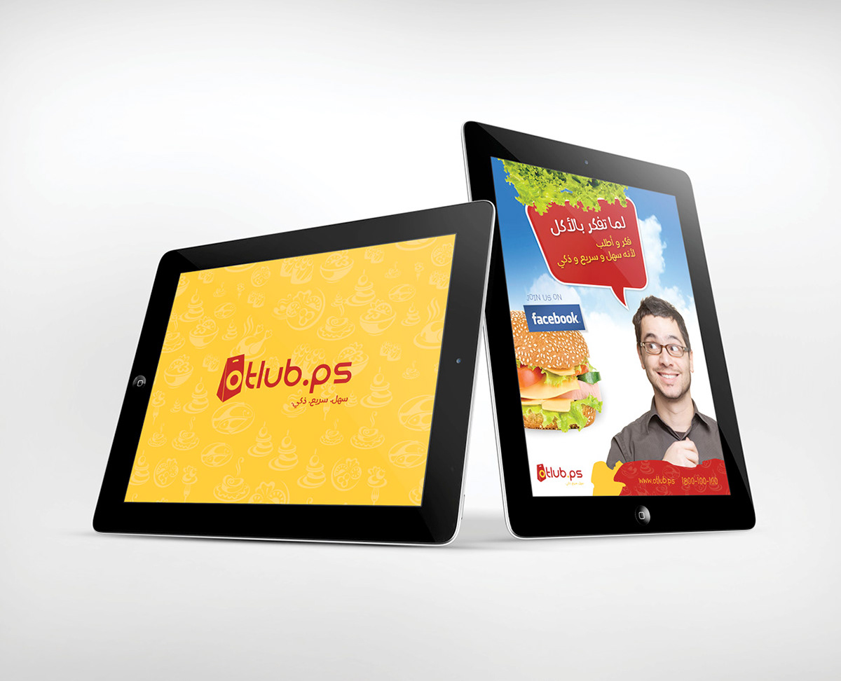
The brandmark conveys the concept of “ordering” through an icon of a delivery bag. This icon is used in a way that flows with the brand name so that it is part of the one-element logo. The bag has a clear illustration of the letter “O” on it with an apparent contrast between red and yellow. Most importantly, the brandmark is distinctive and projects a fresh image for Otlub.


Our tagline is the phrase that sums-up who we are and what we do. This is not to be used as a flashy motto but rather a statement that drives the whole organization.
“Fast. Simple. Smart.” is a three-word statement that describes our core competencies and the reasons for why anyone should use our services.
The tagline should appear on all future communication tools and should always be placed next to the logo in order to emphasize the added value of Otlub to any customer.