


Organic Revival
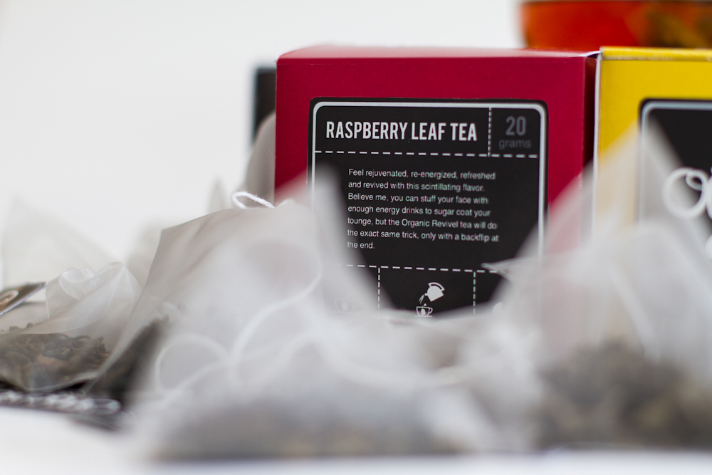
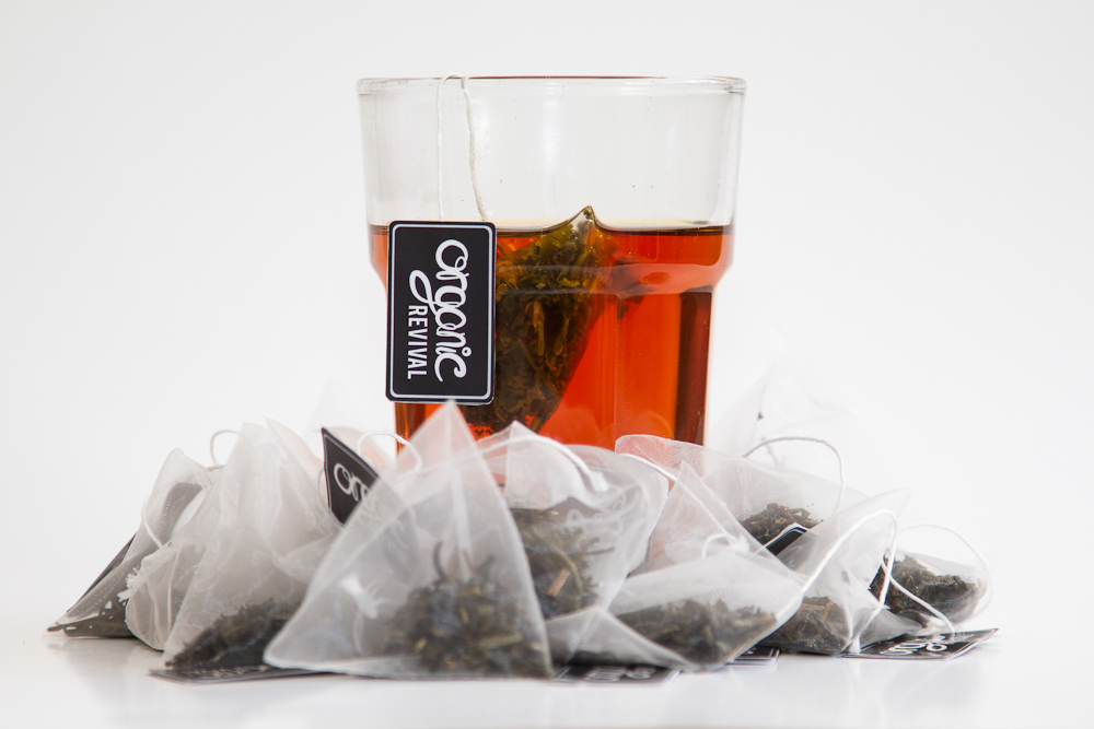
Tea packaging.
Tea packaging.
I started out with a quick design of what I would call "traditional tea packaging", where i scanned loose tea, boosted the contrasts, added some color and paired it up with a serif typeface. A very clean design, but I felt like it’s been done way too many times before so I wanted to try something else.

Basically I wanted to provide a healthier, and more refreshing, substitute to the likes of energy drinks, coffee etc. I played around with the idea of showing tea in an energetic way, i. e. tea splashes, loose tea thrown around etc.
My target group for this assignment ended up being young creatives. Something I could relate to myself. Seeing that the name of the brand was “Organic Revival”, I wanted to make something energetic. Something that would “revive” your creative energy, so to speak.
In the end I concluded with the fact that organic shapes could be quite energetic in itself.


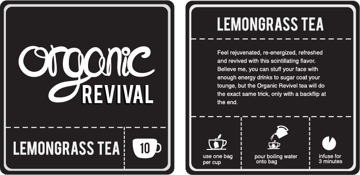
After playing around with my tablet I ended up with a modified version of my own handwriting. Unfortunately the high contrast in the strokes turned out to be bad for legibility, so I had to even it out at bit to better suit the size of the finished product.


Thanks for watching.


