Opus Art Supplies Newsletter
As part of an overall refinement of the Opus Art Supplies image, I made some recommendations for improving the newsletter design and layout.
First, to replace the mix of typefaces used in the past, Opus switched to a cohesive a typeface that is versatile, readable, and suitable an art supply store.
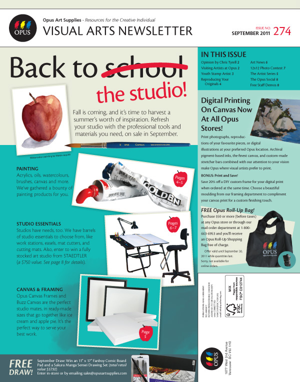
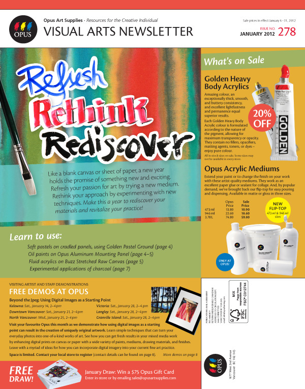
Second, the stoic, text-heavy layout was changed to favour more colourful imagery for the cover, as well as adding cues to the content (expressing the benefits of subscribing, besides the sale information). I added more graphic elements, such as pull-quotes for the main articles, for visual interest. To keep things flexible, the irregular grid was changed to a grid of equal column widths.
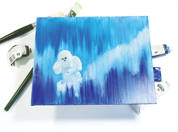
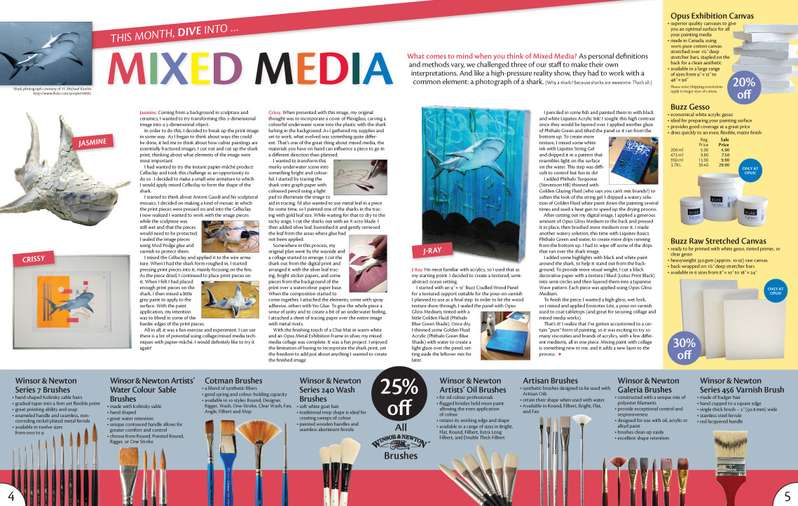
Third, I recommended more emphasis on useful content, such as How-To information and Artist interviews. I created the creative content in the spreads below, including mixed media painting and photography.