WebOS Open
logos design for contest
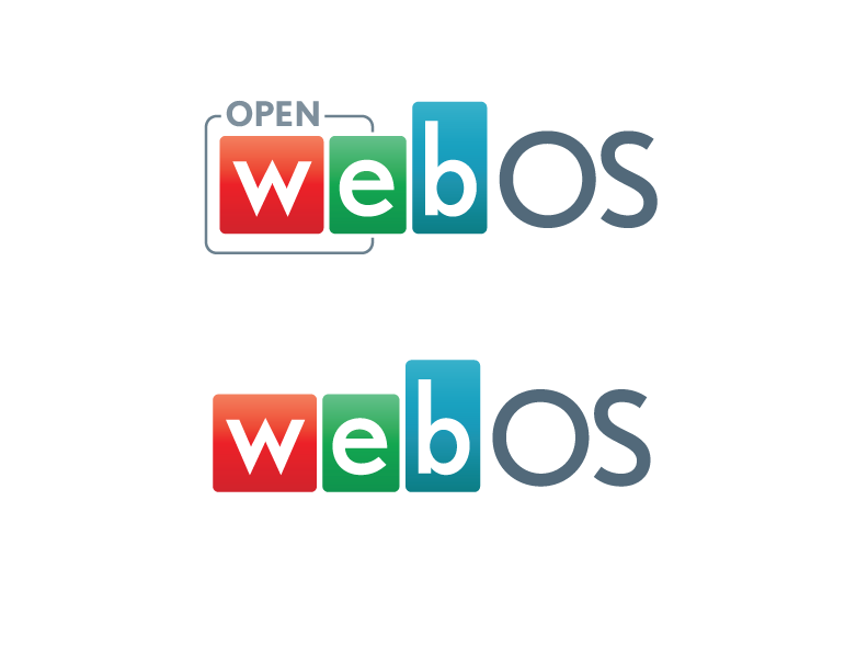
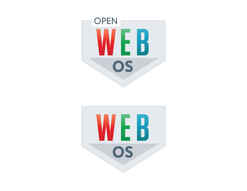
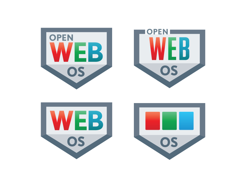
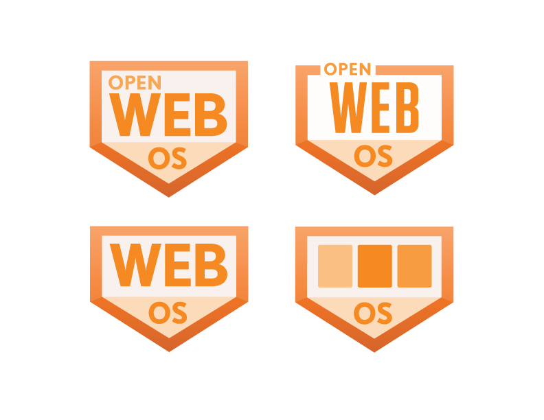
Four versions for a WebOS logo. The contest was directed towards the WebOS open source community. The logos have options both with and without the word "open", for flexibility (if necessary). They incorporate minimized "cards" that are a part of the iconography from HP's TouchPad. For versions 2-4, I used a shield-like graphic element so that it could "sit on the shelf" with ENYO, as well as continue using the card elements to differentiate. Versions 3-4 have a minimized icon that could be made small and used for sub-branding by removing the letters and having the three cards signify the word WEB. Version 4 uses the Palm OS color palette.