
LOGO
The concept for this logo came from the idea of "home" and evolved into a skeleton key which can have multiple meanings, especially for this organization. A skeleton key opens not one, but many doors like Oasis of Hope who opens doors of opportunities to girls who were trapped in the trafficking industry for so long. The key also represents newly found safety, security, & awareness.
LETTERHEAD & BUSINESS CARD
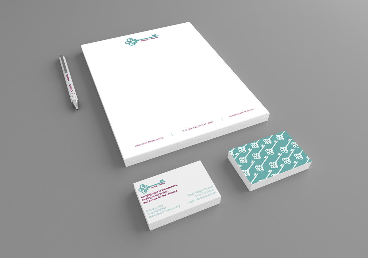
The stationery for this project was created to be simple, cohesive, and versatile due to the low budget of a non-profit organization. We mainly stuck to using two colors or three at most and used repeating graphic patterns to tie the collateral pieces together visually. Credit to group member, Courtney Lynn, for the business card design.
POSTCARD/MAILER
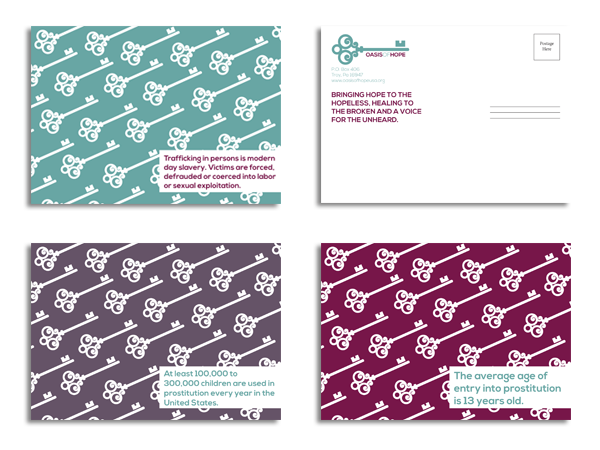
Postcard designs by Courtney Lynn. We wanted to design a mailer that could be reused to provide different facts & spread awareness about the issue of human sex trafficking.
WEB DESIGN CONCEPT
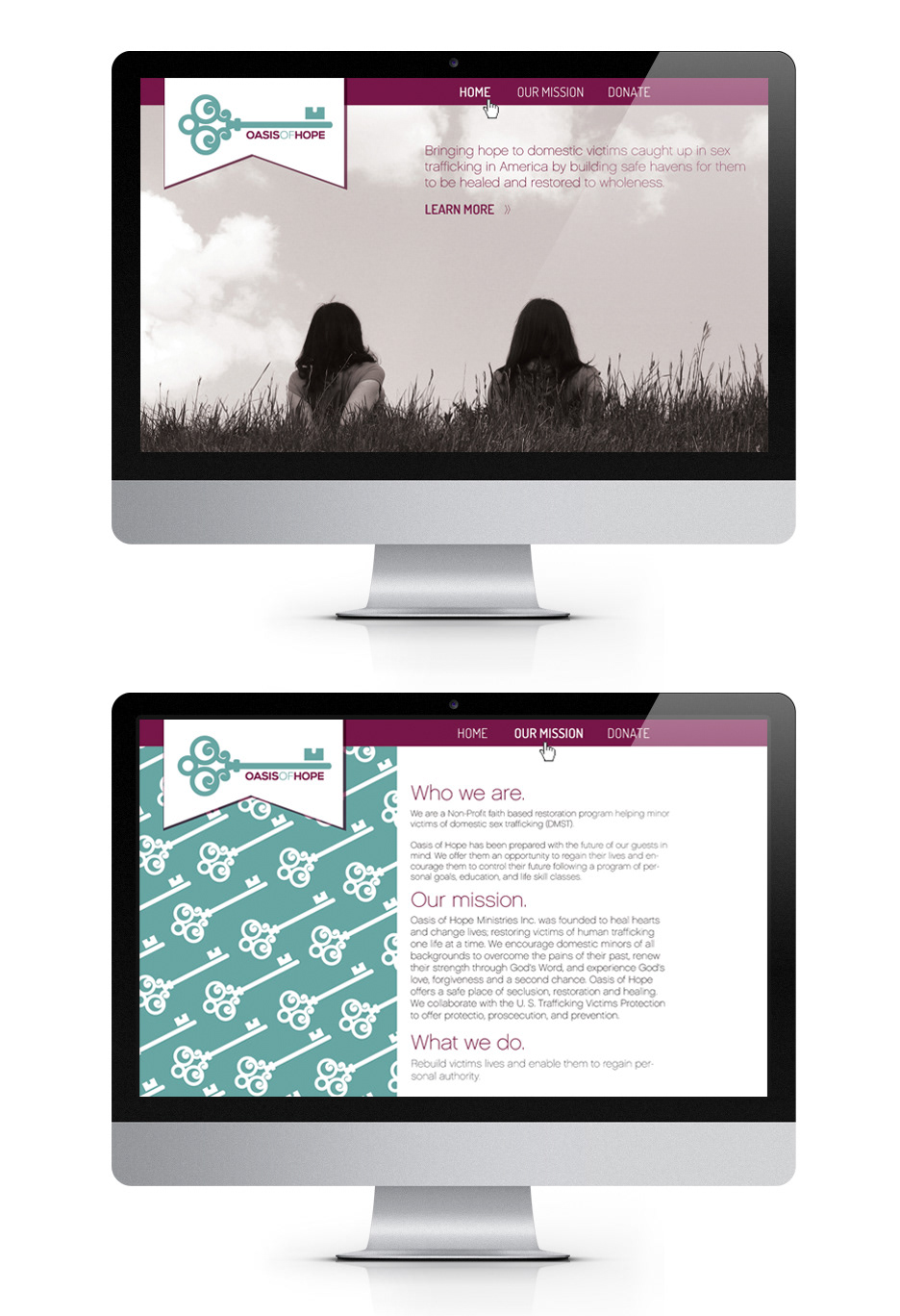
Their website should be easy to navigate & clear with their mission statement to appeal to potential donors.