Oakland A's
Identity / Outdoor / Print / Stadium / TV
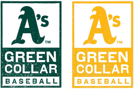
Identity /
These are the official team logos for the Oakland A's Green Collar Baseball campaign (2010-present). To communicate the gritty and no nonsense feeling of Green Collar Baseball, I designed this gridded type lockup and had a giant rubber stamp of it made. Then I stamped it, scanned it and colored it to create the final mark. It was used on everything and anything A's this season from t-shirts to signage to advertising.
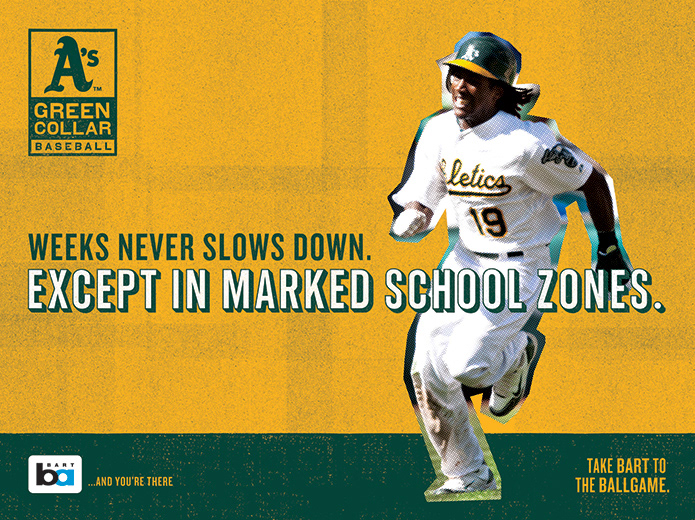
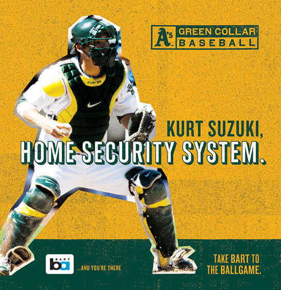
Outdoor /
The tagline for the 2010, 2011 and 2012 Oakland A's is Green Collar Baseball. The idea spawned from the fact that the A's are a gritty, scrappy young team with all heart and no superstars. I've been lucky enough to work on this campaign for the last three seasons (as designer for 2 and ACD for the last) and here is some of my favorites pieces. The two look and feels you'll see here were used across the entire integrated campaign including online, television, print and outdoor.
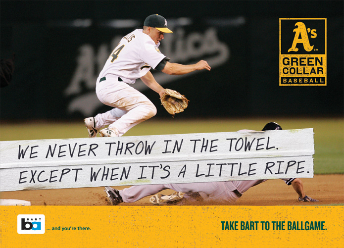
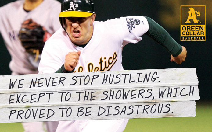

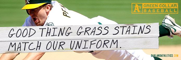
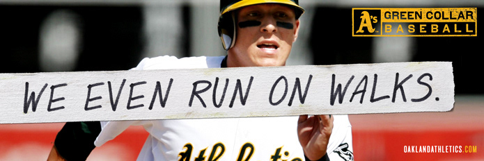
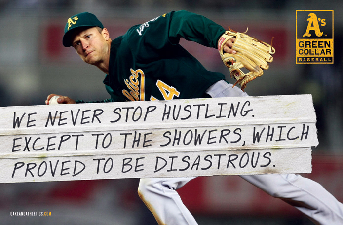
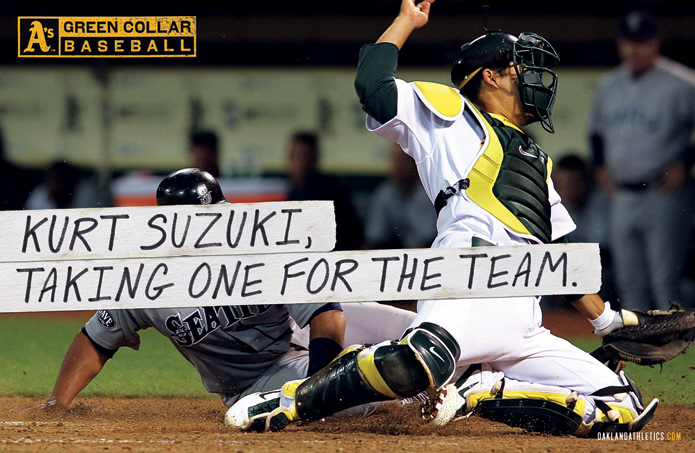
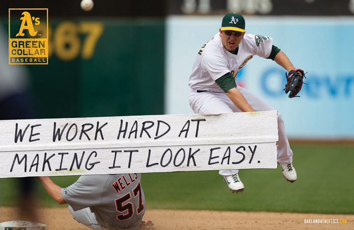
Print /
Here are a few of my favorite spreads designed over the past 3 seasons. The second spread in this bunch ("Showers") was featured in the 2011 HOW International Design Annual - just sayin'.

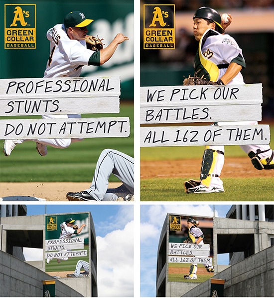
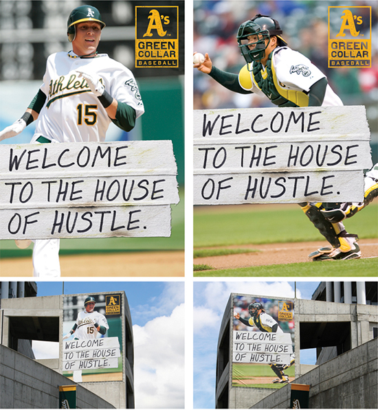
Stadium /
The Green Collar Baseball campaign obviously has to have a large presence at the stadium. Here are a couple of the pieces I designed for the Colosseum.

Television /
I've been the art director on the 2010, 2011 and 2012 A's spots. This scrappy job includes everything from creating locker rooms from scratch and selecting wardrobe/props to designing the end tags and overseeing the color correction in post. Here are a few of my favorite spots from the 2012 season. If you like what you see and want to check out spots from the past few years, you can go here.


