ODITA Magazine
Odita was born after a deep analysis of the current italian female magazines market, and an eye towards the foreign vanguards. Odita faces the editorial landscape as a new reality among the publishing houses which produce fashion and lyfestyle magazines. His positioning is very high for quality and price, but unlike Vogue, it's not made for fashion insiders, it's for anyone intrested in image, trends, style and visual arts, and it focuses also on news and quality journalism.
Odita follows the examples from the great foreign magazines such as ID, Numerò, W, Self Service and V: It talks about fashion, it's snob, it's hip, it's transgressive, and it brings some vanguardism in the italian market. It's target includes mostly women, but just like it happens with "D di Repubblica" or "io Donna" it involves also men interested in this topics.
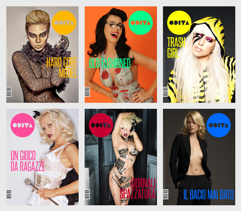
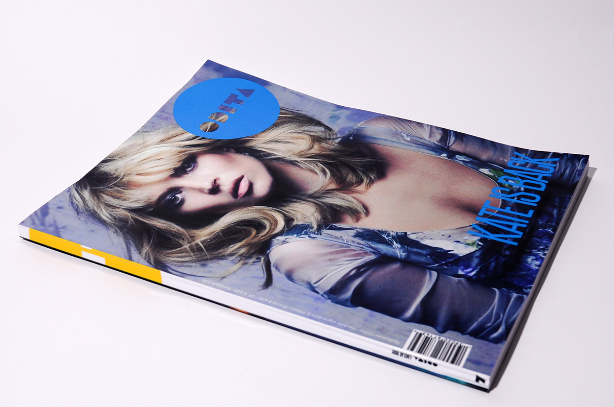
Its logo becomes immediately a mark, a label, an "approval print". A circle (pure shape that indicates movement) and a typeface that you can hardly forget. The covers of the magazines must stay as bare as possible, the faces and the brand are the protagonists and they stand out, thans also to the big format (34x25.5 cm), among the newsagent's shelves.
Odita follows the examples from the great foreign magazines such as ID, Numerò, W, Self Service and V: It talks about fashion, it's snob, it's hip, it's transgressive, and it brings some vanguardism in the italian market. It's target includes mostly women, but just like it happens with "D di Repubblica" or "io Donna" it involves also men interested in this topics.
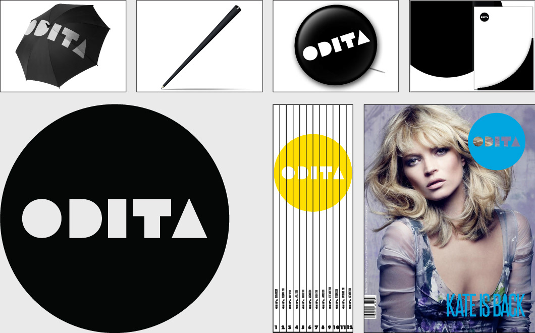
Its logo becomes immediately a mark, a label, an "approval print". A circle (pure shape that indicates movement) and a typeface that you can hardly forget. The covers of the magazines must stay as bare as possible, the faces and the brand are the protagonists and they stand out, thans also to the big format (34x25.5 cm), among the newsagent's shelves.


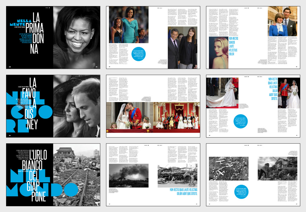


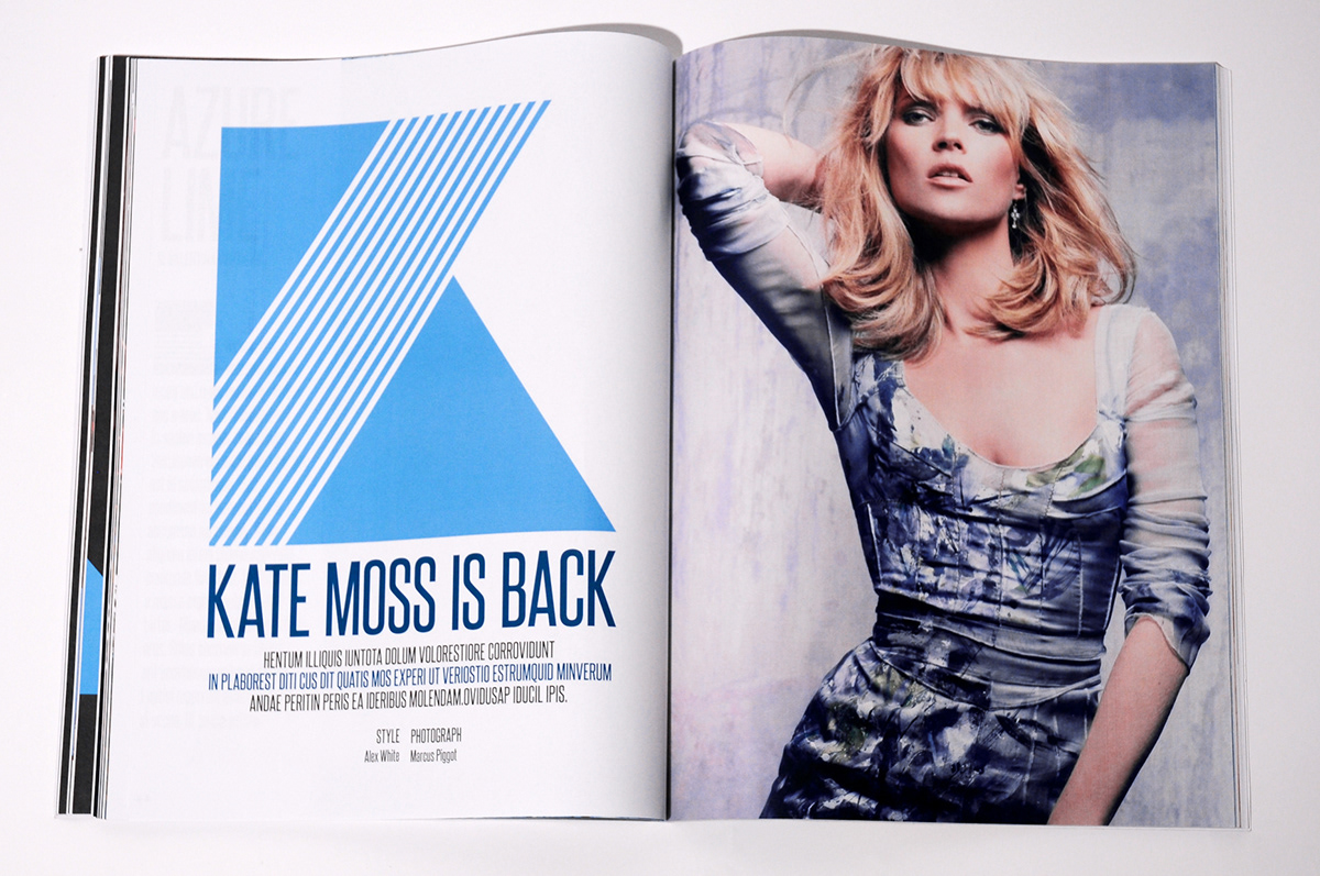
MAIN ARTICLE


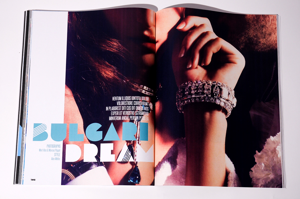
ASSOLO single products highlights


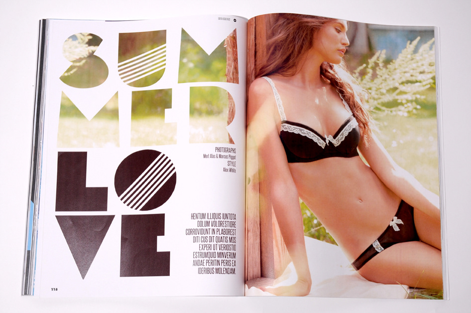
TREND fashion articles


COLUMNS art beauty culture design
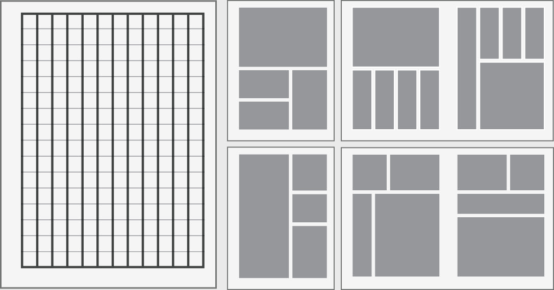
MAGAZINE LAYOUT
ODITA magazine brand

ODITA website example


