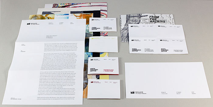
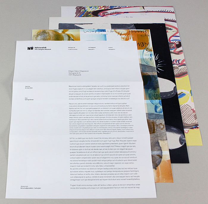
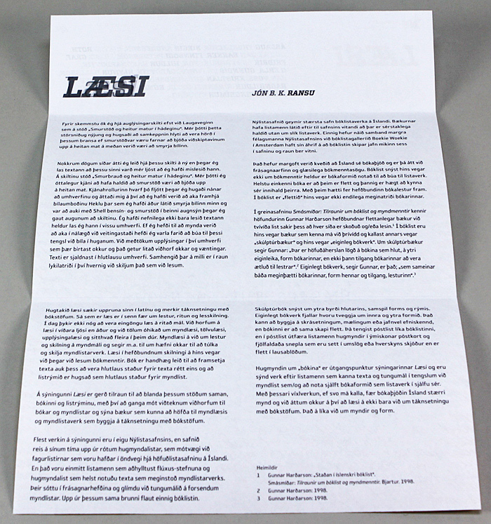
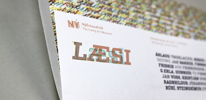
The project was to update the branding of the Living Art Museum. Make a better whole in the brand. We went through the print material the museum already had and came to the conclusion that we did not need to change the logo but the direction and idea behind it. We stripped the logo of all color, made it black and white and changed the font the museum had been using.
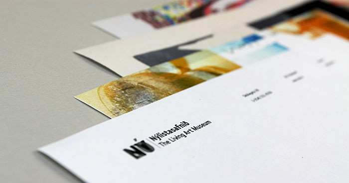
After this first step we looked at what is the core of the museum. Our conclusion was diversity, play full, small funding and a nice collection of art work the museum owns. The museum collection is not shown much so we decided to make it more visual.
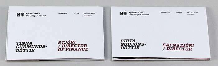
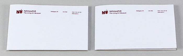
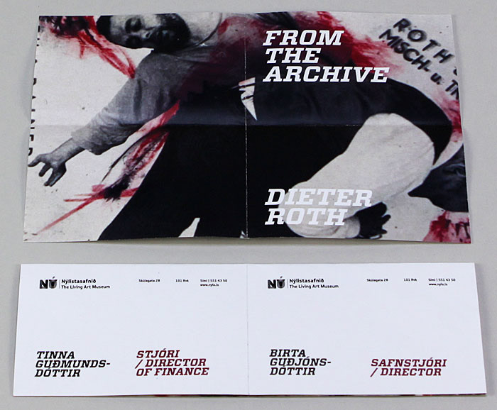
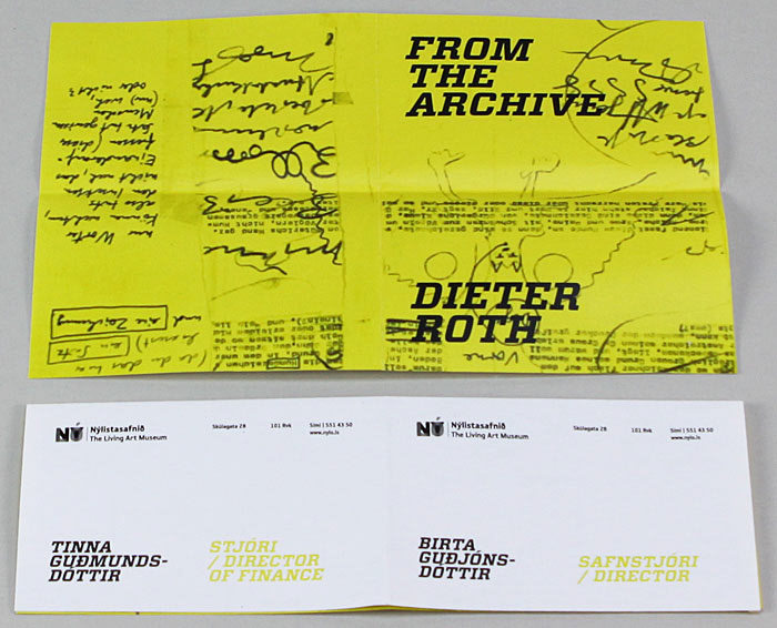
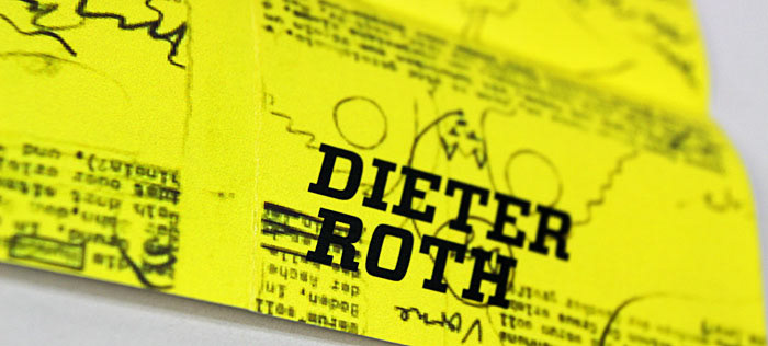
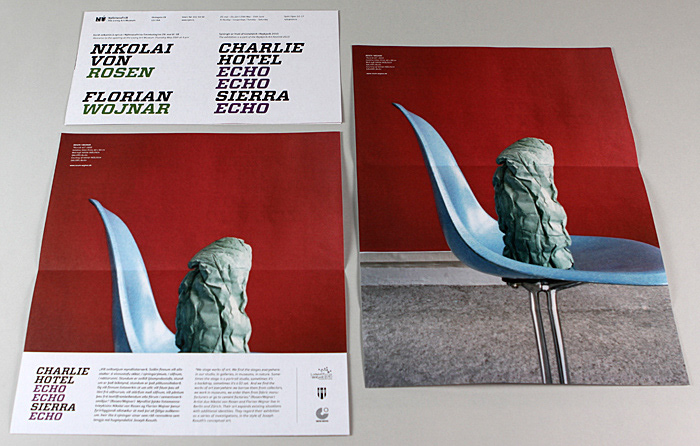
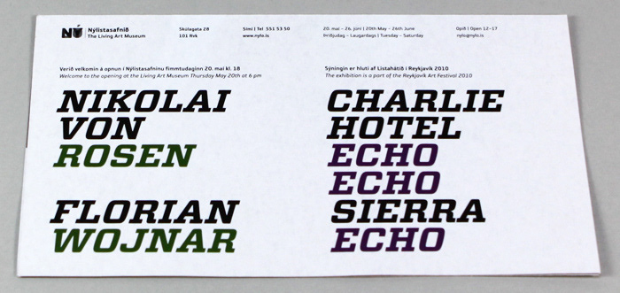
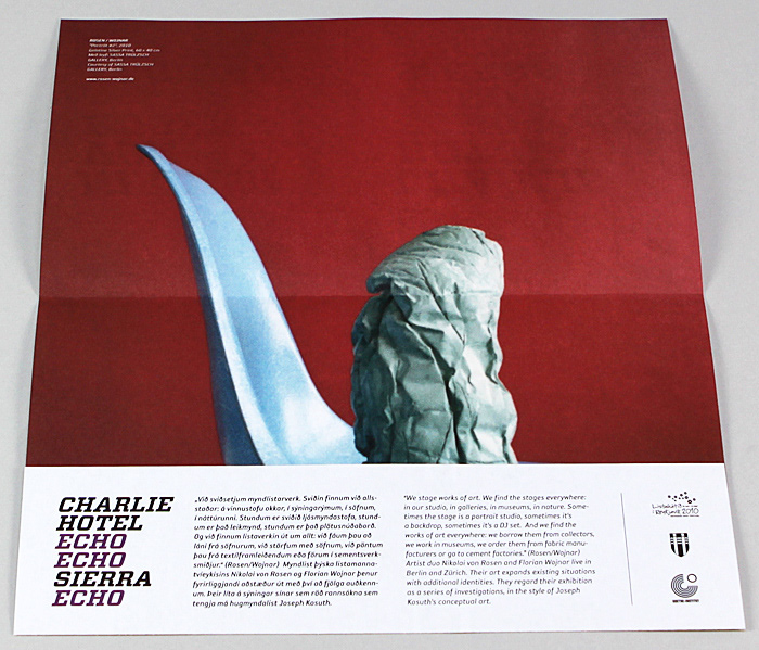
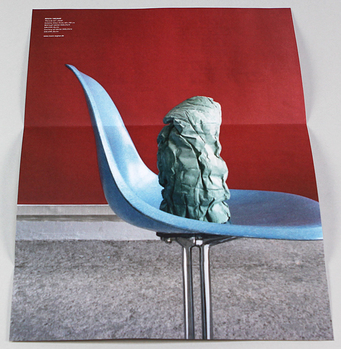
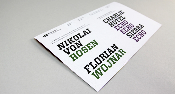
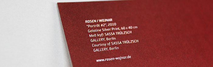
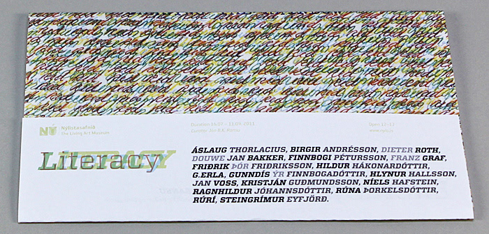
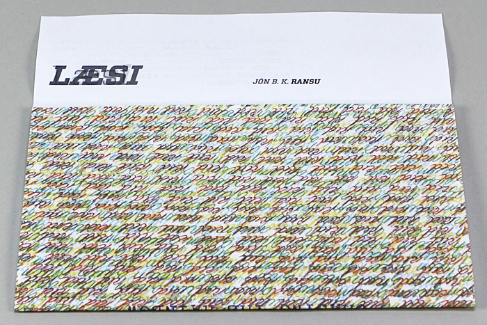
We took these four things into the branding. Diversity is in the color use. When the museum is not advertising a art show or a event it´s black and white but when it advertising a show or an event there are no color restricions. The designer is free to play at will. The play fullness is in folding. every printed object from the museum. Everything from the letterhead being folded into an envelope, the business card is made of four business card that can be used in different ways just by the way it´s folded. Invites every where from A4 to A0 have to be folded in one way or another. Because of minimal funding we decided to print on the cheapest paper possible every time and make the museum make most of it´s printed material self. So when they need to print a business card the can do it by themselves. The museum also tries to go it´s own ways in making sings. F.e. paint the logo on their building and making the signs they can by themselves. The museum collection is going to be used on printed material such as letterheads, business cards, envolopes and more. This is to intourduse the artwork in a easy way.
After this first step we looked at what is the core of the museum. Our conclusion was diversity, play full, small funding and a nice collection of art work the museum owns. The museum collection is not shown much so we decided to make it more visual.
We took these four things into the branding. Diversity is in the color use. When the museum is not advertising a art show or a event it´s black and white but when it advertising a show or an event there are no color restricions. The designer is free to play at will. The play fullness is in folding. every printed object from the museum. Everything from the letterhead being folded into an envelope, the business card is made of four business card that can be used in different ways just by the way it´s folded. Invites every where from A4 to A0 have to be folded in one way or another. Because of minimal funding we decided to print on the cheapest paper possible every time and make the museum make most of it´s printed material self. So when they need to print a business card the can do it by themselves. The museum also tries to go it´s own ways in making sings. F.e. paint the logo on their building and making the signs they can by themselves. The museum collection is going to be used on printed material such as letterheads, business cards, envolopes and more. This is to intourduse the artwork in a easy way.