-
In early 2012 we found opportunity to refresh our web video player for Netflix.com.
Our objectives were to:
+ Maintain current functionality
+ Increase overall usability
+ Overhaul the visual aesthetic
+ Allow for touch input
+ Improve scalability
+ Eliminate legacy code where possible
Original Netflix.com Video Player UI - circa 2012
This was the original Netflix.com video player. It worked well enough, but suffered from many interaction issues: small hit zones, no touch support, and no way of switching episodes without exiting playback, just to name a few. It wasn't visually appealing either.
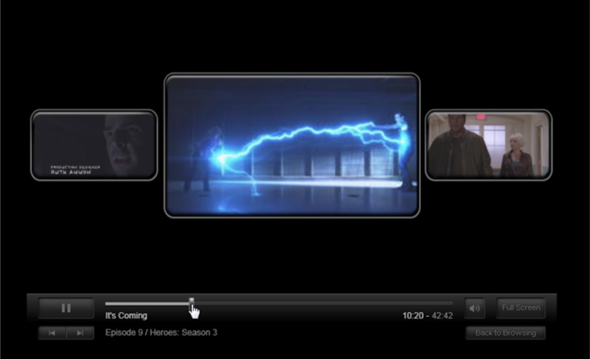
Design Explorations
During the design exploration stage we ran through many different directions for how a new player UI would work. As a design team we always start off pushing the boundaries as far as possible and then scale back as we get rid of bad ideas and identify good ones.

Early concept exploring container-less controls and a circular scrub-bar

A more traditional player UI exploration - UI elements affixed to top/bottom and slide in when needed
Early Concept with translucent floating control set

Early exploration of controls that float and are really simplified

Early concept using larger hit areas

Early exploration of floating controls with a strong separation between primary and secondary controls
After many variations we honed in on a final direction - a “floating UI”. The idea was to have a UI that tries it's best to not compete with the content , to the point where it almost feels to be a part of it. The image below represents the first step in locking down that direction.

Final Design
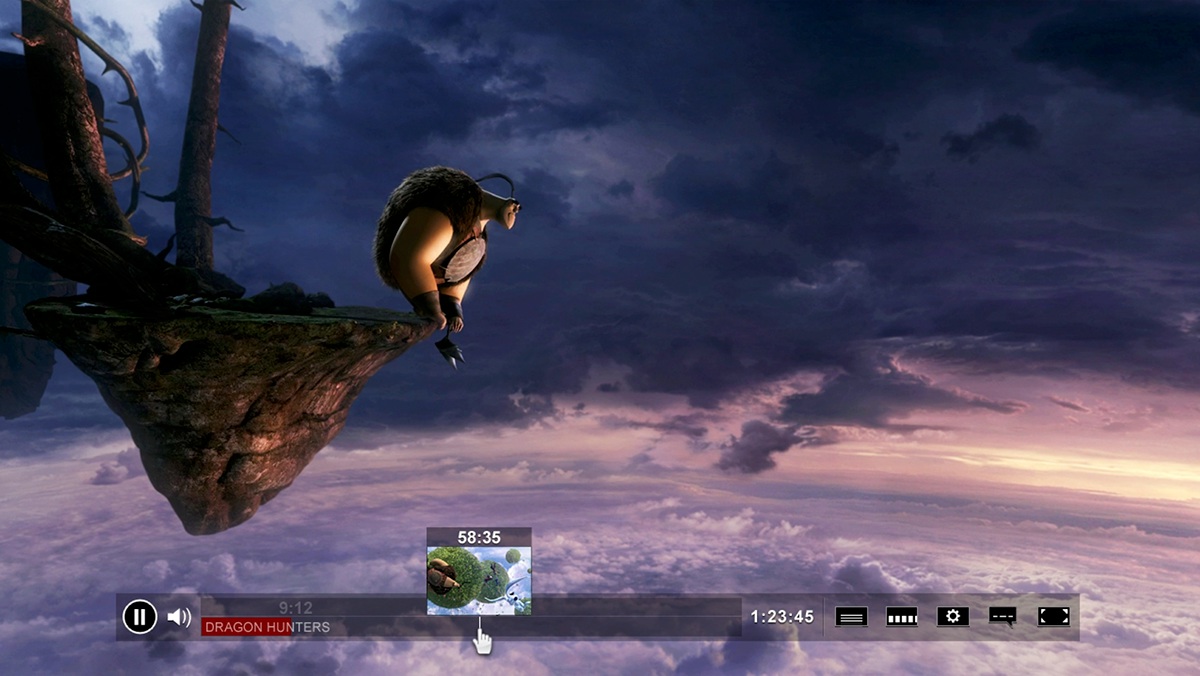
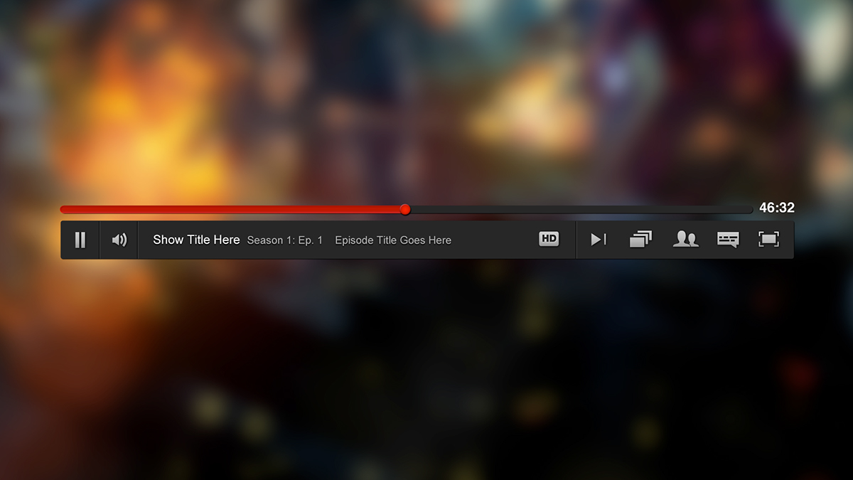
After simplifying the visuals and perfecting the interactions, we ended up with our final design.
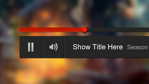
Detail - Left side of main player controls

Detail - Right side of main player controls
Final Design - Video Walkthrough
Final Design - Details

A view of our flyout menu system - upon interacting with a control that has multiple options (i.e. an episode selector) the scrubber bar pushes down behind the main control bar to make way for the flyout menu.)

Next Episode Flyout Menu
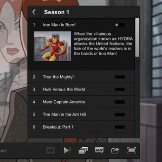
Episode chooser flyout menu interaction

Scrub bar nub + trickplay interaction (with snapback)
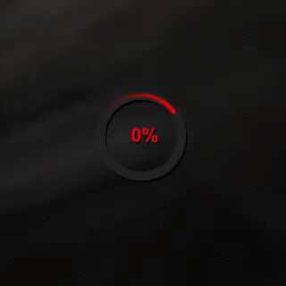
The redesigned loader
Translating the new design to our HTML5 Player
After release of the new UI (originally created for the silverlight browser plugin), it proved to be an effective player UI, so much so we were able to reuse it for our new HTML5 player experience. You can read about it here on our Tech Blog!
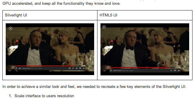
Our Netflix Tech Blog goes over the process of translating the new palyer UI to HTML5
