


Nautilus | Tavern
Nautilus is a cozy beach tavern, located in the bay of Garitsa, in Kerkyra town.
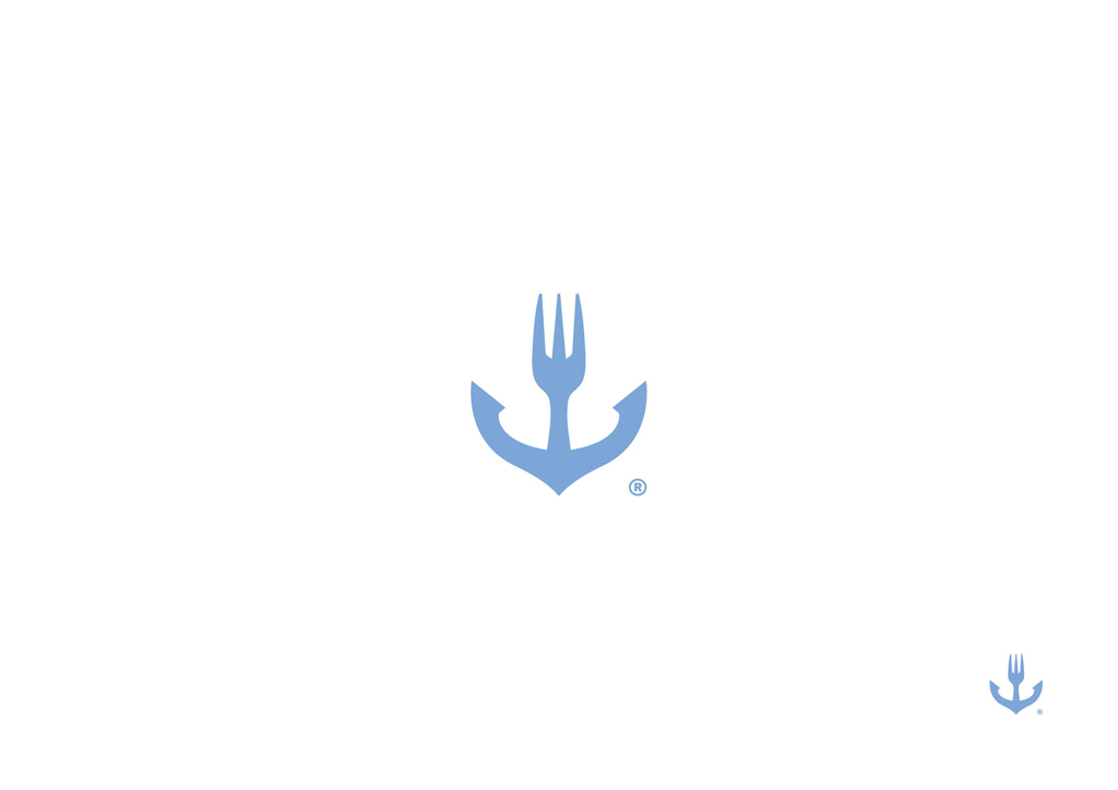
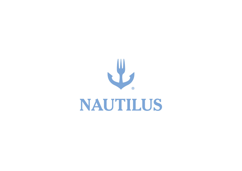
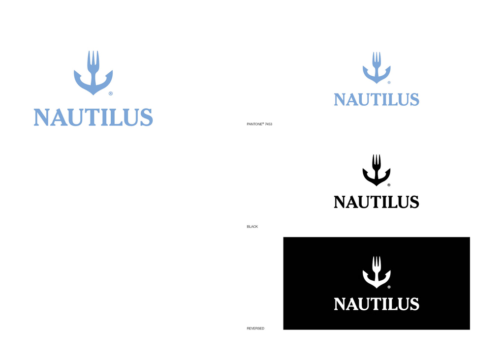
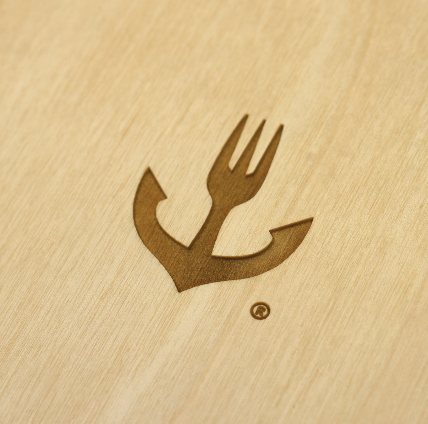
The anchor shank in the logo, takes the form of a three tine fork-such asthe ones used for tidbits-hence indicating what this company is about- food andmore specifically Greek style tapas (meze).
The anchor is a symbol inextricably linked with the sea, and the restaurantin question, due to its privileged, unique location, has a distinct sea aura. Furthermore the anchor is associated with stability and “binding”. Metaphorically speaking, these are concepts Nautilus relates to, since it aimsto become a favorite haunt with regular customers.
The logo is designed in such a manner so as to be totally symmetrical, hence suggesting that the company is consistent and trustworthy.
The name is written in Serif font, which is timeless, clear and sturdy, whilea gentle shade of blue was chosen, in order to represent the sea, calmness andserenity.

To Nautilus είναι ένα μεζεδοπωλείο, το οποίο βρίσκετε σε ένα φιλόξενο χώρο δίπλα στο κύμα, στη μύτη του όρμου της Γαρίτσας, στην πόλη της Κέρκυρας.
Στο σύμβολο του λογοτύπου, η άτρακτος της άγκυρας παίρνει το σχήμα πιρουνιού με τρία δόντια-όπως αυτά που χρησιμοποιούνται για τα ορεκτικά- ώστενα παραπέμπει στο αντικείμενο της επιχείρησης: το φαγητό και πιο συγκεκριμένα τους μεζέδες.
Η άγκυρα είναι ένα σύμβολο άρρηκτα συνδεμένο με τη θάλασσα-και τοσυγκεκριμένο μεζεδοπωλείο, λόγω της ξεχωριστής, προνομιακής του τοποθεσίας, έχει έντονα θαλασσινή αύρα. Ταυτόχρονα η άγκυρα παραπέμπει στην σταθερότητα και το «δέσιμο», έννοιες με τις οποίες το Nautilus ταυτίζεται, καθώςφιλοδοξεί να εξελιχθεί σε αγαπημένο στέκι.
Το λογότυπο είναι σχεδιασμένο κεντροαξονικά, ώστε το σύμβολο να είναιαπόλυτα συμμετρικό, αντικατοπτρίζοντας τη καθαρότητα και τη συνέπεια της επιχείρησης.
Για τη γραφή του ονόματος έχει επιλεχθεί Serif γραμματοσειρά, η οποία είναι διαχρονική, με καθαρό και στιβαρό χαρακτήρα, ενώ χρησιμοποιείτε μια ήπια απόχρωση του μπλε, που παραπέμπει στην θάλασσα, στην ηρεμία και τη γαλήνη.
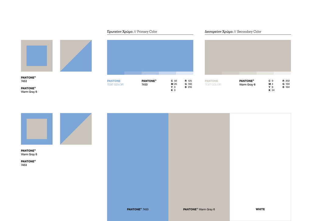
Color Palette
Symbol

Typeface
Logotype

Pattern

Illustration // Squid

Illustration // Octapus

Sous Verres


Sous Plate


CLIENT Christos & Tasos Manesis
CONCEPT & DESIGN Chris Trivizas
ILLUSTRATOR Lila Maria Karydi
EDITOR Sissy Caravia
CONCEPT & DESIGN Chris Trivizas
ILLUSTRATOR Lila Maria Karydi
EDITOR Sissy Caravia
TYPEFACE Parachute® Typefoundry
PHOTOGRAPHY Michalis Kloukinas
©2012
PHOTOGRAPHY Michalis Kloukinas
©2012


