
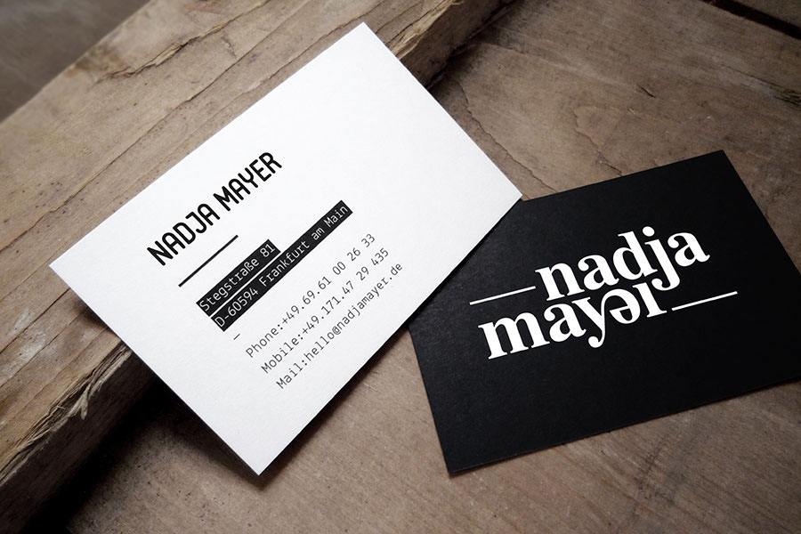
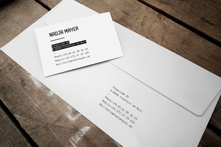
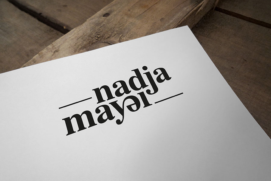
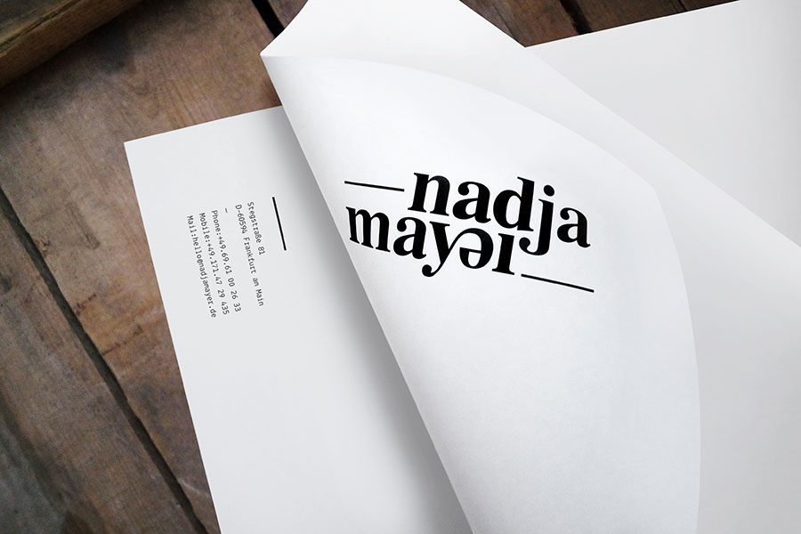
Corporate design for Nadja Mayer. She is a German copywriter, author, creative director and name developer. She wanted a stunning, cool and surprising identity – elegant and modern at the same time. The difficulty was to find something that fitted to all her different professions without mentioning one of them. So it had to be all in the typography. The hyphen and the underscore together with the name tell the whole story of the writing process: you start thinking, you work and your work continues. The twist of the letter »e« is not only a gag but a winking reference: Being left-handed she sometimes sees things mirror-inverted, especially when she is tired.
—
»One day I stumpled upon a blog where some of Miklos’ design was featured. I immediately fell in love with it because his work is so beautiful and intelligent at the same time«, said Nadja Mayer. »Working with Miklos was such a great experience. I am impressed how deep he dives into typography and gets out the most of it. The design he created for me was far beyond what I expected.«


Join me on facebook ------› www.facebook.com/kissmiklosdotcom
...if you get a chance.
—
Thank you very much!
...if you get a chance.
—
Thank you very much!


