


NIUCO is an italian company which deals with corporate restructuring and turnaround management. It creates value to those companies that waste it. NIUCO helps to overcome the discontinuity of the context in which they are located or internal problems by working with them. It applies structured approaches typical of the blue chip companies to SMEs, small and medium enterprises, so a hybrid system.
VISION
Niuco believes that all companies are like men: they have untapped potential. Businesses in difficulty are not an exception, indeed, because of the effects of results or context, they tend to depress still more their potentials.
Niuco believes that all companies are like men: they have untapped potential. Businesses in difficulty are not an exception, indeed, because of the effects of results or context, they tend to depress still more their potentials.
MISSION
Niuco tries to pull out the 100% of the potential of those SMEs that are are going through moments of discontinuity or crisis with a model that fits the context: through consulting or by the injection of human and financial capital.
Niuco tries to pull out the 100% of the potential of those SMEs that are are going through moments of discontinuity or crisis with a model that fits the context: through consulting or by the injection of human and financial capital.
VALUE
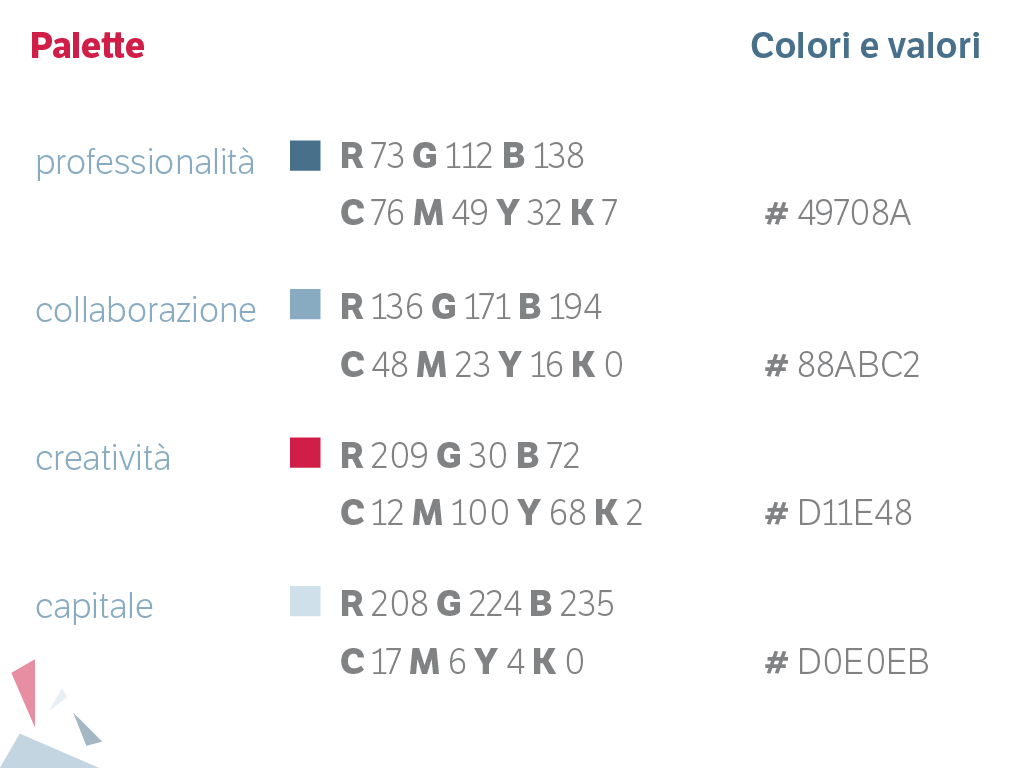
Professionalism. Collaboration. Creativity. Capital.
Professionalism. Collaboration. Creativity. Capital.
I created the brand image of this company starting from an initial research related to the world of corporate restructuring and turnaround management and then reflecting on the values on which it was based.
Abstract values conjugated to a type of hybrid work that target the "creation" of a new company restructured.
Hence the idea to summarize these concepts in a triangle, divided into four parts, each representing a value.
The font is described as follows
Etica, the-moralist-typefamily-project, was born at the end of 2000, but its development is ongoing, overcoming many hurdles and diversions. On one hand, the original idea was spurred by a certain esteem for Helvetica, in particular, its strength and versatility, and on the other, an intolerance to its plenty but inadequate applications; created by those who erroneously consider it to be a neutral and timeless design. We believe that Helvetica is a beautiful typeface, but very deeply rooted in its own era. It is often unsuitably used in contexts that have changed profoundly since its birth.
NIUCO è un'azienda che si occupa di ristrutturazione aziendale e turnaround management. Crea valore da quelle aziende che lo distruggono. Li aiuta a superare le discontinuità del contesto in cui si trovano o problemi interni lavorando insieme a loro. Applica approcci strutturati tipici delle aziende blue chip alle PMI, piccole medie imprese, quindi un sistema ibrido.
VISION
Niuco ritiene che tutte le aziende siano come gli uomini: hanno potenzialità inespresse. Le aziende in difficoltà non sono un’eccezione, anzi per effetto dei risultati o del contesto tendono a deprimere ancora di più le proprie potenzialità.
MISSION
Niuco si impegna ad estrarre il 100% delle potenzialità nelle PMI che stanno attraversando momenti di discontinuità o di crisi con un modello che si adatta al contesto: dalla consulenza all’iniezione di capitale umano e/o finanziario
Niuco si impegna ad estrarre il 100% delle potenzialità nelle PMI che stanno attraversando momenti di discontinuità o di crisi con un modello che si adatta al contesto: dalla consulenza all’iniezione di capitale umano e/o finanziario
VALORI
Professionalità. Collaborazione. Creatività. Capitale.
Ho creato l'immagine coordindata di questa azienda partendo da una ricerca iniziale legata al mondo della ristrutturazione aziendale e turnaround managment e poi riflettendo sui valori su cui si basava.
Valori astratti coniugati a un tipo di lavoro ibrido che hanno come obiettivo la "creazione" di una nuova azienda ristrutturata.
Da qui l'idea di riassumere questi concetti in un triangolo, diviso in quattro parti, rappresentanti ciascuno un valore.


Per quanto riguarda la font si è deciso di scegliere LFT ETICA realizzata da Leftloft, studio milanese.
La font è così descritta
Etica, the-moralist-typefamily-project, was born at the end of 2000, but its development is ongoing, overcoming many hurdles and diversions. On one hand, the original idea was spurred by a certain esteem for Helvetica, in particular, its strength and versatility, and on the other, an intolerance to its plenty but inadequate applications; created by those who erroneously consider it to be a neutral and timeless design. We believe that Helvetica is a beautiful typeface, but very deeply rooted in its own era. It is often unsuitably used in contexts that have changed profoundly since its birth.

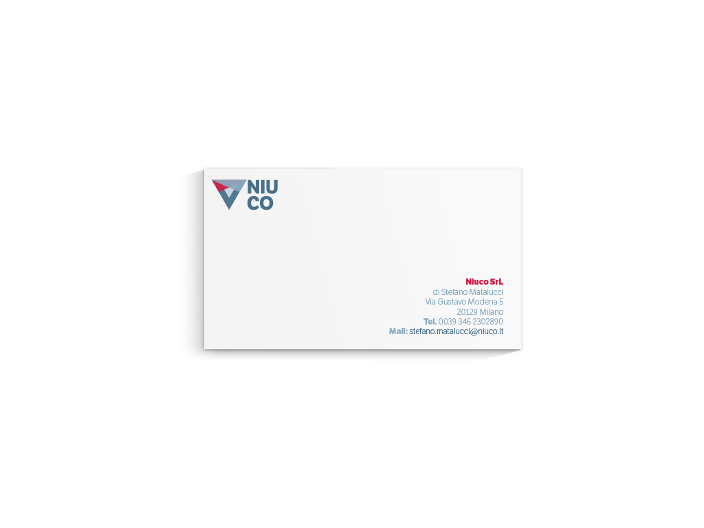
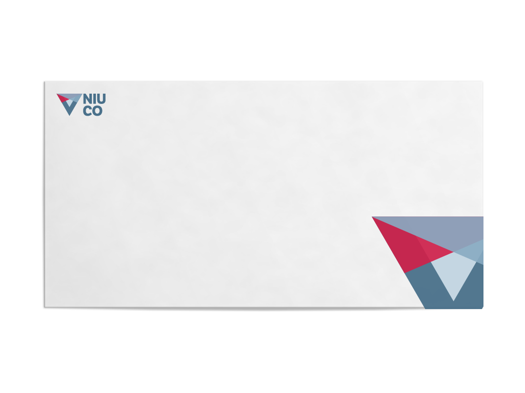
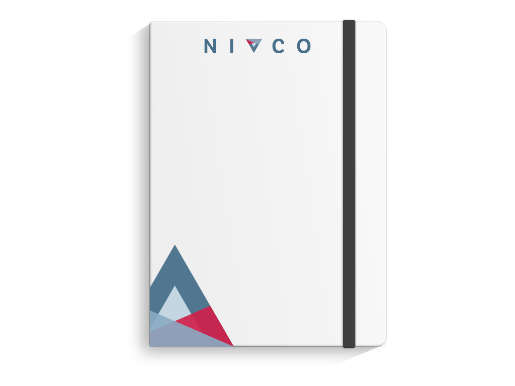
Di seguito la declinazione del logo su biglietti da visita, carta intestata e altri supporti.


Credits to Santiago Moreno for placement template.


