Murmansk: development of the city brand.
A unique city deserves unique branding! Murmansk is the largest settlement in the world located beyond the Arctic circle. It is the last city founded by Russian Emperor Nicholas II. This city defended the Northern borders of our country during the World War II. From this city all Arctic expeditions started, both Soviet and modern. Murmansk combines natural features like Northern lights, polar day and polar night with industrial rhythm of the port and the Northern fleet of the Russian Navy. Our Agency was entrusted to develop the brand for this city. The project turned out to be truly holistic and integrated, largely thanks to the support from the Administration and from the city community. For the city environment we developed a large set of souvenirs, a brand book, outdoor advertising and prints, formed principles of typography and the logo usage guideline.
The Committee for economic development from the city Administration turned to Stas Marketing group and to our Agency to jointly develop the city brand – a tool that will contribute to social and economic development of Murmansk, will help attract investments, increase migration flow, develop tourism and improve demographic landscape. As the first step we carried out a large-scale analysis, which discovered several hypotheses for the main brand idea. Among them were both traditional and innovative ideas, but the winner reflects the role of Murmansk in the current geopolitics of Russia in the Arctic region: "Murmansk is a Russian outpost in the Arctic." Basing on Murmansk brand platform our Agency developed a visual identity for the polar city

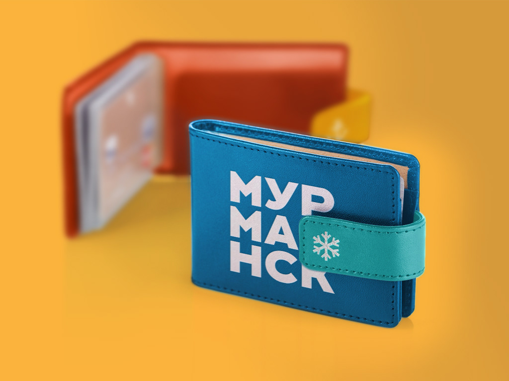
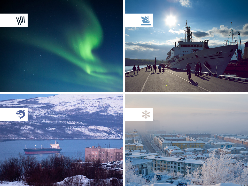
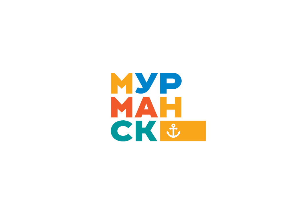
The letters of the logo are pressed closely against each other and make up the word “Murmansk”. The missing square cell is occupied by a brick icon. Dense brickwork, colour containers in the port, people standing shoulder to shoulder – these are the main images associated with the new logo. Murmansk's brand colours were suggested by the city itself – unusually warm and light shade of green, sunny yellow, blue (the colour of sea and sky), pinkish shade of red – the colour of fish. The set of icons includes the building of the city Administration, landmarks (nuclear powered icebreaker Lenin, the monument of Alyosha, the Circus), sport icons, transport, cultural objects, natural phenomena (Northern lights), and local cuisine. The typography concept is taken from the logo – bright coloured plates, tightly pressed against each other can be easily used for any communication for the city.

Murmansk brand not only attracts attention of city residents and its guests, but also receives numerous awards! Today Murmansk branding is the most awarded project in the field of branding in Russia. Among the awards you can note the 1st place at the festival of territorial branding OpenFest in Minsk in 2014, the winner's diploma of the contest “Tourist brand – best practices” in 2016 and the 1st place of the National Award in the field of territorial marketing and branding in 2017.