
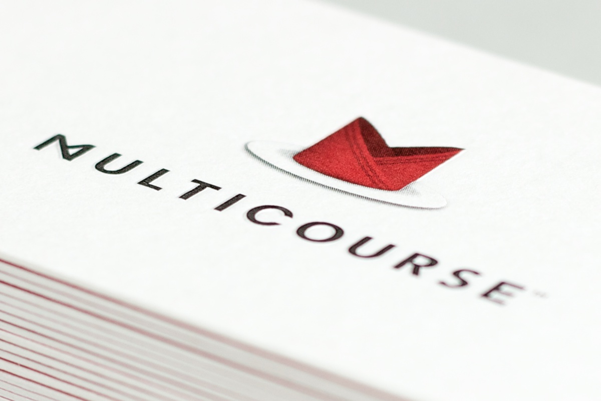
A folded napkin is chosen as the icon for the logo for its obvious representation of a fine restaurant. The way the napkin folds form the letter "M", for Multicourse™. The "M" in the logotype is a stylised napkin.

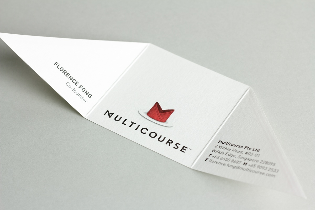
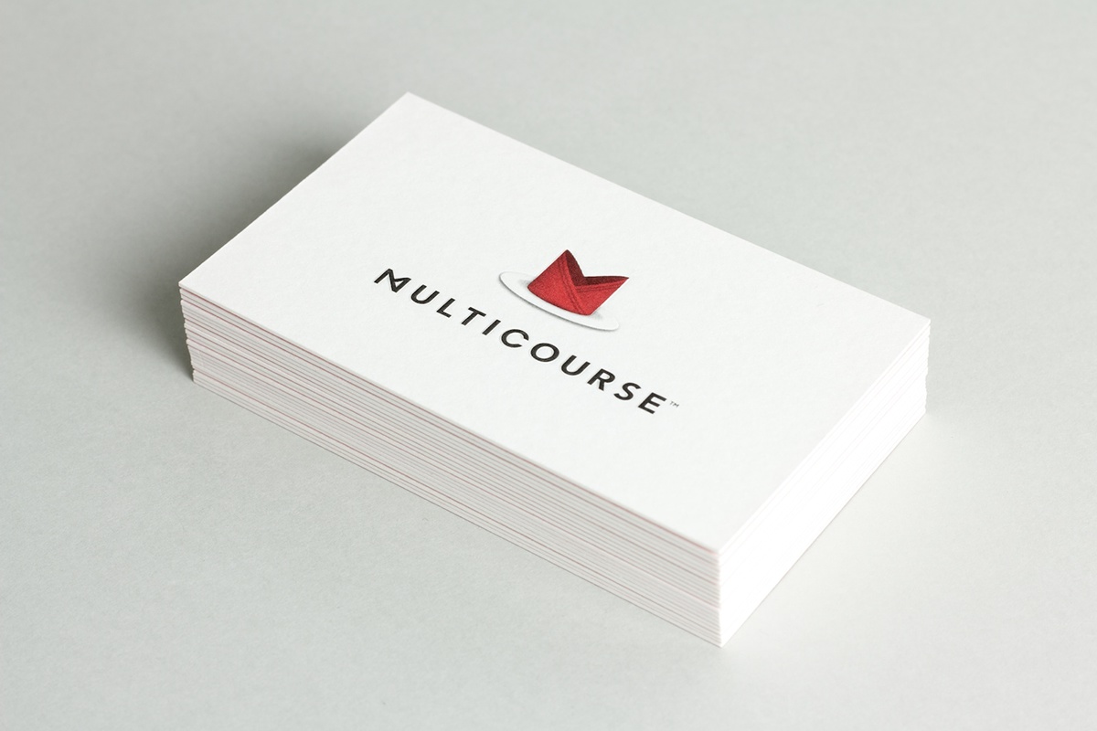


We designed 2 types of business cards for Multicourse™, a typical one for serious business and a fun 'napkin' style for more informal occasions.

The website is designed to provide "good service", like how a good waiter will serve you in a fine restaurant.


