Movicel
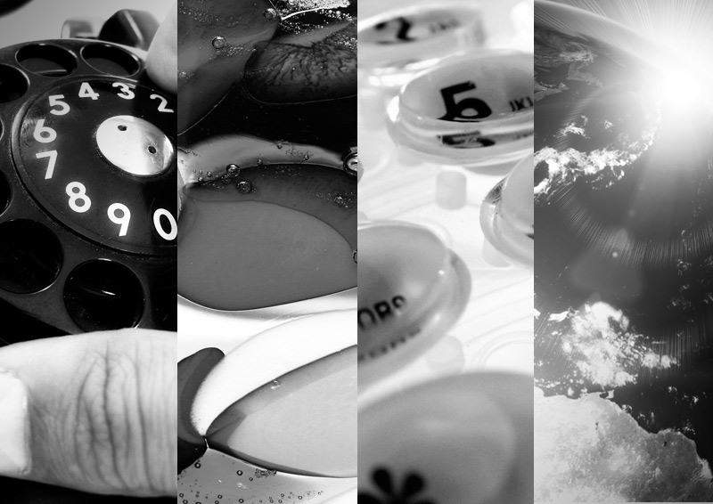
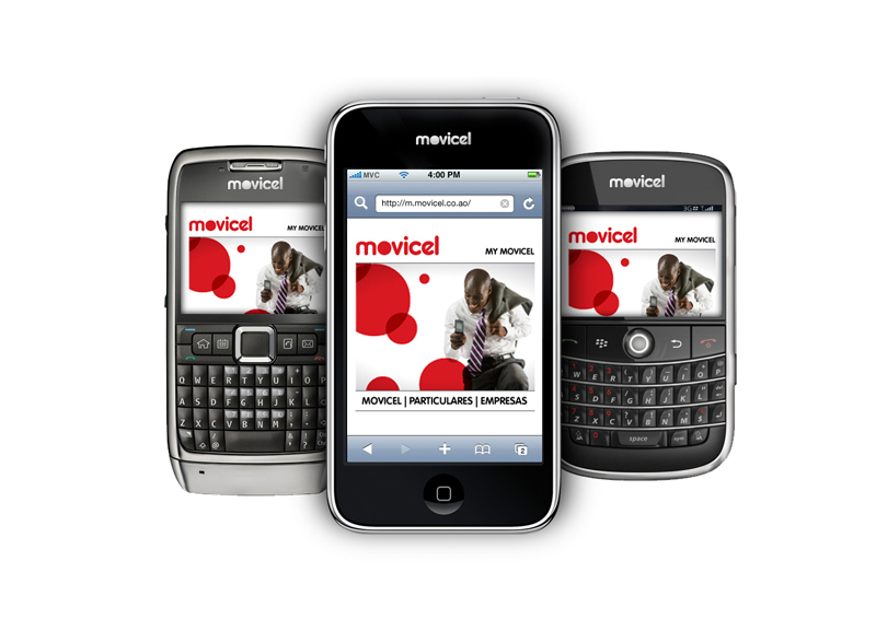
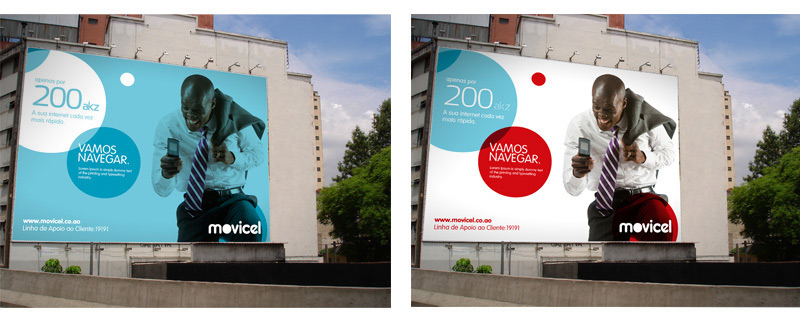
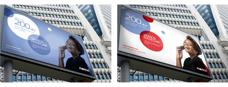
They were looking for a more modern and direct identity to communicate the Movicel present and a way to project it into the future. Formal inspiration in telephone components (technological side) and in the life / universality sense (human side). Use of the same colour as a means of transition from the old to the new logo, but also the colour as synonym of life, strength and entrepreneurship.
Proposal presented on a pitch.


Agency NAD/ | Client Movicel | Art Direction & Design Cláudia Pereira | Creative Direction Nuno Abreu

