
This bottle Re-design was a 3 week project in which we were given then assignment of creating character designs for products. Personally, I wanted to re-create an actual product on the market. After much though I decided to choose a brand that I felt not only matched my personal drawing style, but was a fun and playful product to make. For this reason I chose Mountain Dew bottles.
Conceptually the character is a representation of what we turn into when drinking too much Mountain Dew. The Mountain Dew addict, wanting so drastically to return to his normal skin type, adornes a human mask to fit back in to society.

Final physical bottle label. Photography taken by me.
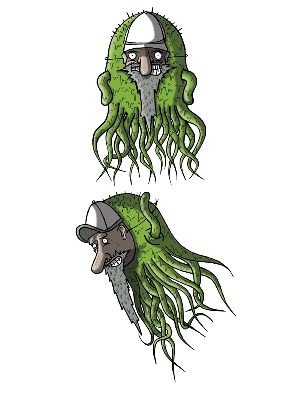
Final Character Illustrations.

Final Bottle Label
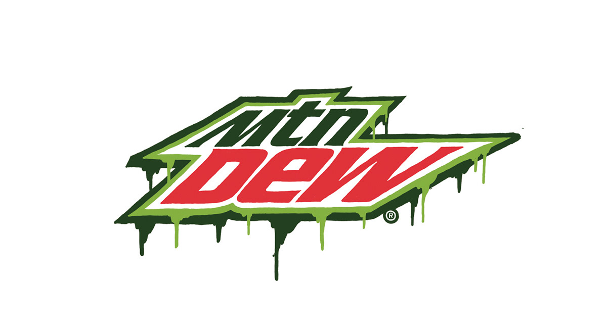
Redrawn Mountain Dew Logo. Done in Photoshop with my Tablet
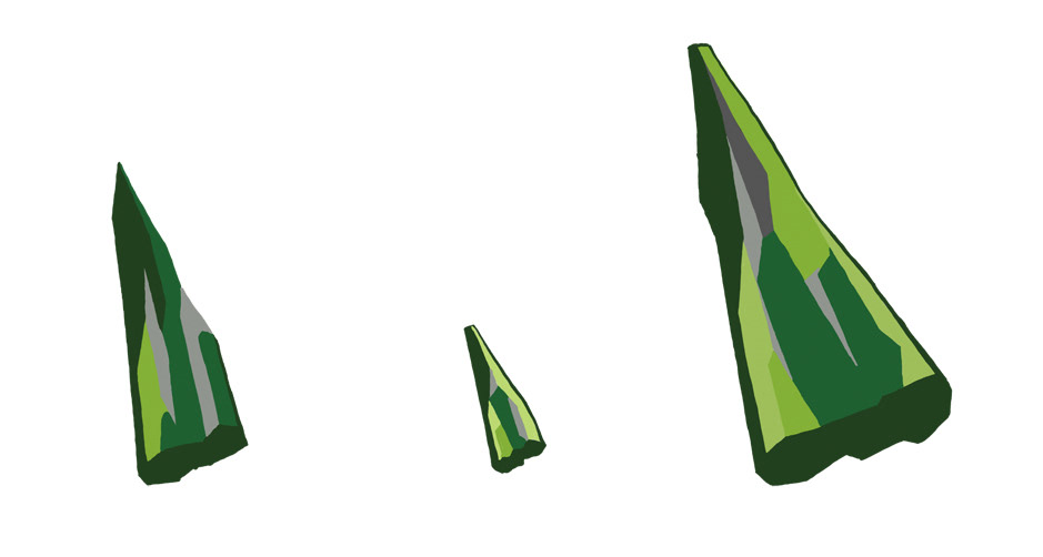
Mountains traced from the branding on the original packaging. I did this in photoshop with a Wacom tablet.
Conception & Process
I went through quite a drastic series of character illustrations to come to my final product. These are a few of my process shots

These are beginning character concepts. Each of the 10 characters have 2 different illustrations each.
A mid stage illustration of my character. I decided to shorten both the arm and body length for both size and style benefits.

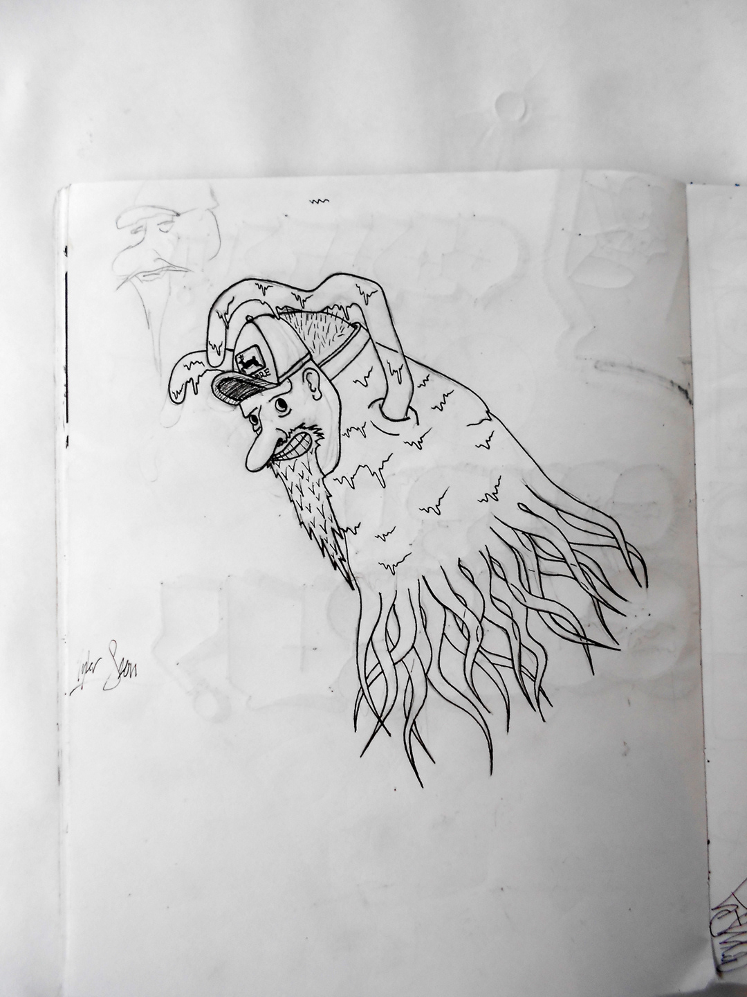
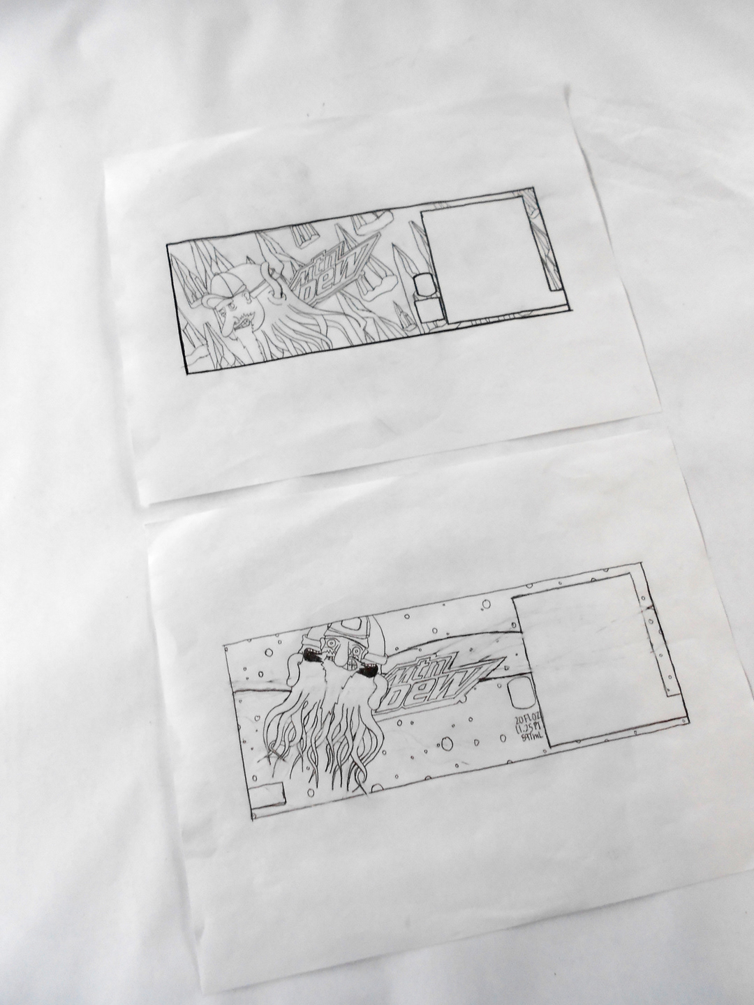
The final ink drawings for my two part character illustration.
Bottle label concepts.


