Mir Skincare
We designed the original Mir range back in 2000 as a no nonsense natural skin care range sold exclusively on the internet. In 2010 we were asked to review the brand and packaging as a retail range.
The essential point of difference between Mir and other skincare products is its honesty and efficacy, something that is relatively easy to convey on a web site. For the range to work in retail and still appeal to its loyal internet customer base we had to keep the simple qualities of the original but make the packaging much more visible, desirable and tactile.
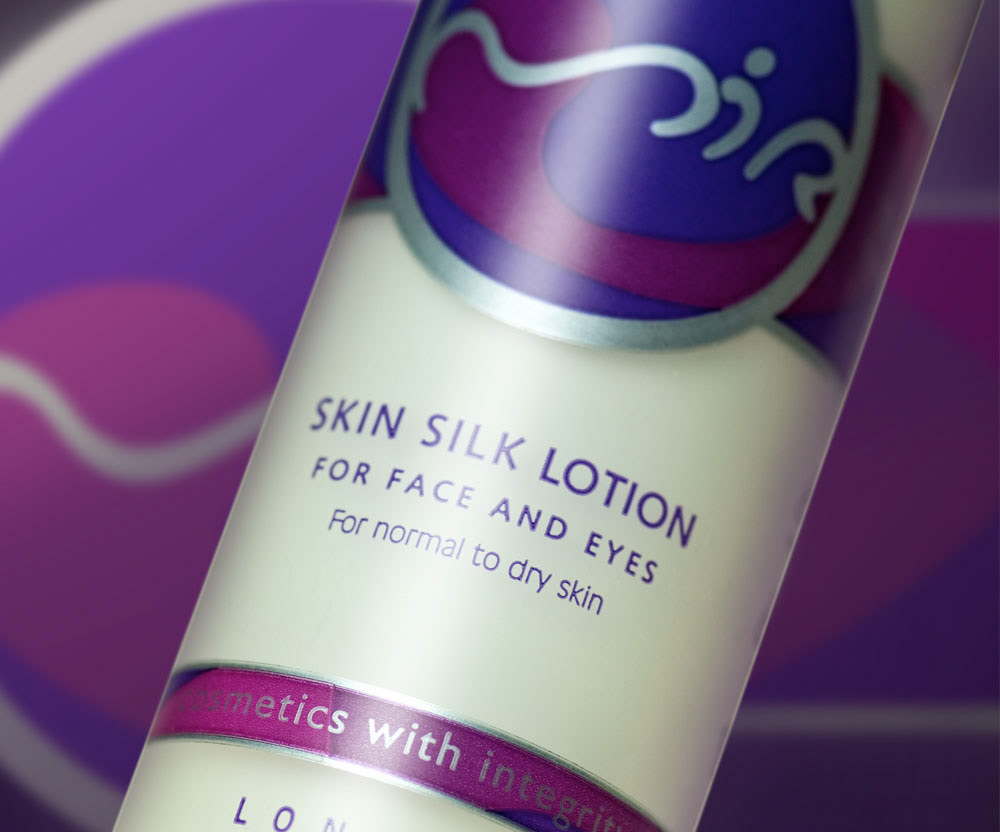
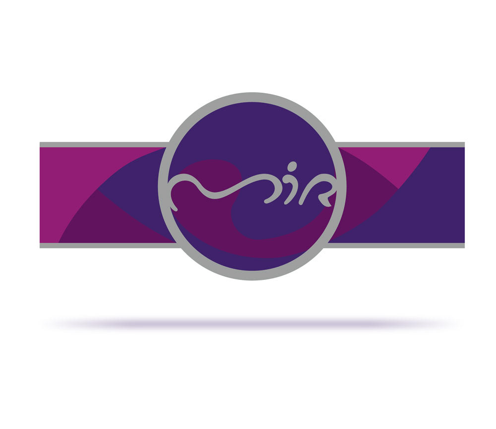
The mir letterforms were originally drawn to suggest the human form in free movement and rest. The challenge with the redesign was to keep the hand drawn qualities whilst strengthening it graphically.
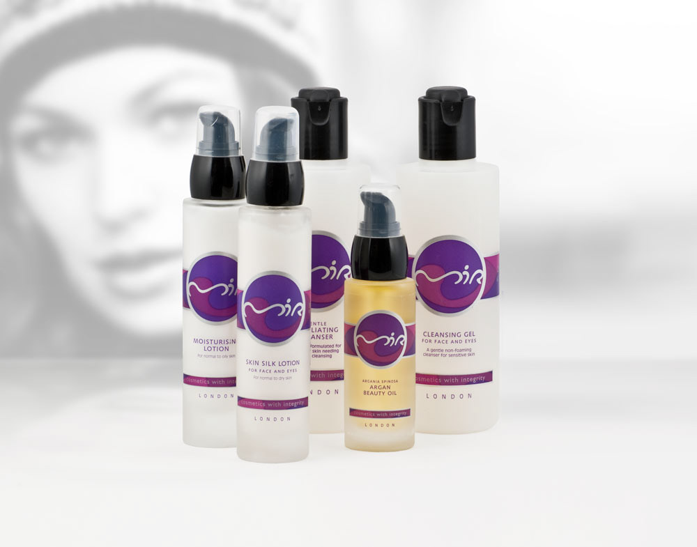
Glass and plastic bottles were carefully matched to make the range. An important criteria was the use of common neck threads so that one size pump would work on all glass bottles and one size on all plastic bottles.
Graphics are printed onto a transparent substrate that blends with the bottle surface and is virtually invisible. The benefits of this route over on-body printing were two fold: the client had greater flexibility with stock holding and secondly, the design could exploit the finer registration possible with flexo/letterpress labels.

