Mina
A typeface for newspapers
I have developed this text typeface as the practical project duringmy studies for the MA in Typeface Design at the University of Reading,UK.
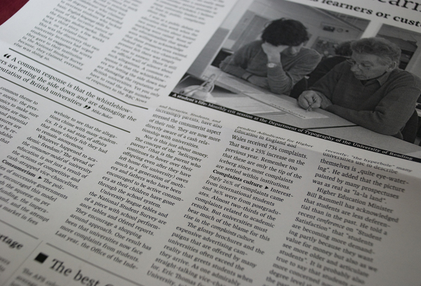
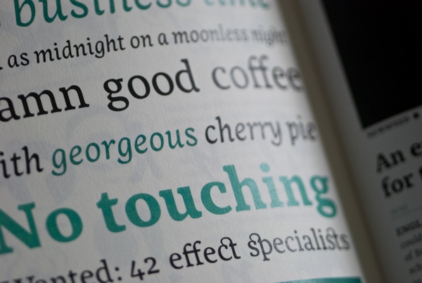
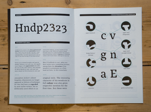
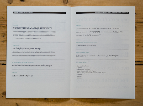
Mina is a contemporary newspaper typeface with a sturdy and organiccharacter. Robustness and strength help make Mina be a work horse. Itsstrong colour in text is ideally suited to high-speed printingconditions. A low stroke contrast gives the old style typeface almostthe appearance of a slab serif. The serifs' styles are calligraphic andasymmetric, as well as well-defined. Though heavy in weight, theseserifs give the letterforms a lively character. This feature allowsMina to be the perfect partner for magazine typesetting. Mina is verylegible in small text sizes and easy to read in long texts. Thetypeface is economic -- its x-height is large, the capitals are low inheight and its decenders are short. Mina's Latin extended character setfor the Regular, Italic and Bold -- as well as the Telugu version -- arestill in progress.
Submission 06/2008
Mina pdf specimen download


