

Mike Kelley Photography: Logo & Business Cards
January 2010
January 2010
Mike Kelley needed a unique mark to brand his photography business. This gallery documents my process in developing his logo and business card.

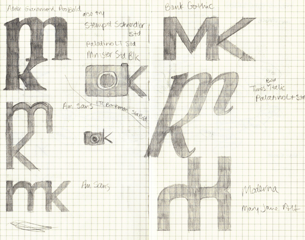

After sketching, I went into Illustrator and started playing with fonts, weights, ligatures, and anything I could. These were the final four concepts. While I still liked the uniqueness of the top-left concept, I believed that the bottom right was most recognizable as a mark and most appropriate to his style and personality. He agreed.

The final logo in all its glory.

In creating his business cards and writing the copy on them, I decided to lean towards a strong, straightforward "voice" to match the stark straightforward logo. Again, this was to help match his personality and style.


