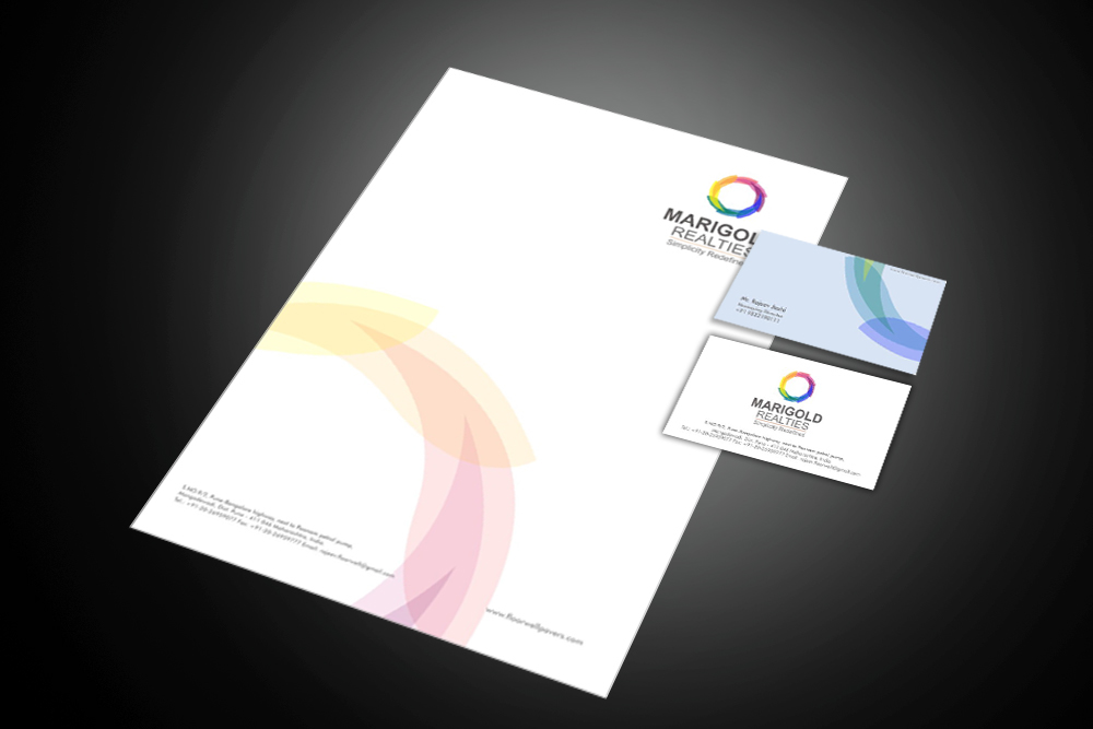
Concept :
The logo concept is inspired by the circle of life. Like a circle of life , it has different shades, every shade is made from a petal of Marigold, inferring that Marigold as a company will be there for all shades of life. Also symbolically saying Marigold completes life.
Another attribute that we have taken is Simplicity, circle and petals, both are simple and pure forms, but together they completely redefines it.
The Tagline - Simplicity Redefined : It very aptly conveys the meaning and attitude of the company.


Concept
The orange circle describes the circle of life full of vibrancy, joy and happiness. Also its symbolic marigold flower The bigger circle symbolizes earth, life, and nature. So a logo that describes life full of vibrancy, joy and happiness amidst nature.
The tag line – Innovative Life Spaces: a fairly direct line that describes the company philosophy.


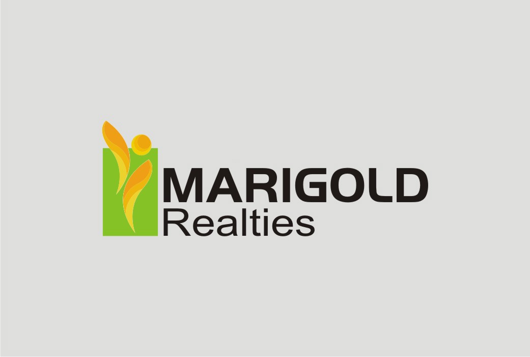
Concept :
The logo is solely based on two attributes simplicity and innovation, the petal of the marigold describes the simplicity, nature, uniqueness and comfort .
Where as the orange dot describes life also, the shape looks like an abstract human figure. The green background is to iterate the natural aspect of the living also to give depth to the whole concept.
The Tagline- Simply Innovative: Aptly describes the above philosophy