Client: March of Dimes - Non-profit
Year: 2012
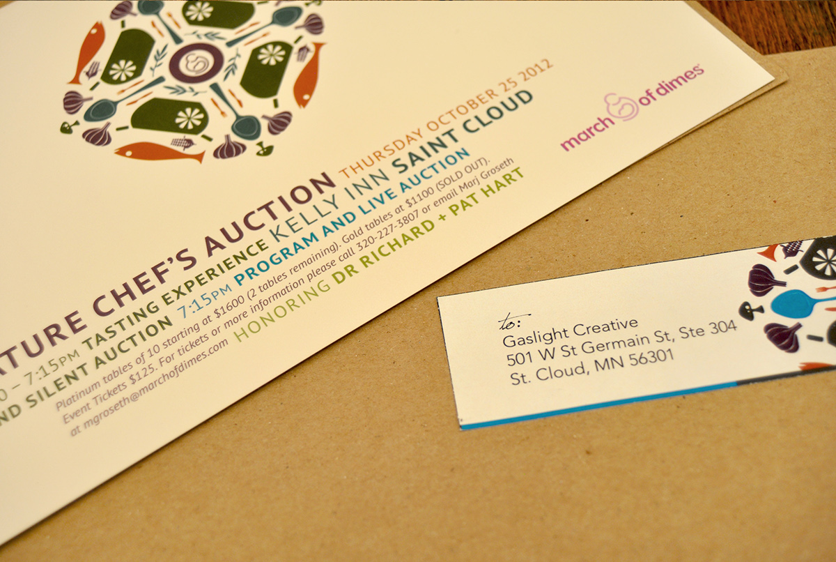
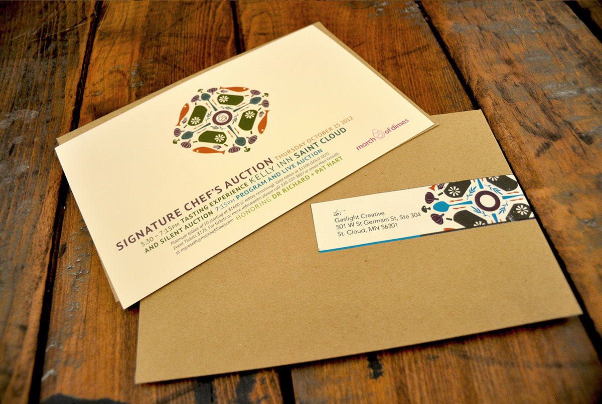
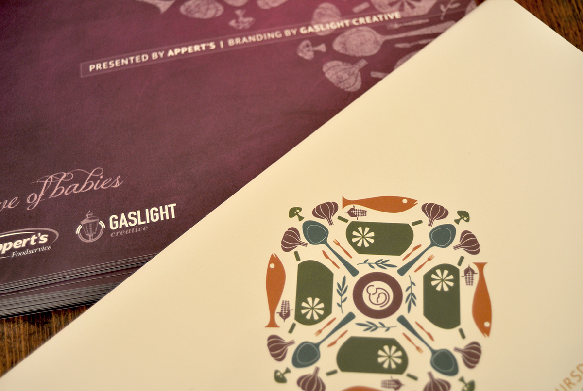
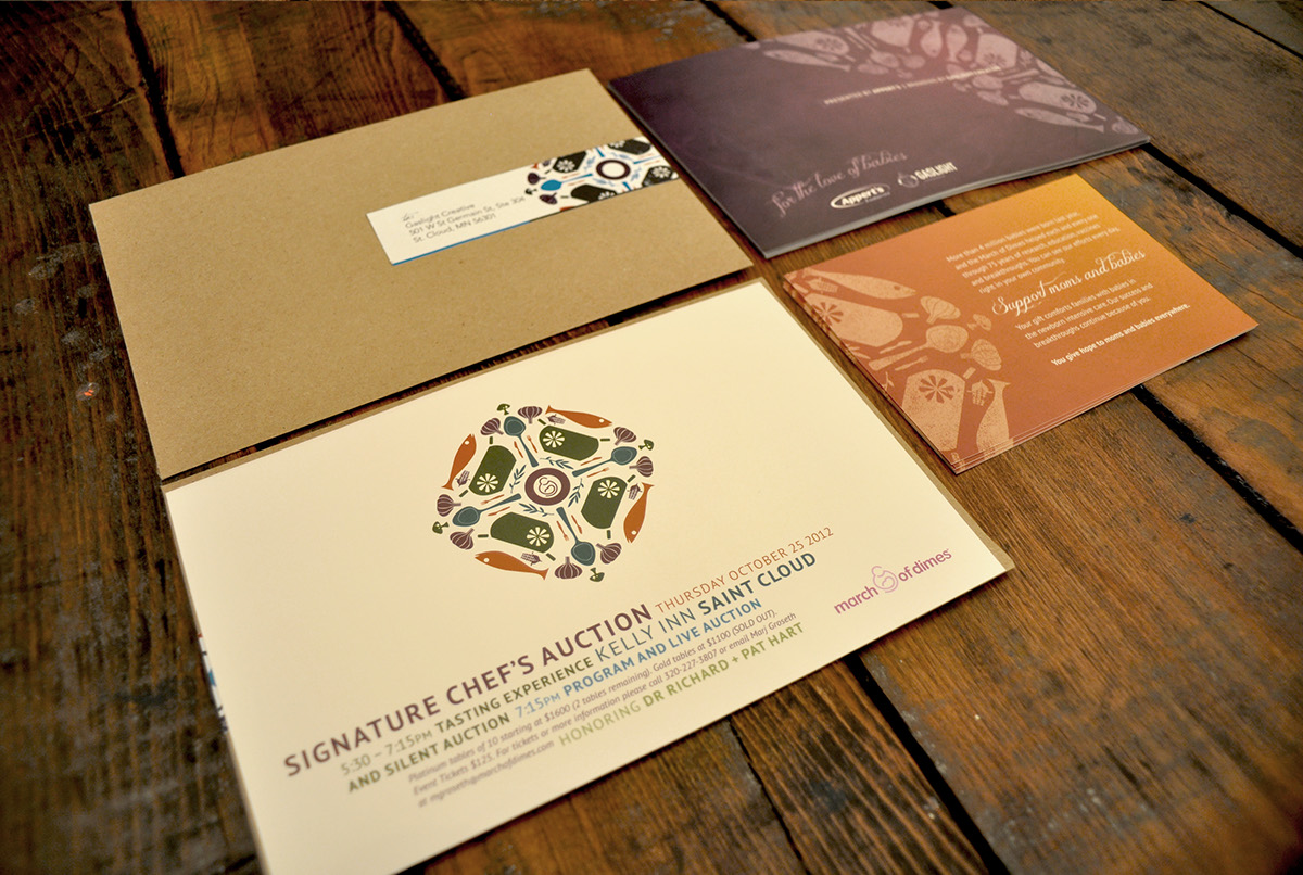
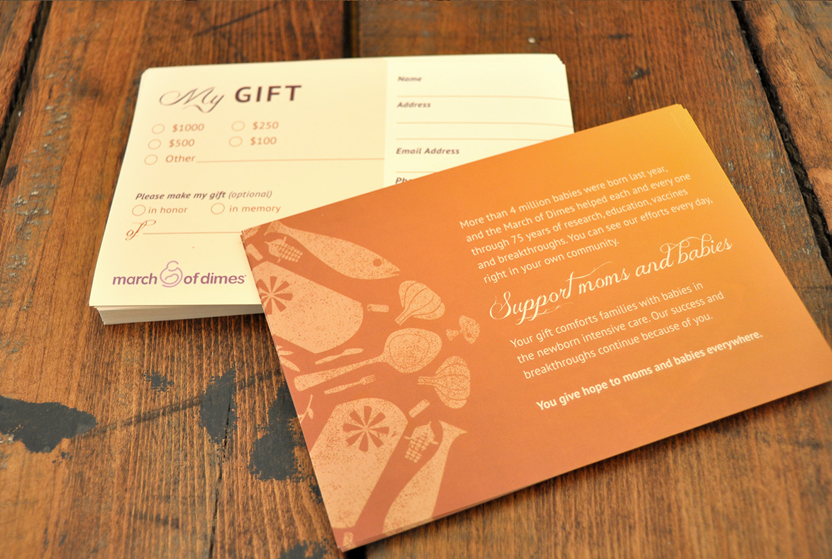
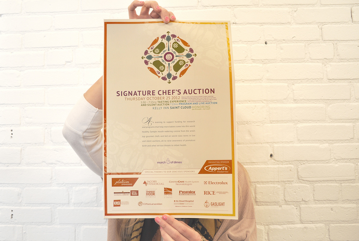
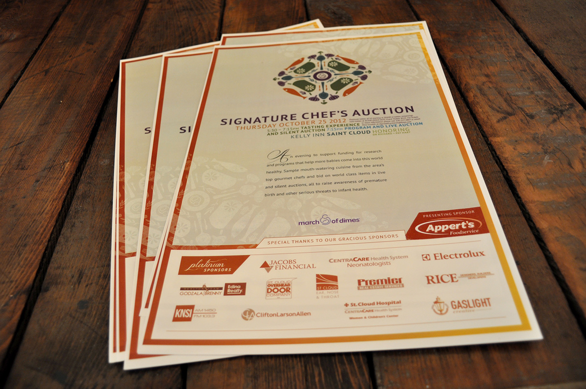
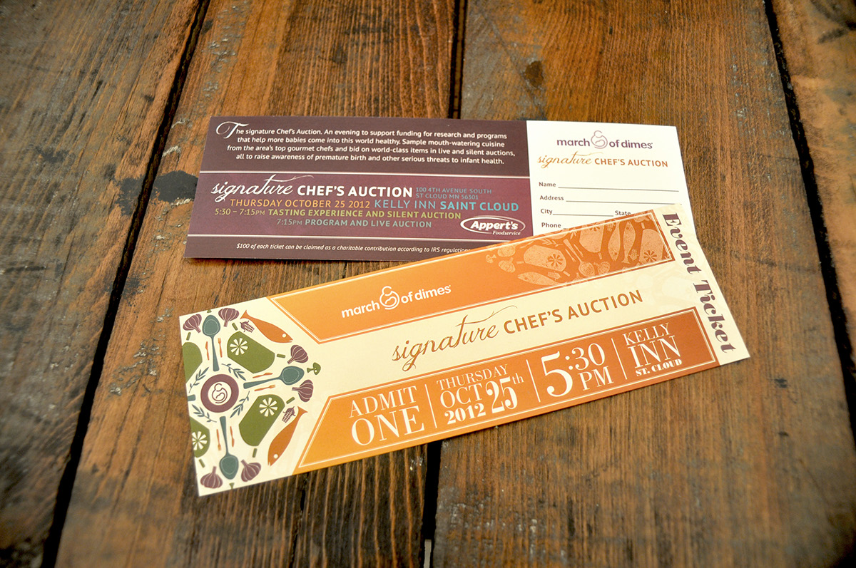
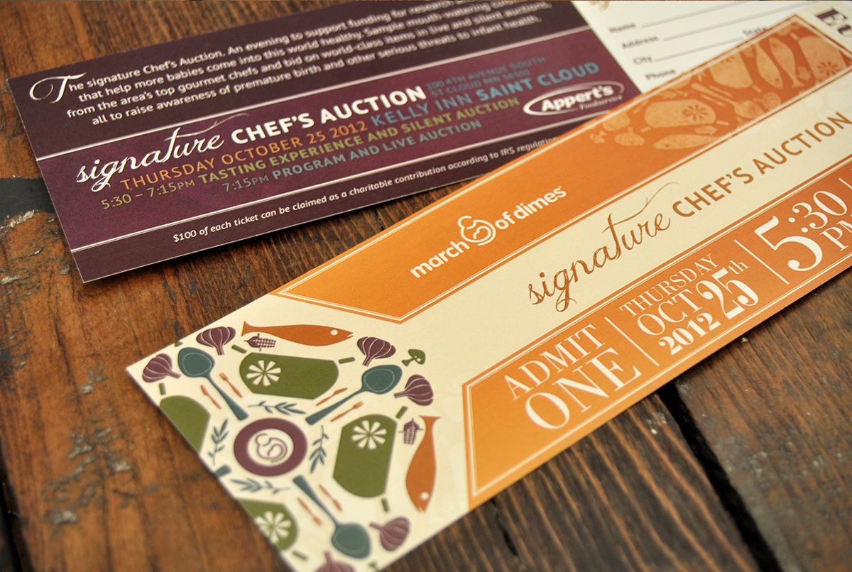
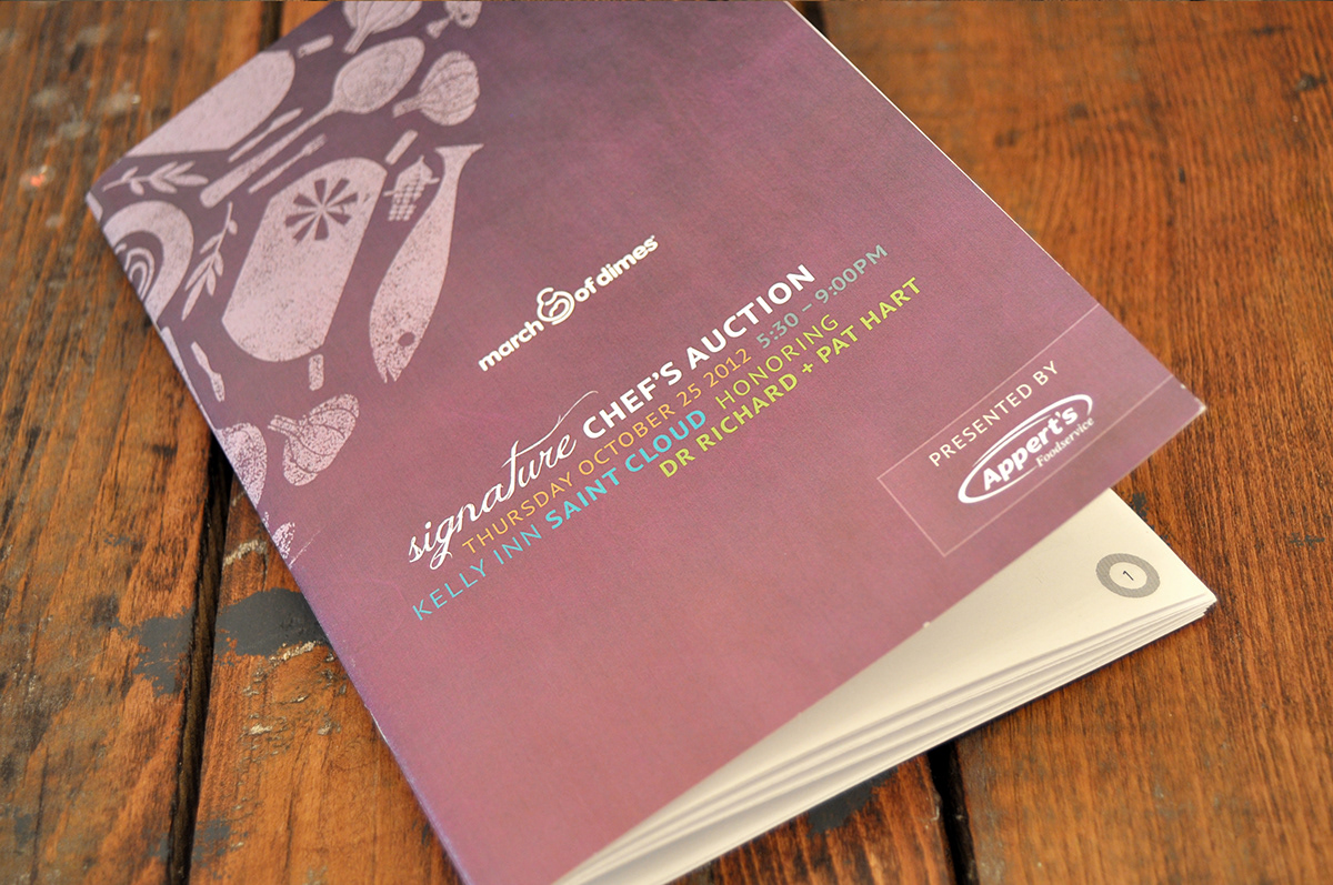
It's for the babies. We put a bit of fun and whimsy into the materials for our for area March of Dimes annual fund-raiser. First up was food-inspired logo exclusively for this gourmet event.
We were inspired by geometric shapes pulled together to create a larger focal point in the center of the program brochure. The shapes in deep, vibrant hues set against a natural background had the effect of sophisticated whimsy befitting this event.
Services: Print