Månefestivalen 2010
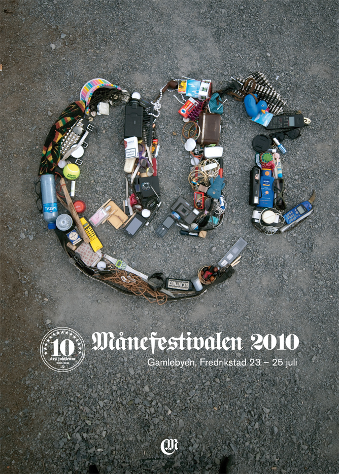
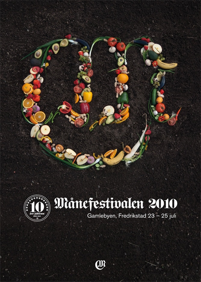
The festival is situated in the oldest part of town in Fredrikstad, Norway. A really nice old town with brick and wooden houses, paving stone in the streets, a lot of old signs and decorations made in iron and a really open and bohemian kind of vibe that gives the festival a special, calm and soothing atmosphere. We took inspiration from the location and the symbol and typeface in the logo is based on the gothic typeface, Proclamate, to give the same feel. The symbol is an M with a half moon around it.
They mainly needed posters, ad's at first and playful identity based on elements you will find in a typical music festival. Their main media is posters and we built the logosymbol out of: One with different instruments and music gear. Another with shoes (in this case Converse All Stars). The third we made with items people have in their bags and pockets during a festival. Because that this was also a big part of the festival ast but not least ecological fruit and vegetalbles.