Project I did for a potential client. See site here
"There is a magic in graphs. The profile of a curve reveals in a flash a whole situation — the life history of an epidemic, a panic, or an era of prosperity. The curve informs the mind, awakens the imagination, convinces."IntroductionThe first question any data artist must ask is 'why not a table' & 'what am I doing'? In this case of ersatz data for the sake of extrapolation, the answer is open-ended. For example, in counties where more people donate to Obama, are there more people on Mainecare? Or is it something surprising like people are giving to Romney even when they are on MaineCare and that is a program he wants to cut? Either way, I knew that the best way was not the most obvious.
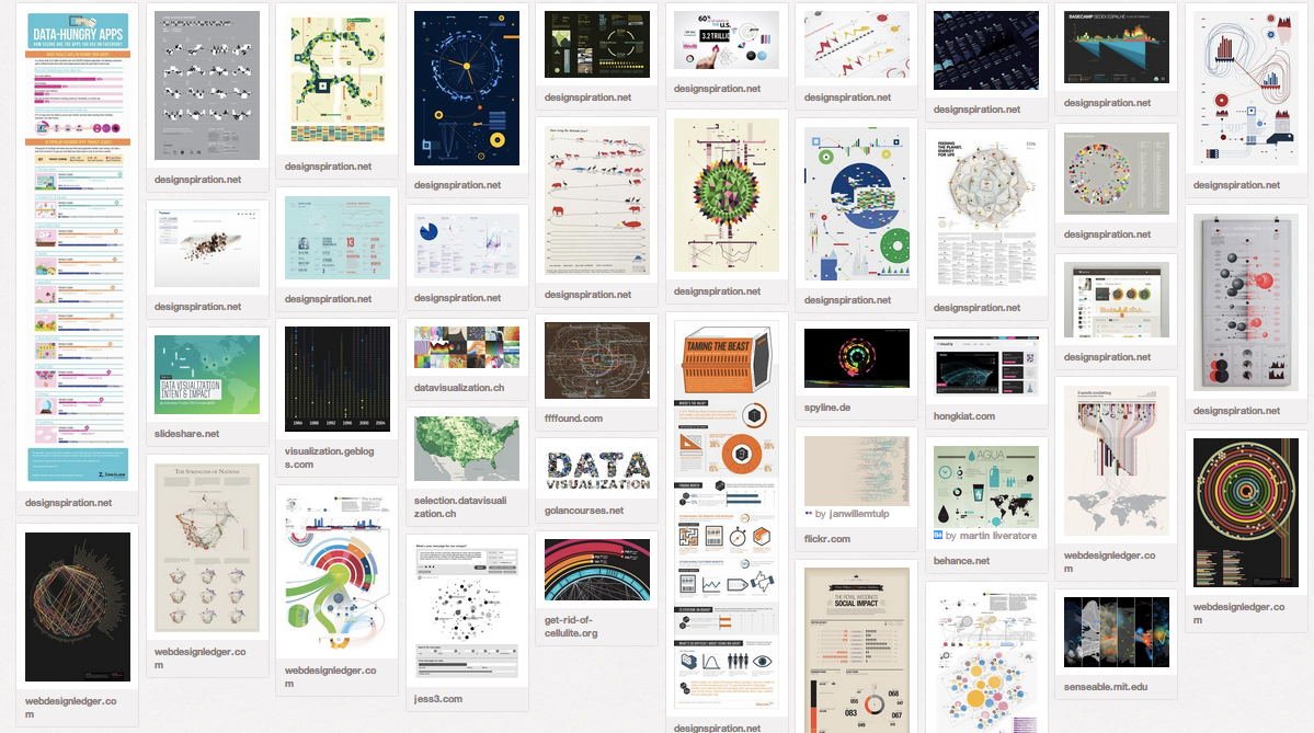
InspirationI then set out to my mood board and looked at the most successful examples of data visualization in the world, albeit loosely related to the project, it is vital to manifest standards. These are some of the most compelling and original ways that artists manipulate data to date.
See live pinboard here
"There is a magic in graphs. The profile of a curve reveals in a flash a whole situation — the life history of an epidemic, a panic, or an era of prosperity. The curve informs the mind, awakens the imagination, convinces."IntroductionThe first question any data artist must ask is 'why not a table' & 'what am I doing'? In this case of ersatz data for the sake of extrapolation, the answer is open-ended. For example, in counties where more people donate to Obama, are there more people on Mainecare? Or is it something surprising like people are giving to Romney even when they are on MaineCare and that is a program he wants to cut? Either way, I knew that the best way was not the most obvious.
InspirationI then set out to my mood board and looked at the most successful examples of data visualization in the world, albeit loosely related to the project, it is vital to manifest standards. These are some of the most compelling and original ways that artists manipulate data to date.
See live pinboard here
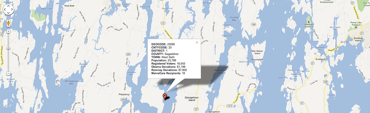
Infographic IdeaHere's what I cooked up in the evening as a basic concept for a way to break down the datasets into the three catogories: registered voters, party backings, and mainecare. The map to the left acts as the control that serves up the datasets visualized on the left. I made it toggle between two different counties and added on a different style just for kicks. While I'm not anamored by this creation expressed here, I particularly enjoy my concept behind the dueling political party piggy bank deposits.

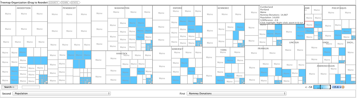
Treemap TreatmentI remembered that a family friend started (and since ended) a project called manyeyesthat is one of the first out of the box data visualization tools. I decided to plug in this data into it and see how it holds up on current standards. While its dated, janky, and aesthetically underwhelming, this representation offers a nice, albeit crass preview of how this data could be purposed in a treemap setting.
Check it out here.
DISCLAIMER: It will probably crash your browser. Firefox is the best bet
Check it out here.
DISCLAIMER: It will probably crash your browser. Firefox is the best bet
Google Fusion TablesSince there's no more google buzz, I guess it's safe to say google fusion is all the buzz. It's a beta tool that allows users to create dynamic tables from their own data. Sadly, I hit a dead end because I didn't have time to geojson those geocodes. But what I did learn is that we should not use google fusion in any capacity or at any date because I discovered a hotbed of superior libraries that trump this monolith.
See fusion in action here
DISCLAIMER: There's not much going on except a visualized CSV file...
See fusion in action here
DISCLAIMER: There's not much going on except a visualized CSV file...
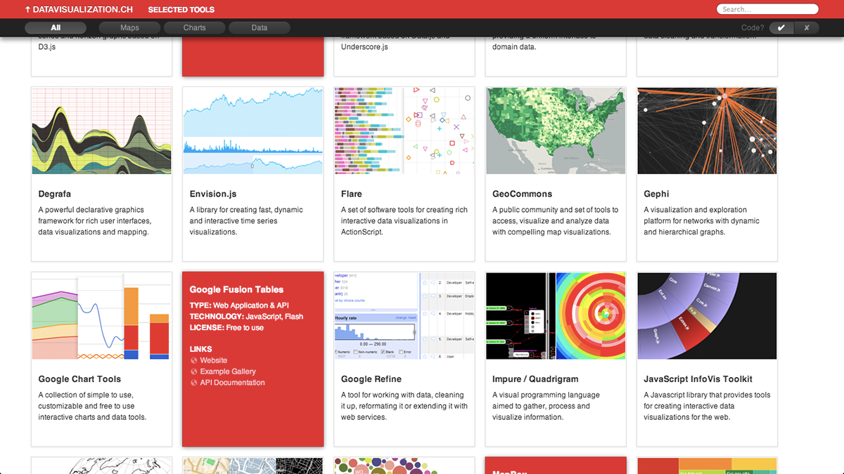
Tools of The TradeWhile exploring options to dynamically extend data, I found some invaluable resources that will increase production & creativity for any project. This website has a nice masonry layout of a lot of really nice mainstream tools available for skilled data artists (and some novices!). But this is just the tip of the iceberg. In my research, I've found dozens of resources that document solutions with a similar service and am excited to experiment with the ones that really stand out.
Check out where that picture came from here
Computerworld also flooded itself with some great resources.
Check out where that picture came from here
Computerworld also flooded itself with some great resources.