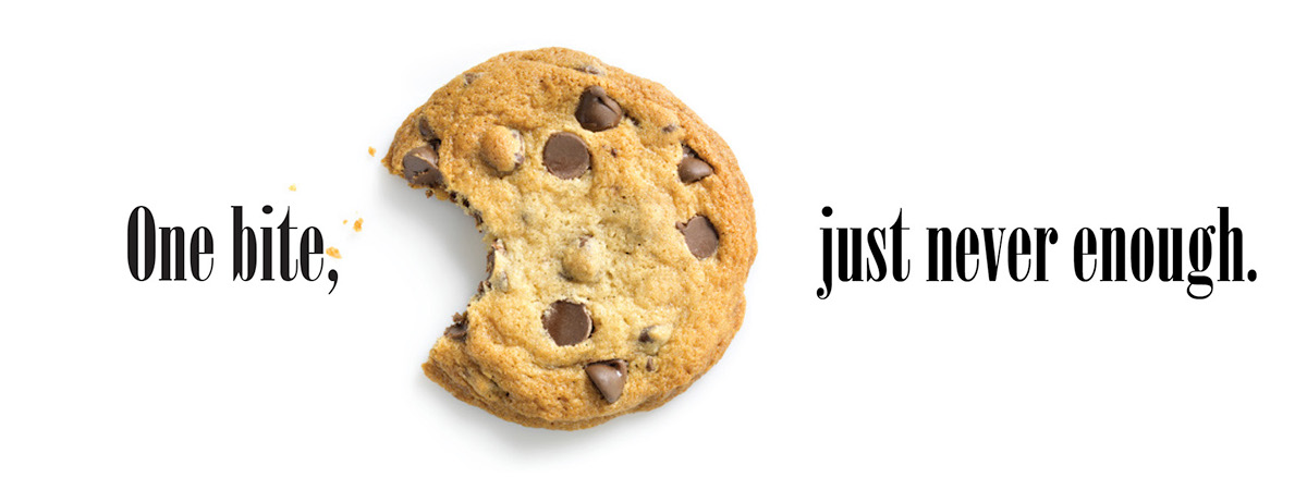
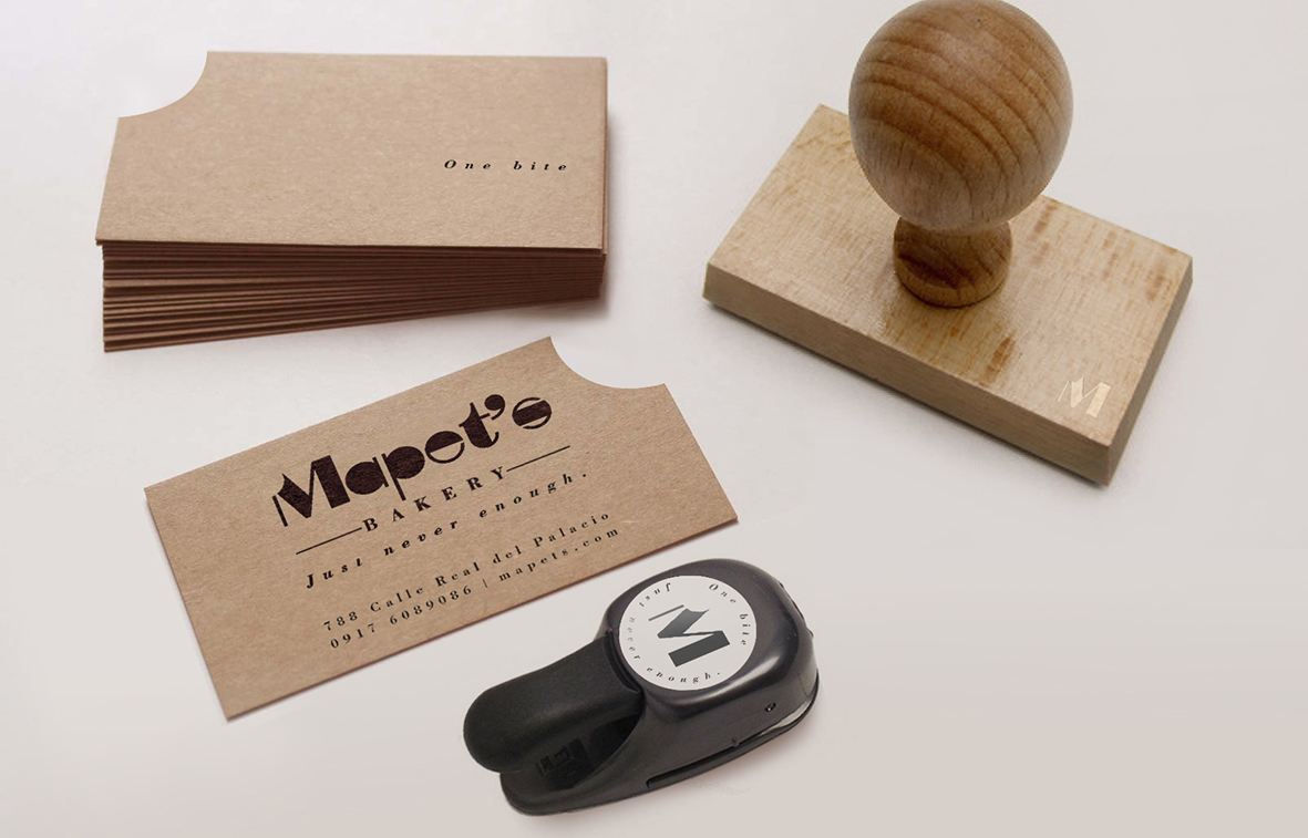
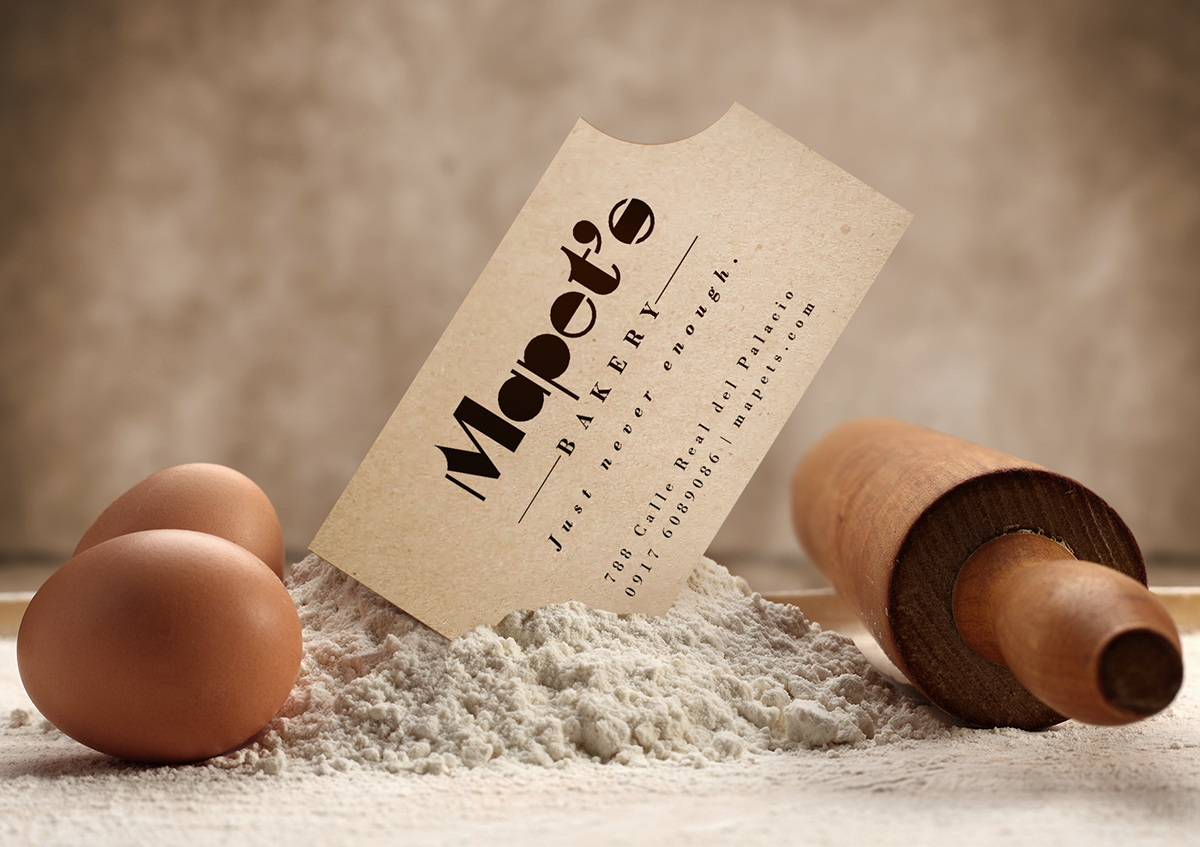
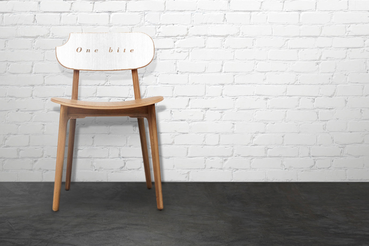
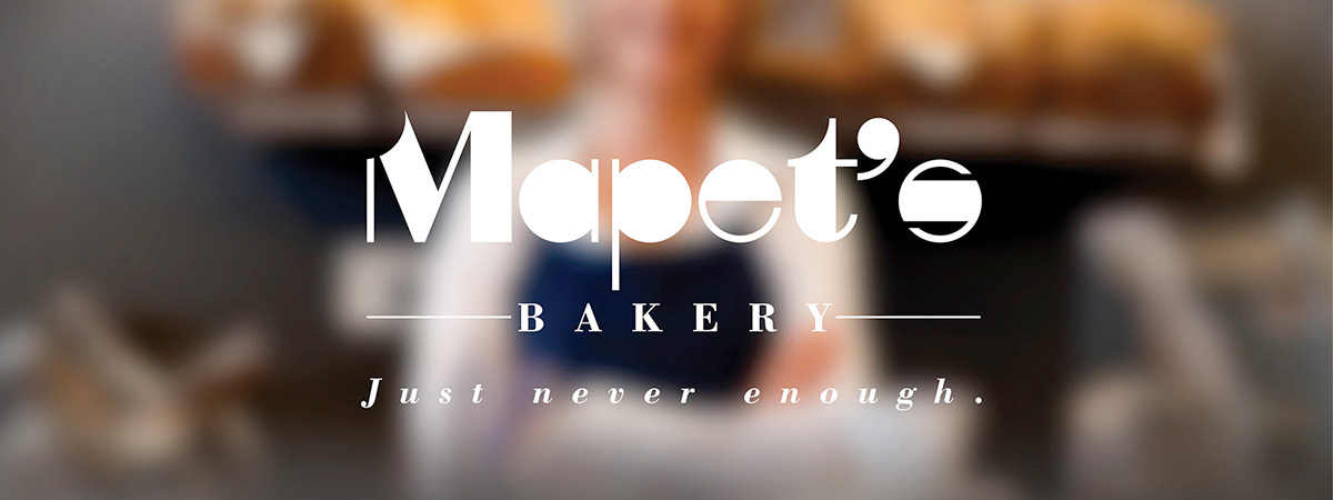
One bite, just never enough.
Mapet’s homemade cookies are truly made by hand with ingredients that are incorporated evenly so that each bite will be as delectable and unforgettable as the next. Mapet's goal is to serve the best quality cookies and share the happiness with all customers.
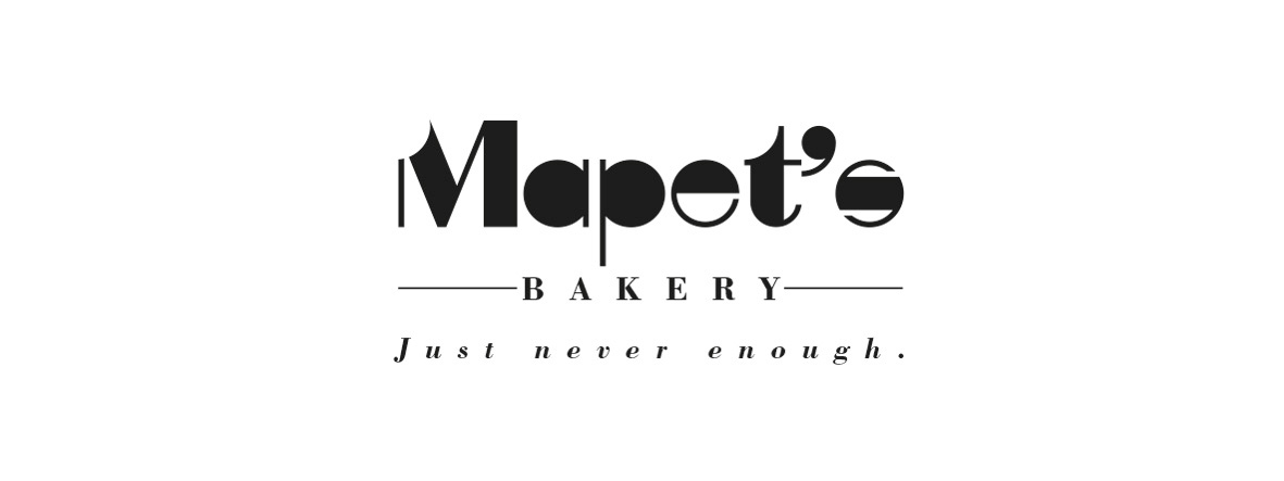


CONCEPT
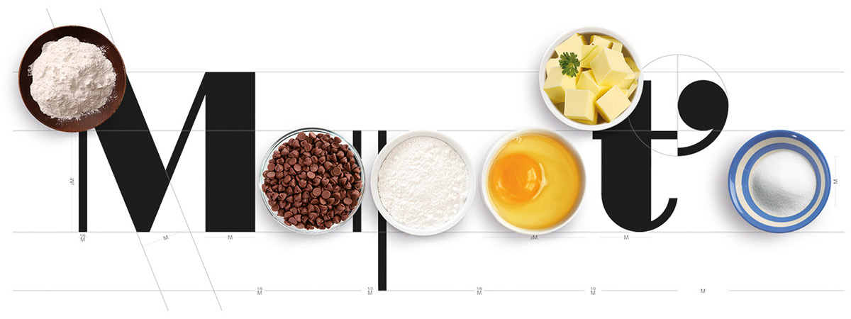
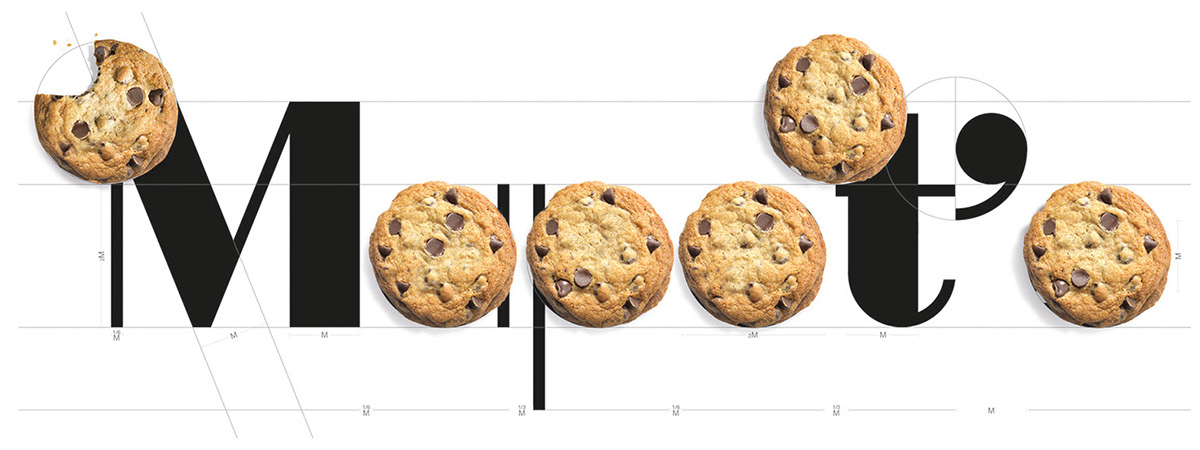
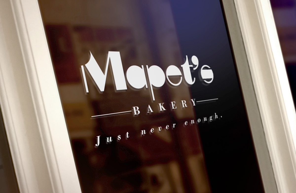
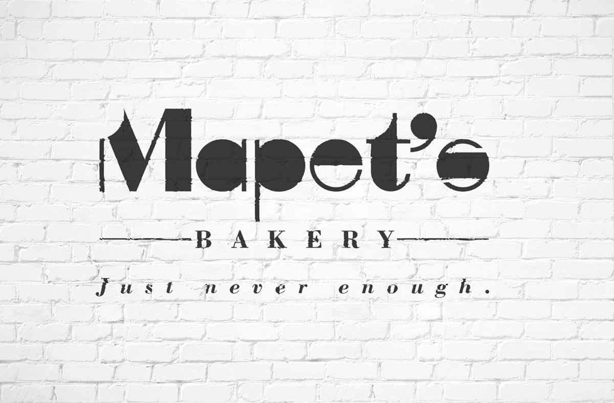
The “bite” on the initial M represent Mapet’s produce irresistible delicious cookies.
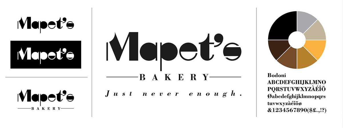
The customised typeface makes Mapet’s logo unique, highly readable and legible.
This simple logo allows for easy recognition and allows the logo to be memorable.
This simple logo allows for easy recognition and allows the logo to be memorable.
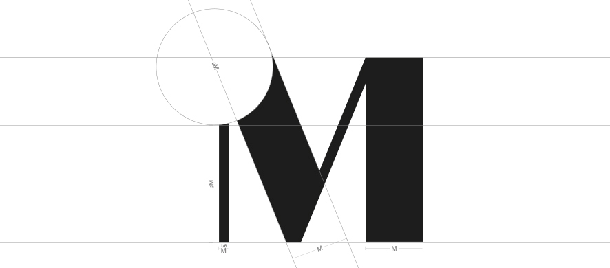
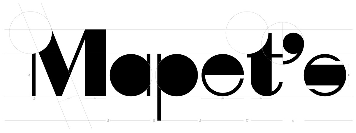
SHAPE
Mapet’s logo makes use of simple geometric shapes.
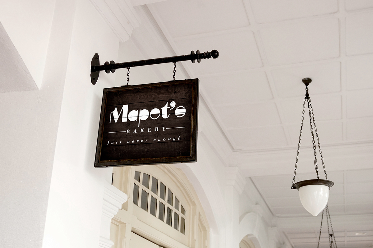
It will endure the ages, and the logo still be effective in 10, 20, 50... years.
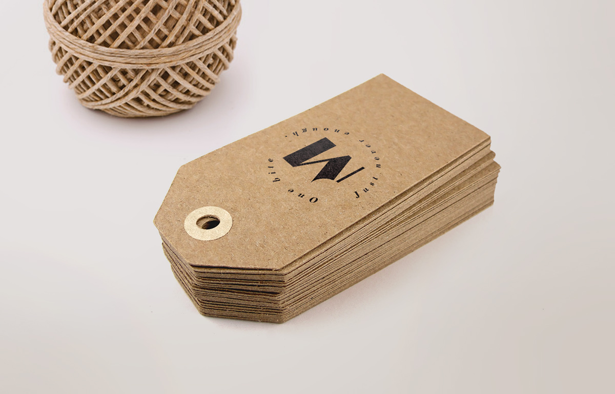
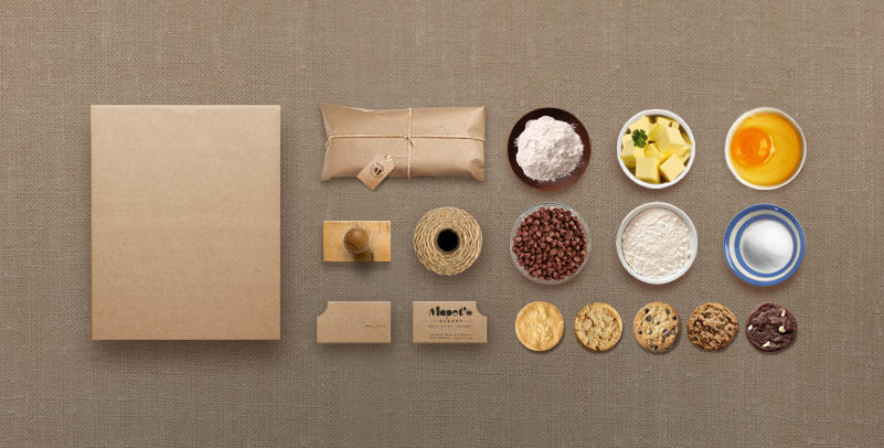
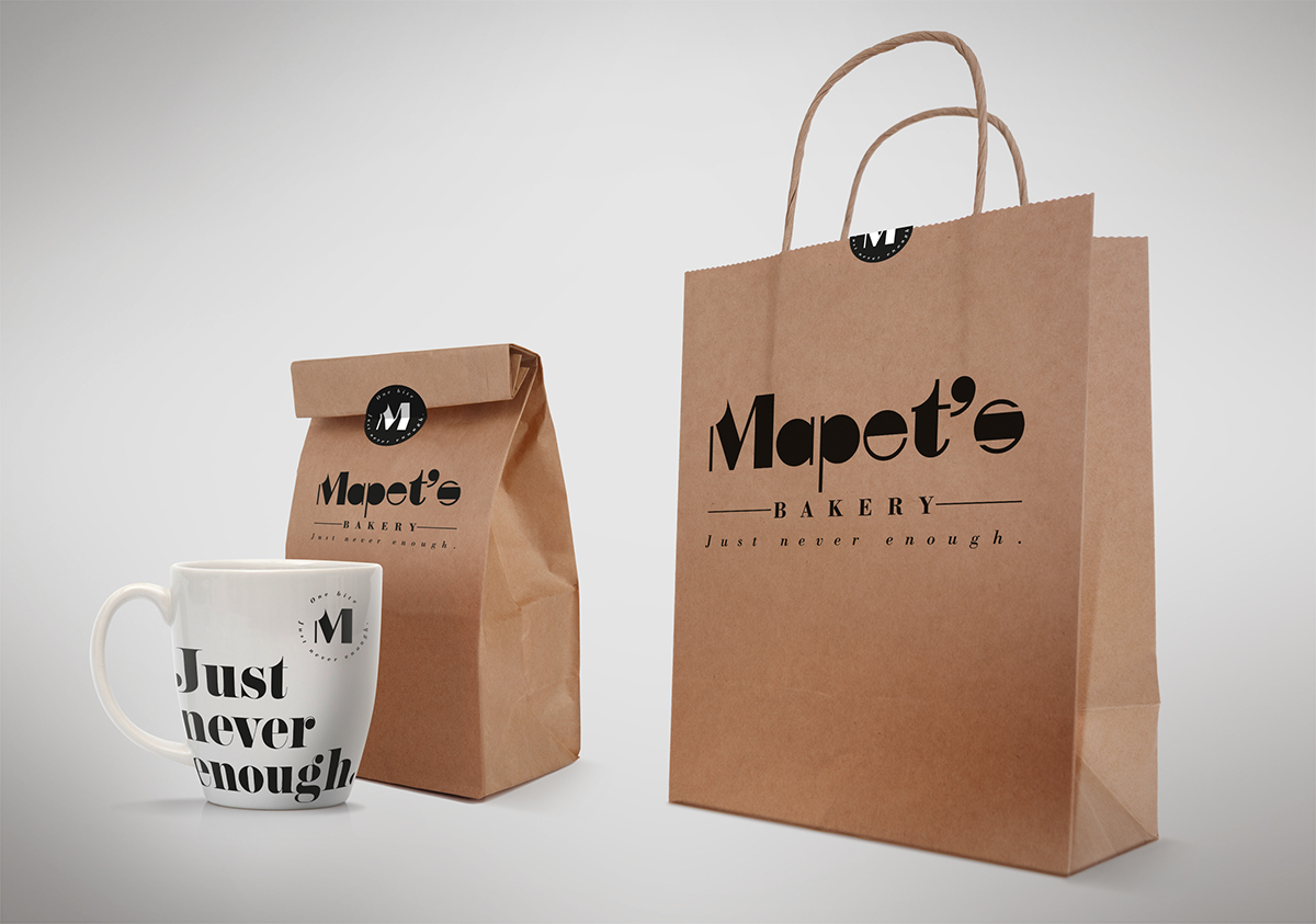
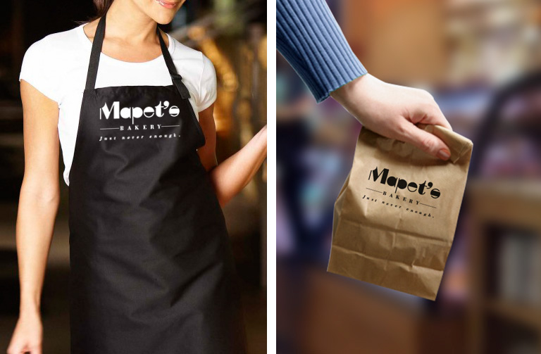
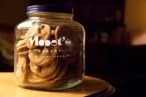
APPLICATION
Mapet’s logo stamp is able to work across a variety of mediums and applications.
It is affordable flexible and reusable.
Please click the link below if you want to see my another branding project.
Thanks for watching.