Corporate Logotype Redesign
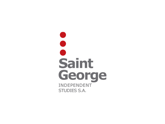
St. George Logotype 1
St. George Logotype 2. My first adaptation.

Adopted proposal for company profile motto.
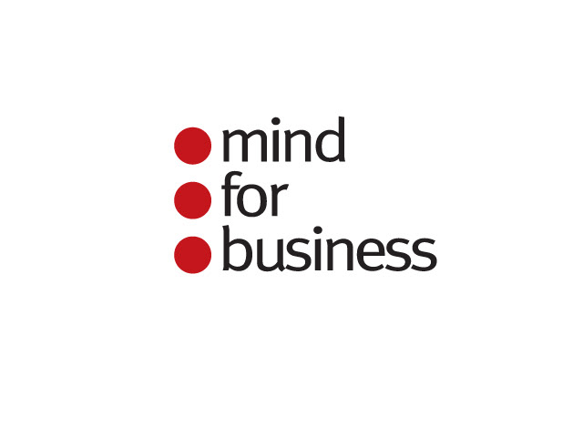
The Red 'bullet points', set vertically, support the company profile motto. Let's call this 'the bridge'.

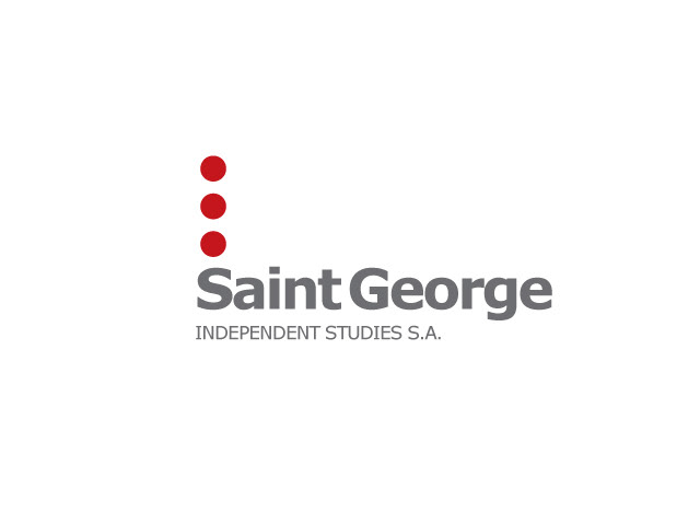
Omitting the motto, the starting point of the 'three dots concept'. An attempt to move further away from the original company logo and it's legacy.
The 'three dots concept', served as an alternative graphic proposal for a transitional sign device, another step towards the abstract, away from the 'shield & cross concept'.
The 'three dots concept' logotype variant.
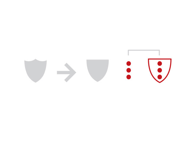
Creating a new sign by combining the two concepts.Let's call this 'Hybrid'.
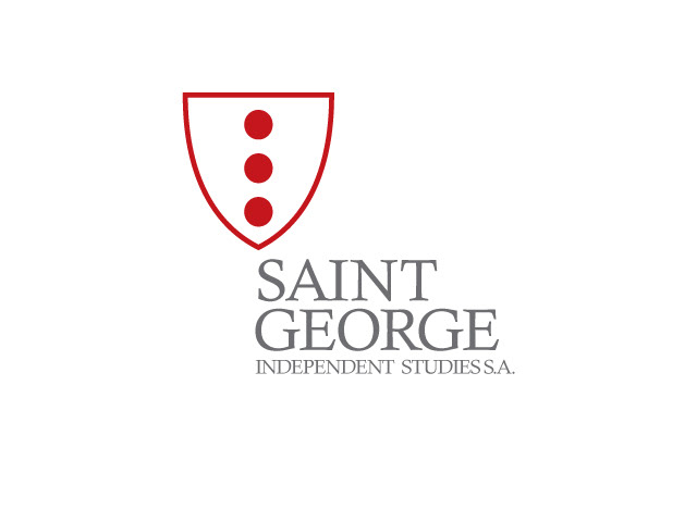
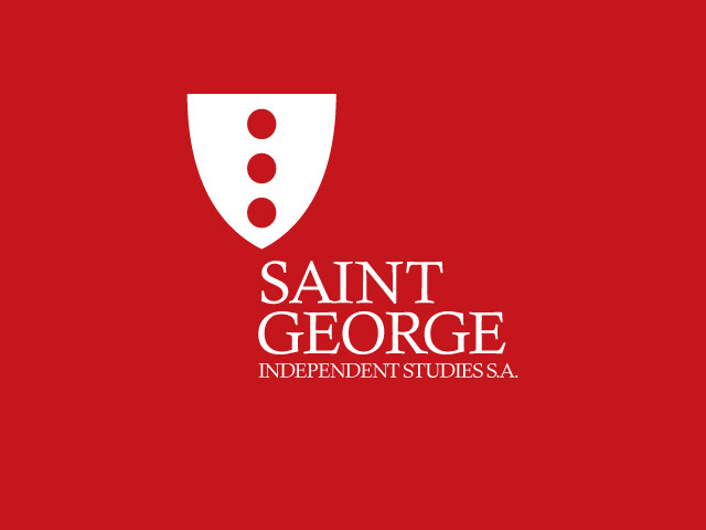
The 'Hybrid 1' logotype in two colours version.

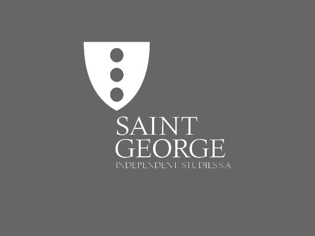
The 'Hybrid 1' logotype in grey.
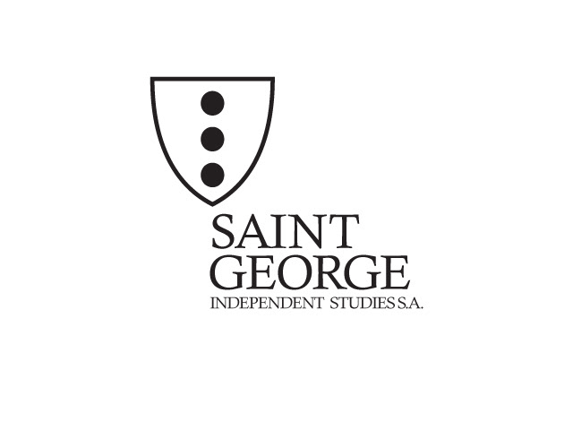
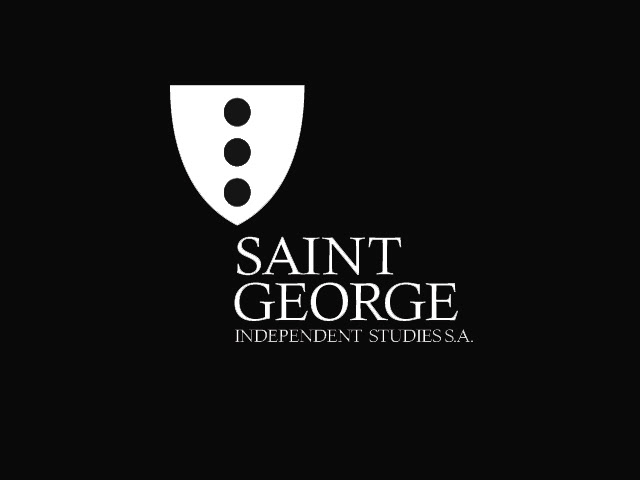
The 'Hybrid 1' logotype in black.
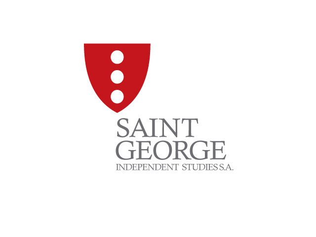
The 'Hybrid 1' logotype in inverted red version.

The 'Hybrid 1' logotype in inverted two colours version.

The 'Hybrid 1' logotype in inverted two colour version.
The 'Hybrid 1' logotype in inverted grey version.
The 'Hybrid 1' logotype in inverted black version.
The 'Hybrid Variant' logotype in two colours version.

The 'Hybrid Variant' logotype in grey.

The 'Hybrid Variant' logotype in black.

