Client: Colette.
I was very lucky to design the logo of superstore Colette in Paris — which became an international icon of style.
Process
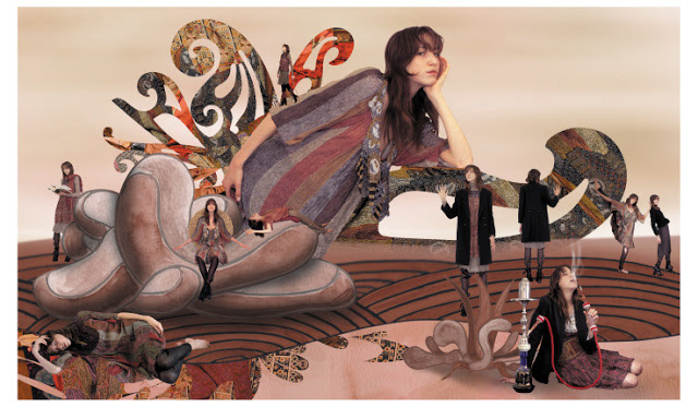
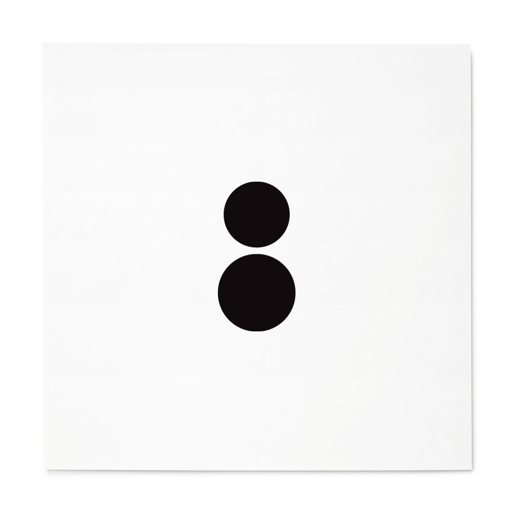
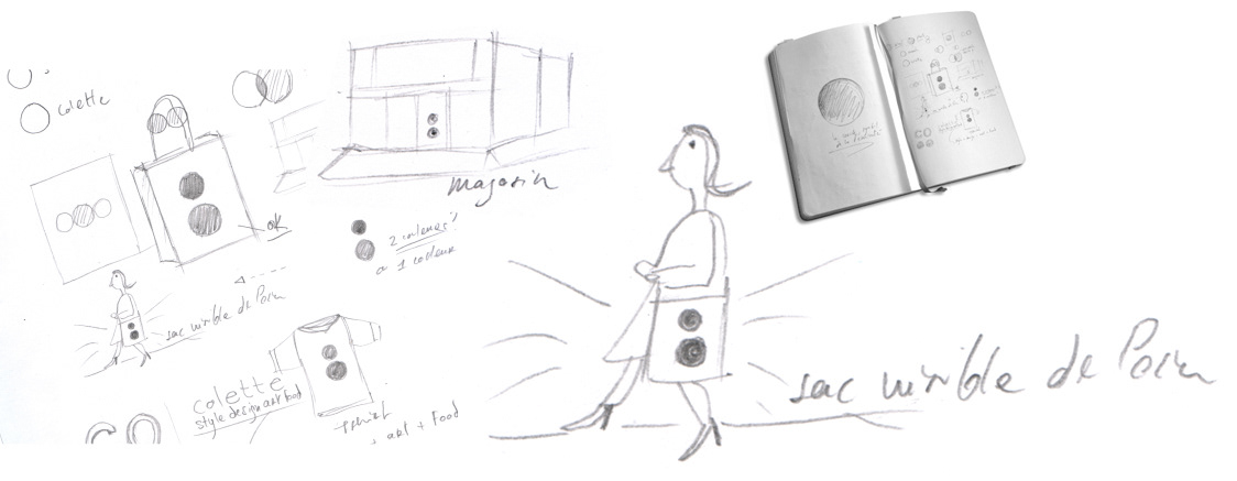
As I started working on this project I realized that the logo had to be extremely important. I thought about the legendary Nike "swoosh" and offered that Colette needed something as powerful to immediately capture the public's imagination. We needed a strong symbol — an icon. I imagined a costumer leaving the store with her Colette shopping bag. How could this bag be immediately identified? Could this bag educate the public on the nature of the store? As I imagined how this customer would feel and act, I sensed that her bag should be beautiful so it could complement her outfit. Feminine, friendly, happy, became my keywords.
Solution
I wanted to give to the brand a simple, minimal feel in order to create something that could virtually last forever — yet constantly evolve. This project became an exercise in elegance and simplicity. Drawing from the study of Archetypes I found that Colette's logo should be based on a circle: the symbol of the feminine but also the symbol of wholeness. I started sketching and found that the founders, Colette and Sarah, could be represented as circles themselves. Playing around with two circles I came to finalize the two dots, placed on top of each others. Next, a big "aha," came when I added "styledesignartfood" (no spacing) under the Colette name to educate the public in a direct tagline. The branding also included an unlimited use of possible color variations that could change whenever needed.


Results
Described by The New York Times as "the coolest store in town," Colette became an international sensation. Over ten years after it first launched, Colette maintains its position as the most influential store in fashion. Driven by the talent and incredible work ethic of founders Colette and Sarah, the store is an official icon of a new spirit in fashion. Colette went beyond the retail space to create a cultural and social experience. Just as planned, the Colette logo kept mutating changing colors, texture to accommodate the many limited edition collaborations produced over the years. The tagline "styledesignartfood" was finally removed when it became evident that everyone knew about Colette and its numerous offerings.
Colette's logo became a cultural symbol: copied, highjacked, or idolized — it entered collective consciousness. I once heard of a young woman who had hung Colette's bag on her living-room's wall, like a piece of art. Mission accomplished.


Client: RDAI Architecture
Known as the architects of Hermès, RDAI is an amazing studio creating spaces that are both modern and timeless.
The logo conveys this union of timelessness and modernity.

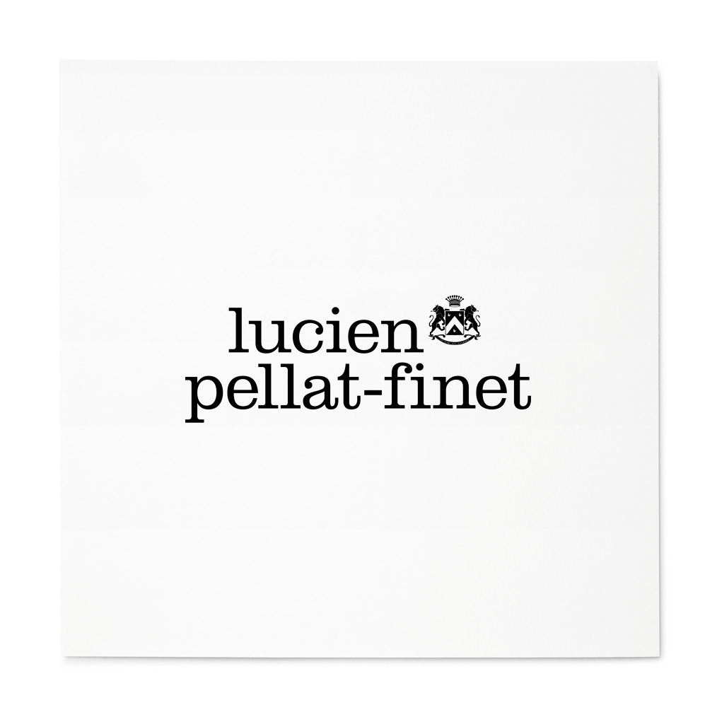
Client: Lucien Pellat-Finet
I collaborated 10 years with Lucien Pellat-Finet working on every aspects of the brand image (logo, illustrations, ad campaigns).
Interestingly, the skull I designed for LPF (see below) became an instant icon and launched a cult-craze for the brand.


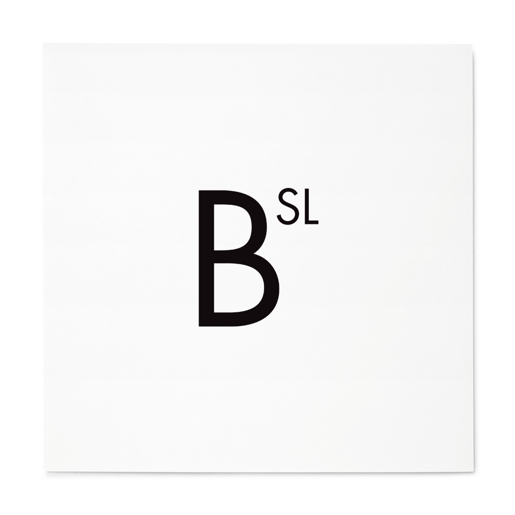
Client: BSL Gallery
For the ultra-modern design gallery BSL, I decided to create a minimalistic logo evoking the periodic table.
It was a real pleasure to work with this client.


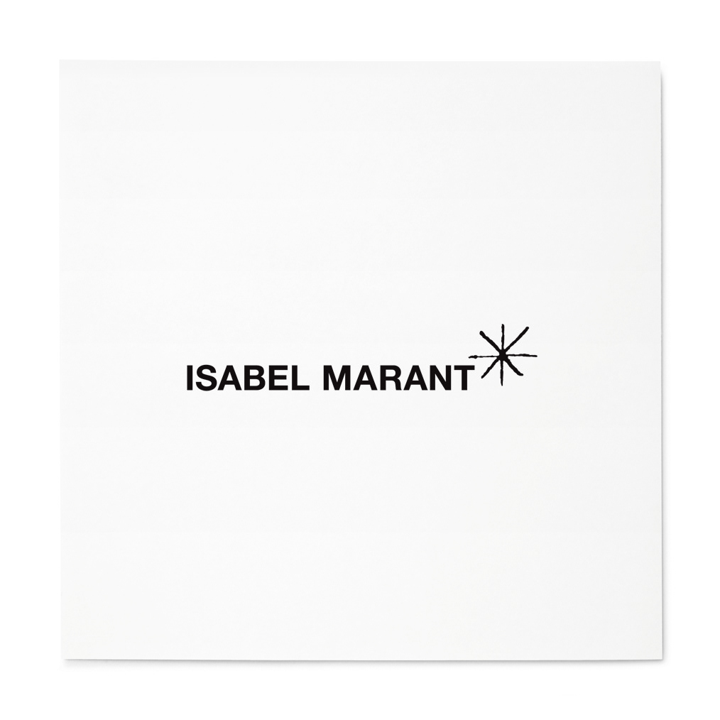
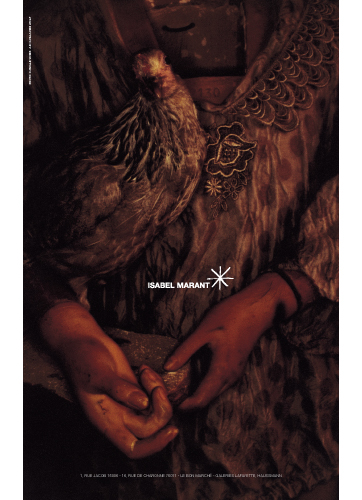
Client: Isabel Marant
For the Isabel Marant logo, I brought a sense of order and bohemia combined. I worked with Isabel on her brand image, invitations, and advertising campaigns.