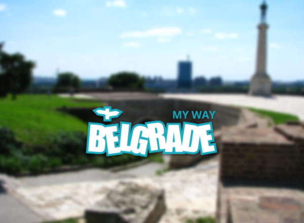
Belgrade My Way is a website that promotes the attractions, activities and culture of the Serbian capital - Belgrade. The blue line around the logo symbolizes the Danube and Sava rivers that surround the city, while the white letters represent the White City (meaning of the name Beograd), with it's chaotic yet bold architecture.
This is the updated version of the logo for a creative team called iVision, which specializes in identity and web design and development.
Zanimljiva Srbija is a magazine that promotes the natural and cultural treasures of Serbia to the Serbian-speaking audience.This version of the logo features a more interesting typography, as well as an organic color scheme.
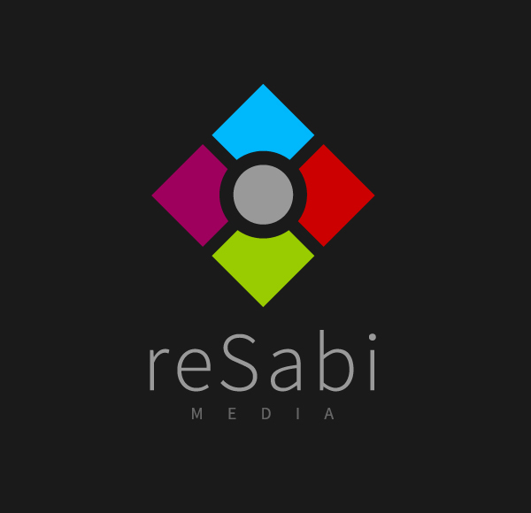
The reSabi Media Diamond logo is a combination of the previous two logos, with a new idea. This version features a square symbolizing a gatherpoint for creative people and ideas, while it's colors tell of a multi-niche content and services.

Here are the previous versions of the logos featured above, along with a couple of older creations that haven't been updated (yet).
I hope you enjoyed scrolling through my logo compilation. If you did, please hit the APPRECIATE THIS button below. Thanks! :)


