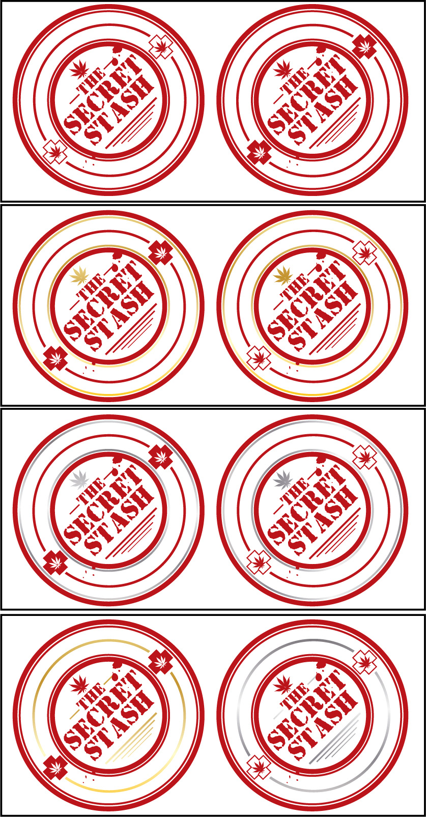
This was a redesign concept I did for a local MMJ dispensary. Their existing logo was a rectangular 'top secret'-esque stamp. The person I was dealing with gave me the instructions to use the stamp idea, but to make the logo more clean and classy. After a couple of consultations and mockups, I arrived at this. She loved it, but the other owners decided to go with a character logo using a cartoon skunk in a suit...for that classy element I guess.
At that point, I quit the project as I was no longer interested in investing any more time and energy into the client. I felt this design was everything she asked for, and after capturing exactly what she wanted only to have them decide to go in a completely different direction had no desire to continue on.


