Logo Design
The logo design process is amazing and I enjoy every bit of it. Especially when I discover that visual metaphor that will make the difference between a meaningful logo or a generic one. To me, designing a logo, is stripping down the identity of a company to its bare essence into a visual capsule.

My own logo: Design-Inside
The logo and the name Design Inside are representing my portfolio and my path as a designer, also my passion for everything that is design related. Many hours of sketches went into designing my own logo. I first wanted to find the idea, the concept, before using the computer. I discovered that the word DE SI GN shares almost the IN SI DE groups of letters, so this mirroring started to take shape. But what to do with the letters G and I, because they do not mirror? How to create a G that looks good in this whole composition? The answer came to me gliding: A spiral.

Tulips - A home decor shop
I developed this logo for my home decor and gifts shop, with goods imported from The Netherlands, therefore the name, the orange color - which is the national Dutch color - and the "li" taking the shape of tulips.
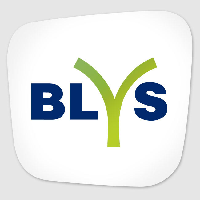
Blys - Agricultural machinery manufacturer (FR)
This is a logo proposal I designed for Blys (France). I defined the agricultural activity of this company by illustrating the letter Y as a freshly grown little plant. The edges of the plant are straight because they express the machines that this factory is producing. Like freshly cut grass. I couldn’t leave the ends of Y in a pointed shape, because it’s about machinery. One has to get the feel of that when looking at the logo.

Web.nl - Informational website (NL)
After many many sketches, I was happy to find a great shape that includes the letters W, E and B. Displaying them in a clockwise direction represents the endless web findings on any given theme, which is the main objective of the website.

I so love the result of my research (by sketching endless ideas) here. When I discovered that I could play with the letter J and transform it into a ring, summarizing the shape of the precious stone in a rhombus, I was so happy. I love minimalism, therefore I wouldn't have chosen a diamond shape there. The pun has to be immediately visible.
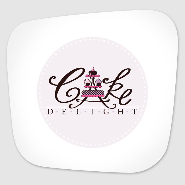
I love it when I do what I love. Great combination of the two: LOGO & CAKE! So here’s the result: Logo for Cake Delight. Of course, again, I was looking to integrate the meaning into the logo. This time playing with the letter A.
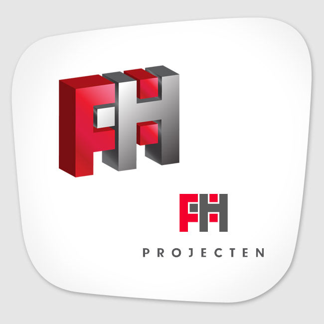
Construction company? Visual answer: brick and mortar. The letters F and H are interlocking eachother, to suggest partnership and solidity. FH Projecten is a construction company from the Netherlands.

Safety is the main important activity of this one man company. I created an icon of a person which can be either the person to be saved in case of a calamity, either the man who’s orchestrating it all. The logo design is based per request on the three Boxes of Orden, from a book with the same name. These boxes can only be used in a certain order and manner, which is exactly the way the company operates, therefore the three red paths I designed in the logo, to convey just that, plus the font type chosen as if the letters are a continuation of those paths.

Club Bizar was the place to be in my hometown Arad, Romania, by the end of 90's. Lots of live music going on, with the famous Romanian bands at that time, such as Timpuri Noi, Krypton, etc. I also did the interior design and I was pleased in particular to coordinate the manufacturing of the neon sign outside the club, using a beautiful venetian glass neon.
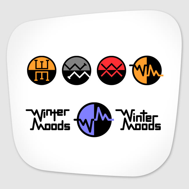
These are logo proposals I designed for a rock band from Malta called Winter Moods. I was playing with the first two letters of the name of the band, W and M. The first row of logo proposals are decorative, as for a rock band. But in the last proposal, there is meaning: the W and M take the shape of an electrocardiogram, expressing the idea of a heartbeat on a melancholic winter’s night.
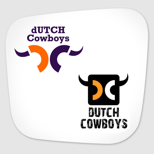
I entered the Dutch Cowboys logo competition with these two proposals. Dutch Cowboys is an informational website from the Netherlands. Sharp visible D and C letters, with horns, to express the cowboy idea, designing together a subtle bull / buffalo skull, using orange as typical Dutch color. I also created from scratch the letters in the black logo.

For this personal online shop project called Mad About Amsterdam, I developed an Amsterdam image that is a bit more than a logo. The letters DAM are mirrored in the water into the word MAD. The letter A takes the shape of a typical skewed Amsterdam house.

