
Started off by doing research on user interface design, and found these useful guidelines:
--------------------------------------------------------------------------------------------------------------------------------
There are three important factors you need to consider: your focus (as a business), how familiar your users are with your UI, and how different your UI and functionality are on different platforms.
Focus:
There may be branding reasons to keep a consistent UI across your platforms, perhaps especially for lesser-known brands that are still fighting to establish an identity in the minds of their customers. However, users are typically more familiar with the device-specific UI conventions than those of a brand. Jakob Nielsen often states, “Users spend most of their time on other sites,” and while we’re not just talking about websites here, it is much the same principle (on a smartphone, simply replace “sites” with “apps”).
Familiarity:
Are most of your users spending hours a day using your service? Have they used it for a long time? Or are the majority of your users infrequent or newly acquired? Let’s say you have a business or productivity service and you know the majority of your users spend lots of time in it all year long. In this case, familiarity across the applications trumps device UI conventions, because the user has invested a significant amount of time learning your unique UI. On the other hand, if users haven’t spend that much time with your services and haven’t built strong cognitive and emotional ties to your designs and features, then device-specific UI conventions will generally result in better usability.
Functionality:
This has two aspects: a) Is your service only solving a single problem with a single feature, or is it more advanced? and b) Is there a difference in functionality and features across the various devices? If the features you offer on different platforms vary greatly, then adhere to device UI conventions, since cross-platform consistency will yield little benefit in terms of usability (using the same branding and general aesthetic design won’t help the user if the features are widely different — in fact, they could potentially cause harm as the user will think there’s overlap when in fact there isn’t). On the other hand, if you’re solving a single, simple problem, then diverging from device UI conventions is okay since users will very quickly learn your unique UI and you’ll potentially be able to solve the UI problems specific to your feature more readily than the generic device conventions afford.
Balancing Usability Research With Unique And Creative Concepts
The concept of your product, service, app or website is at the core of your user experience. It’s where you differentiate yourself from the competition and where you create true value to the customer. So develop your concept as creatively as possible and make it as original as possible. Then, when it comes to the real-life implementation, read up on user research, study UI conventions and perform usability testing as much as your concept allows.
Usability research and testing are what make your services easier and more seamless to use (which are truly important qualities in a competitive landscape), but they are not the reason people choose to use a service in the first place — they do that to solve a problem or fulfill a need. So first come up with that ingenious new concept, and then draw heavily on user research when implementing the service.
Usability tools are there to test and validate your designs, allowing you to continuously iterate your design based on user behavior and perceptions — an optimization process that should continue throughout the product’s life cycle.
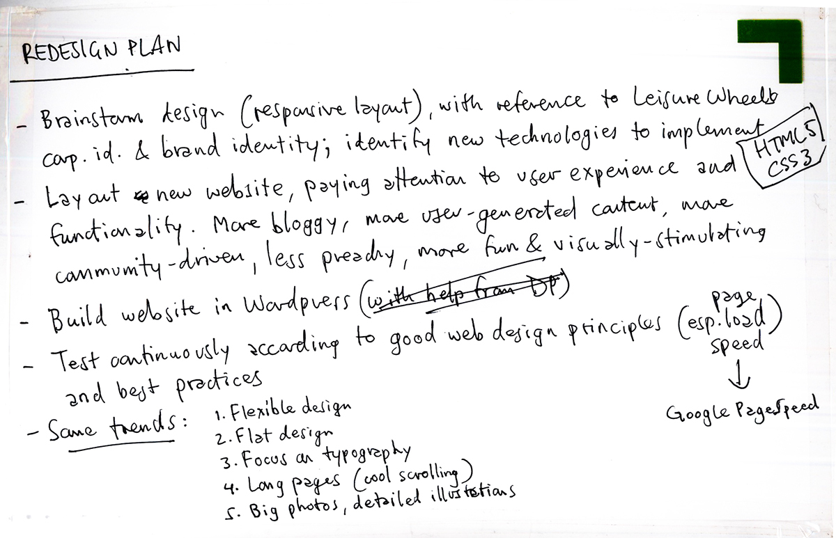
Had a brainstorming session with the Leisure Wheels team. Came up with a logical site structure and basic page plan:

Started with the mobile layout:


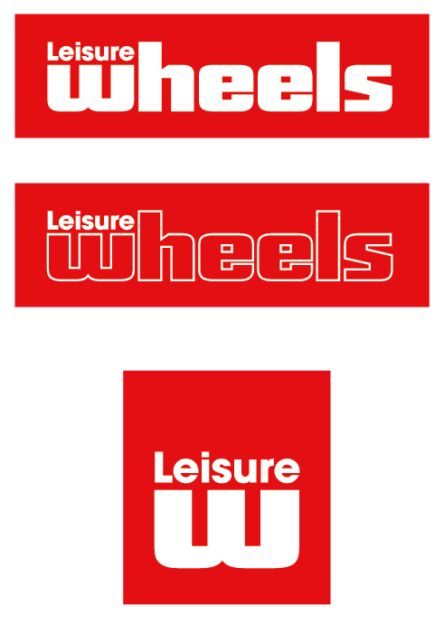
Reworked logo & digitized wireframes:
I retraced the sketched wireframes in Illustrator and started bringing in colours and elements into the layout, using some very well-designed responsive websites as reference. I decided to use the simplified Leisure Wheels logo for the website as it is much bolder than the print logo, more “webby” and perfect for app and mobile applications. It is also far more iconic and recognisable. This version of the logo is already well-established as our brand shield on Facebook so it makes sense to pull it through to all our digital applications. It will also translate well to merchandise and branding applications like T-shirts and caps if we decide to take it through to print.

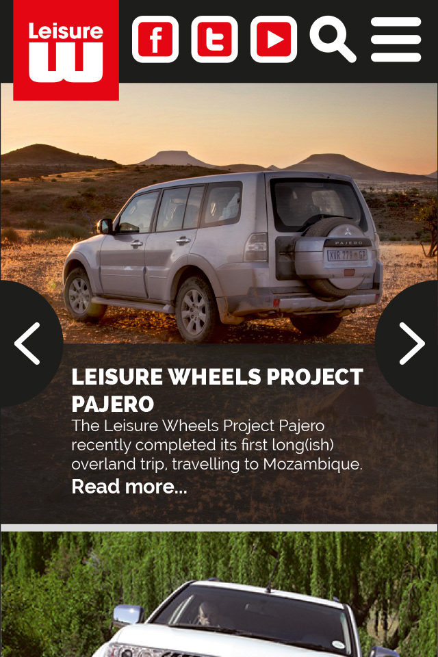
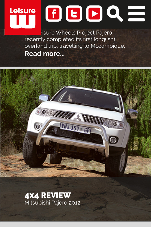

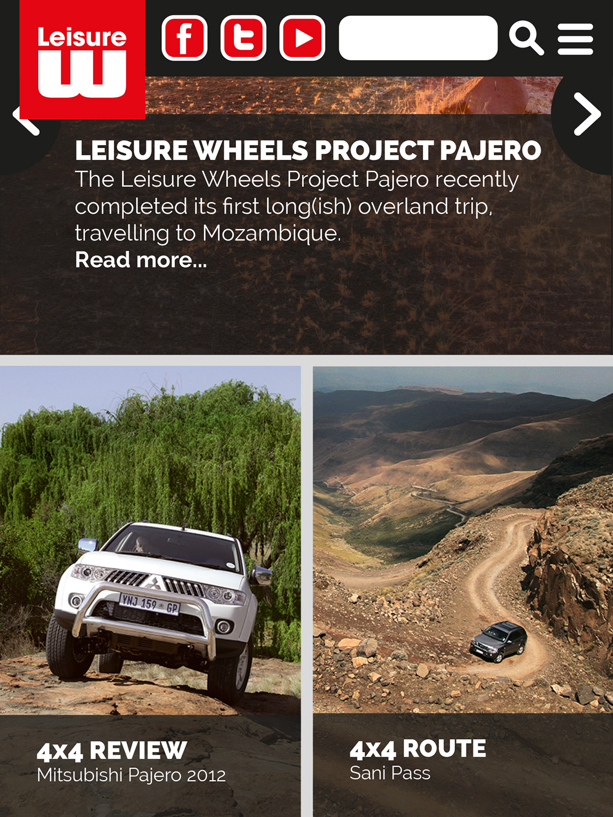

Our users are accustomed to the current website so care should be taken to make sure they are taken through the new website using visual clues and recognisable iconography.
Decided to design this fully responsive website from the mobile view up - a logical way to approach such a project as the mobile view is often the most challenging layout to solve.
--------------------------------------------------------------------------------------------------------------------------------
Inspiration:
http://www.mobify.com/blog/70-stunning-responsive-sites-for-your-inspiration/
http://www.webdesignermag.co.uk/category/inspiration/
http://www.webdesignermag.co.uk/inspiration/5-responsive-wordpress-themes/
http://www.webdesignermag.co.uk/inspiration/5-inspirational-one-colour-backgrounds/
http://www.webdesignermag.co.uk/inspiration/5-killer-mobile-menus/
http://socialdriver.com/2013/06/50-best-responsive-website-design-examples-of-2013/
http://appscreens.tumblr.com/
--------------------------------------------------------------------------------------------------------------------------------
This is a work in progress... Check back for updates. And please feel free to give feedback :)


