Sagførerne
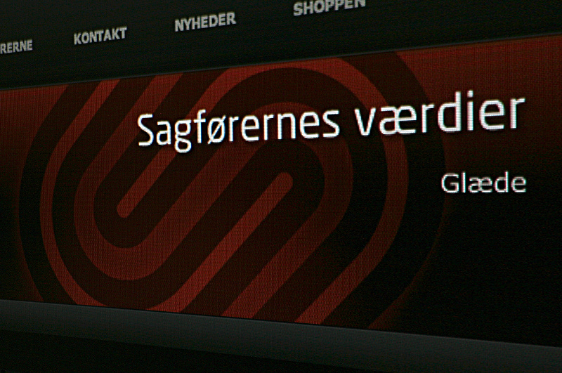
One all together very different law firm, with the following four core values:[A] Joy
You will always be much better at what you do,
if it is something that you really enjoy doing.
[B] Empathy
The ability to put yourself in the clients position and by that
having a much greater understanding of the case at hand.
[C] Sharpness
Knowing the subject to the fingertips and always be more than
well prepared and with great clarity in the argumentation.
[D] Innovation
Thinking outside the box, always try finding that new angle.
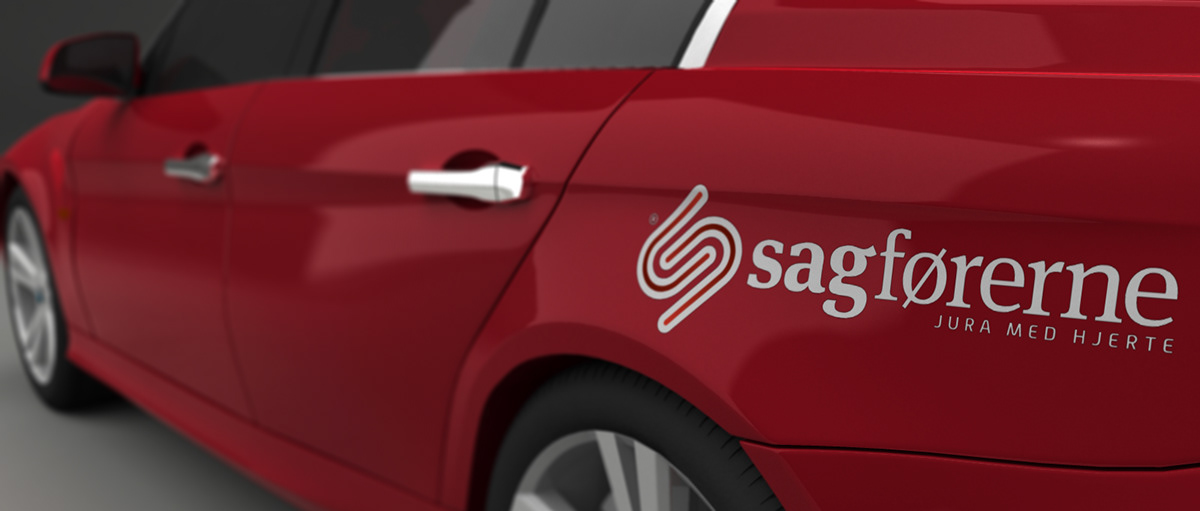
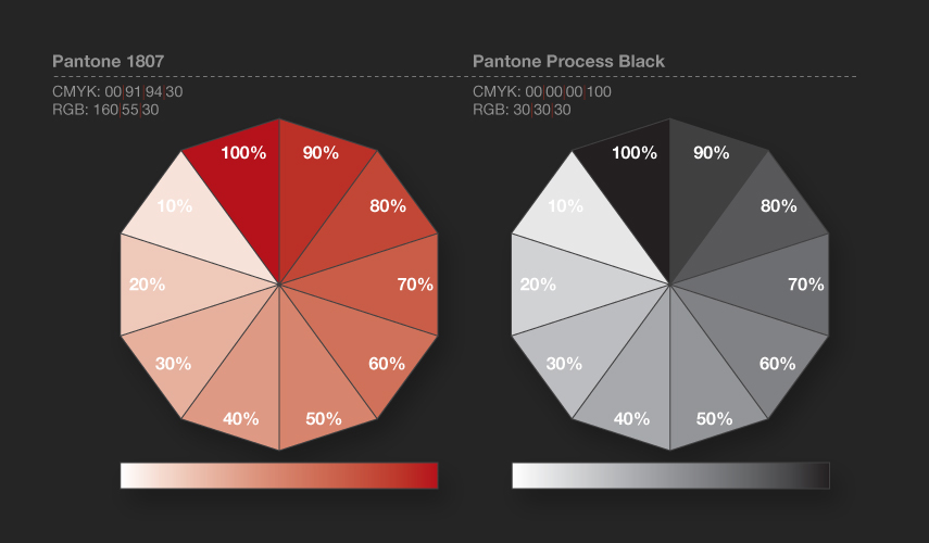
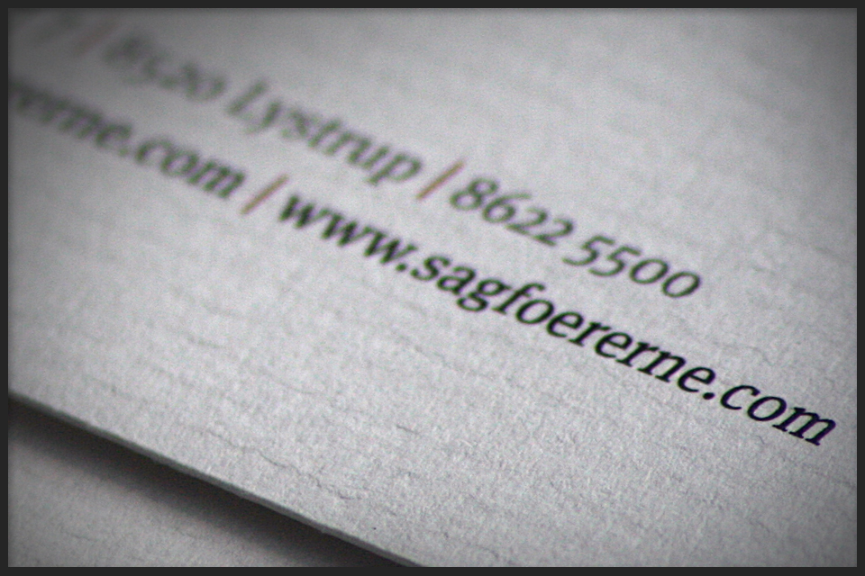
So to emphasize those four values, I choose rounded shapes for the logo. The typeface Meta Serif where choosen for it´s classic yet modern style. Then underlined it all with the Pantone 1807. The paper used for business cards etc. is conqueror, a high quality paper with an off white colour and a little relief in it.
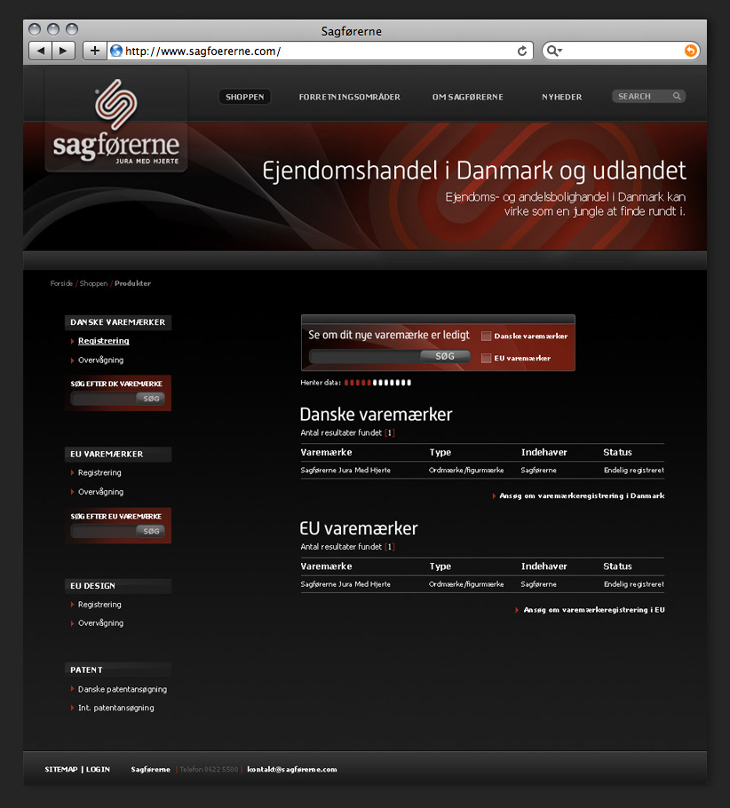
The site by the way is a video based website, where every aspect of their work is explained in common language, so that everybody is able to understand the othervise difficult law lingo.
Check it out here: www.sagfoererne.com


Idea
The company payoff in Danish (Jura Med Hjerte)
means something like “Law From The Heart”.
Based on that idea, I looked for shapes to complement it.

Tech


Typeface

Colours
Printet Identity


Website


Keynote


Interior inspiration


Auto