
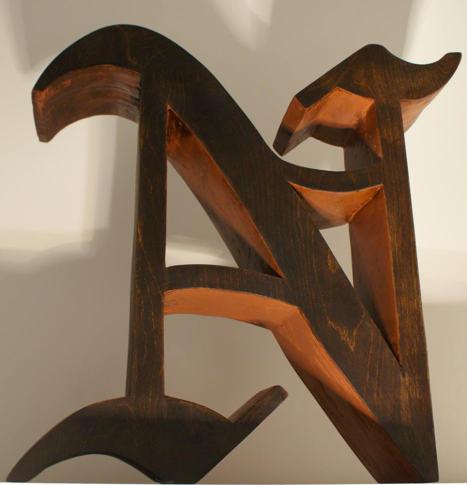
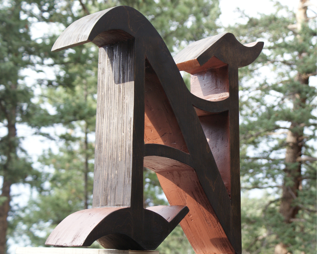
For this project, we were tasked with making a large-scale letterform that could appear in an urban signage system. We were given the dimension of 2 feet as a requirement, for which I set both my height and width. We started form schematics, and produced a final letterform through a variety of media. We chose to spell out the word "Harmony" as a class. I chose a blackletter N for the woodworking challenge and formal qualities that would create a nice contrast when set next to the other letters. I stained it a dark color in order to really accentuate the contrast, shadows & depth of the letter when lit.
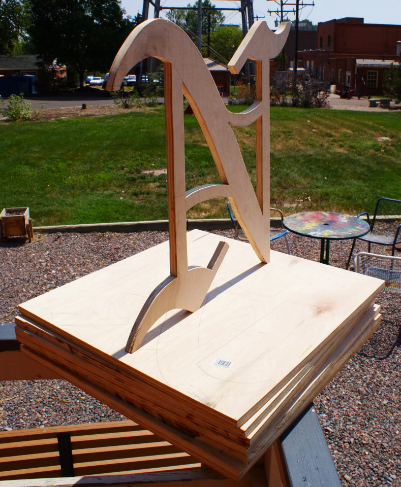
Process images of the wood cuts that went into fabricating my letterform.

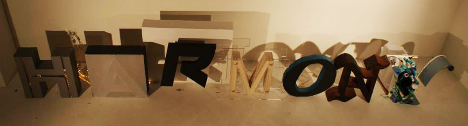
Our class' finalized letterforms placed to spell out our chosen word!


