El Centro de Estética y Rehabilitación Oral La Guadalupe C.A. es un sitio pensado para ofrecer a los pacientes la comodidad de recibir tratamientos odontológicos de la mas alta calidad, en manos de un grupo de especialistas dedicados a realizar tratamientos inspirados en devolver la anatomía, función y estética perdidas por el paciente, con amplio criterio científico, tecnológico y técnicas de ultima generación.
La razón del nombre para este centro es rendir honor a la Virgen de Guadalupe, Patrona de América Latina.
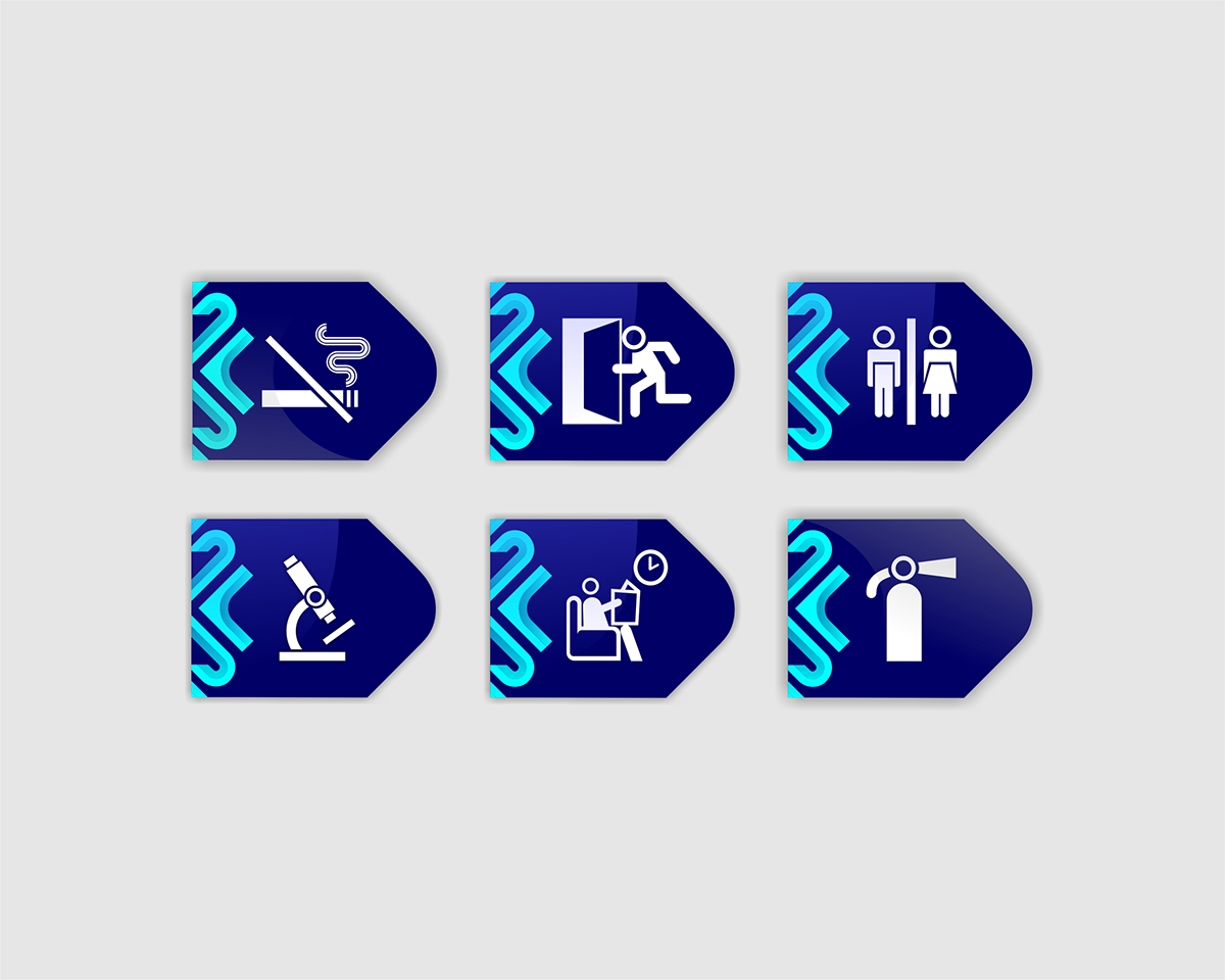
Tomè como referencia inspiracional para el imagotipo la cruz de la fachada de la Basílica de Guadalupe en la Ciudad de México. Basado en esto, creè esta nueva cruz que hace referencia a lo clínico y hospitalario. El logo, con una tipografía inspirada en la original (Trajan Pro); diseñè este híbrido con una estructura totalmente geométrica. El logo en general tiene un concepto ecléctico debido a la unión de lo moderno en la arquitectura de su cruz y las versales y versalitas con un estilo clásico. Los colores, al igual que la arquitectura del imagotipo, hacen referencia a lo clínico y hospitalario. El sistema gráfico en general posee estructuras geométricas que creè a partir de las retículas diseñadas.
______
Estethic and Oral Rehabilytation Center La Guadalupe C.A. It's a place thought to offer to the pacients the confortly of reciving odontologycal trictment of the best quality, in hands of a group of specialist ispired on bring that funtional and stetical lostted for the clients, with a high scientiphyc though and tecnologycal with last generation technicals.
The reason of the name was for giving honor to The Guadalupe's Virgin, America Latina's Patrona.
I took as a Inspirational referens for the combination mark the Guadalupe's Basilica frontage cross in Mexico City. With this on mind, I Created this new cross doing referens to the clinical and hospital theme. The logo, a typography inspired in the original one (Trajan Pro); I designed this hybrid with a total geometrycal structure. The logo in general have an eclectic concept because of his modern-union on his cross architecture and the capitals and the small capitals with a classic style. The colors, and the combination mark architecture do referens to the clinical and hospital theme. The Graphical desing in general has geometrical structures that I made from the designed reticles.


Inspiration: Architecture in the facade of the Basilica de La Guadalupe, México. Aztec Sculptures.


Visual Identity Manual