
[LITTLETON] Tourist Brochure
Pocket brochure to attract visitors to a small English seaside town
Pocket brochure to attract visitors to a small English seaside town
(This is actually a copywriting assignment from the Writer's Bureau home study course - I decided to create a graphic concept as well)
[Brief]
You have been commissioned to devise a slogan and produce a brochure for Littleton, a traditional seaside town in the south-west of England which is seeking to reverse a decline in visitor numbers. The brief from your client includes the following information:
Objective: The council realises that people today are unlikely to book a week-long holiday in this small, quiet resort. The main goal is therefore to attract people for weekends and short breaks. A secondary goal is to attract people for day trips from nearby large cities.
Attractions: The highlights of the town include its largely unspoiled Victorian seafront, a good range of restaurants, beautiful surrounding countryside, and a thriving arts and crafts community. The annual Creative Arts Festival in July is a major tourist attraction.
Special Promotion: Visit the Littleton Tourism Office and receive a coupon book worth £100 off at local attractions, entertainment venues and restaurants.
(other details about facilities in Littleton were also given)
[Solution]
Whentaken off the shelf by the reader, they would open out lengthways first toreveal the top half of the cover image which says “Your Little Guide to”.
The second slogan, “A Little Of Everything You Need” can be used standalone without needing to be shown alongside the word Littleton.
The main body copy is focussed on the fact that there are a wide range of activities for visitors. This works perfectly with the slogan, in that the activities are not necessary unique or ground-breaking, but that the variety can fulfil everyone’s desires in any family. Single word bold background headings are used to highlight the nature of the facilities available in Littleton.
[Brief]
You have been commissioned to devise a slogan and produce a brochure for Littleton, a traditional seaside town in the south-west of England which is seeking to reverse a decline in visitor numbers. The brief from your client includes the following information:
Objective: The council realises that people today are unlikely to book a week-long holiday in this small, quiet resort. The main goal is therefore to attract people for weekends and short breaks. A secondary goal is to attract people for day trips from nearby large cities.
Attractions: The highlights of the town include its largely unspoiled Victorian seafront, a good range of restaurants, beautiful surrounding countryside, and a thriving arts and crafts community. The annual Creative Arts Festival in July is a major tourist attraction.
Special Promotion: Visit the Littleton Tourism Office and receive a coupon book worth £100 off at local attractions, entertainment venues and restaurants.
(other details about facilities in Littleton were also given)
[Solution]
Brochure layout
Sticking largely to the prescribed 4-page brochure layout, I kept the whole brochure on two sides of A4-sized paper. However, I decided to lay the material in a folded format that reduces down to A7 size. This makes the brochure pocket-sized and easy to carry. It would be concertina folded, three folds down the short side of the paper, keeping the front cover image on the left quarter of the page on the front and then folded in half. This would leave the bottom half which says “Littleton” at the top of the A7-sized format and that would be how it sits on shelves.
Whentaken off the shelf by the reader, they would open out lengthways first toreveal the top half of the cover image which says “Your Little Guide to”.
Two slogans, twice the impact
Ina way, I devised two slogans for the project. The first one, “Open To Enjoy” is meant to accompany the word Littleton on the brochure. This is partly a literal reference and call-to-action to open the brochure, and partly aninference that Littleton itself is always “open to be enjoyed” by the reader.
The second slogan, “A Little Of Everything You Need” can be used standalone without needing to be shown alongside the word Littleton.
The main body copy is focussed on the fact that there are a wide range of activities for visitors. This works perfectly with the slogan, in that the activities are not necessary unique or ground-breaking, but that the variety can fulfil everyone’s desires in any family. Single word bold background headings are used to highlight the nature of the facilities available in Littleton.

The images on the cover are roughened up with sprayed brush strokes to give a more natural, organic feel - this is an attempt to emphasise the countryside and nature aspect of Littleton.
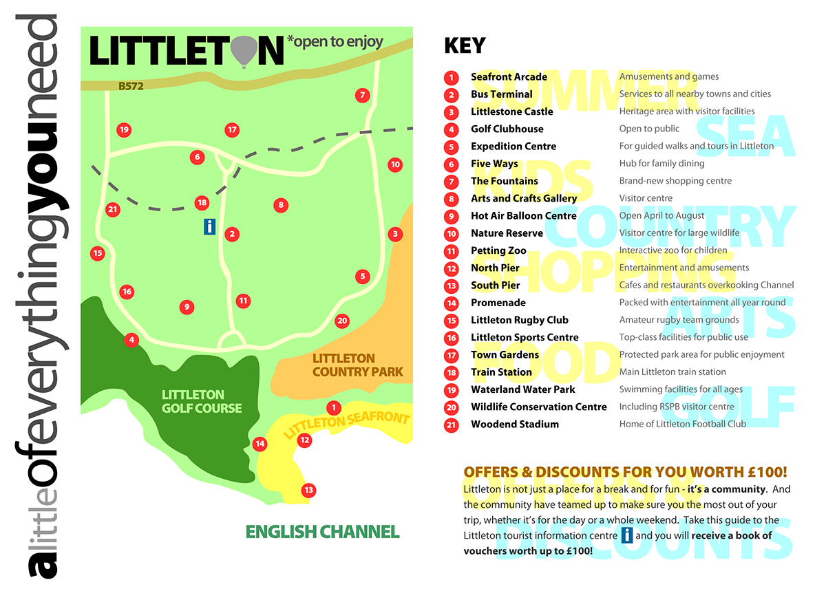
The alternating coloured background headings theme is continued on this side. This is supposed to resemble a striped beach towel.


