


The theoretical underpinning of this flour package redesign was largely inspired by the feelings associated with the use of flour and the traditional family aspect of gathering a family together to bake something special for loved ones. Many people have the memory of learning to cook as a child, smearing flour across benches for rolling and resulting in fingerprints of flour on clothing and faces. I wanted to embody this experience in one photograph that will be used as the focal point of the design, attracting audiences with its vibrant colour. This mixture of modern and traditional would hypothetically open up new markets for the brand, attracting younger audiences through their increased interest in cooking ignited by reality cooking shows such as my kitchen rules and master chef.
I began by researching the background of the Lighthouse brand, particularly focusing on customer feedback found online and the brands mission statement; its main focus being in the products use in Australian homes and long standing tradition. This background information was important to gain an understanding of the brands positioning in the market and the image that they wish to convey. In purchasing the product and looking for it in multiple supermarkets around my local area I found that other competitor packaging used the same colour palette consisting of white backgrounds combined with red or blue typography, which were largely sans serif fonts. The positioning of the package in the corner of the top shelf meant that the package design would need to be bold in order to stand out and catch the eye of consumers.
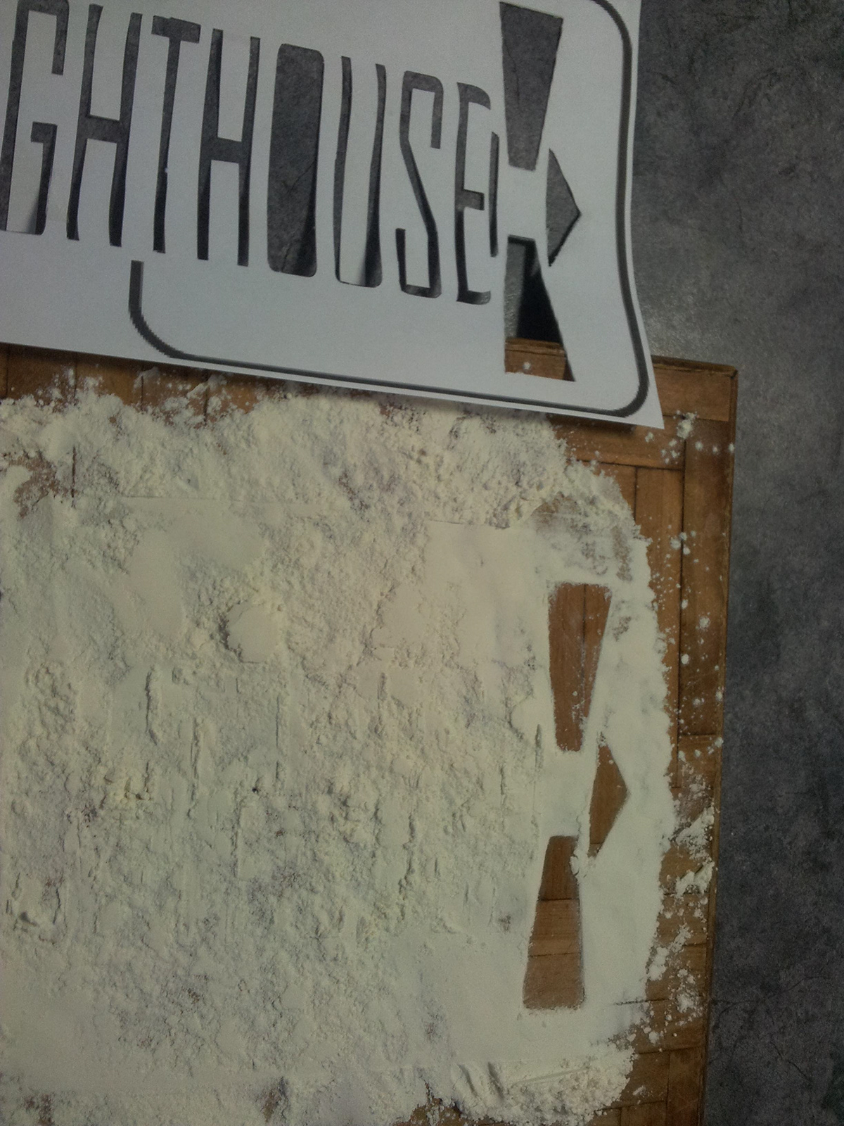
I then analysed the existing package, noticing the large amount of unnecessary text, repetition of obvious information and a large barcode which extends across the entirety of the bottom tab, as well as the need for an updated logo, which had not been redesigned since the brands founding in 1865. I designed the new logo which is largely typographic in nature and has lighthouse shaped embellishments surrounding the name which creates the effect of the brands name being in the shape of the lighthouse. This was designed with multiple application uses in mind, ensuring that the logo can be translated and easily understood on a variety of backgrounds and product types.
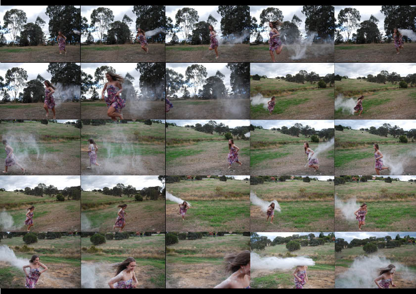
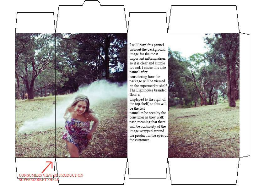
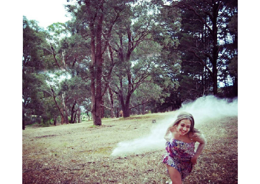
I then took a large amount of action shots to be used as the background image on the package. The final photograph was chosen because I believed the long streak of flour would translate well wrapped around the package, while the models face recreated that sense of joy I wanted to convey. In applying the image to the flour package template I decided to leave one panel blank to contain the most important information, so it is clear and easy to read. I chose the side panel after considering how the package will be viewed on the supermarket shelf, as this will be the last panel to be seen by the consumer as they walk past, meaning that there will be continuity of the image wrapped around the product in the eyes of the customer.
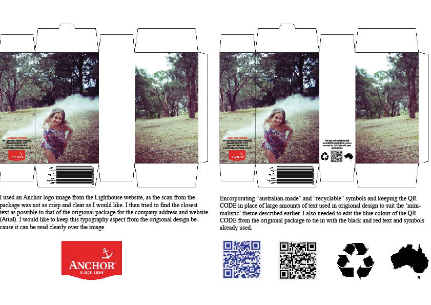
I also redesigned the barcode to represent a growing wheat crop which traces back to the products origins and makes a necessary element more visually appealing. The serif font was chosen as it appears more traditional and will stand out against competitor packaging. I also actively tried to simplify the information through the use of symbols and the QR CODE which can be used by customers to access recipe ideas and other brand related information.
The largest challenge I faced was learning how to extend the photograph onto the upper tabs as I believed leaving these white looked awkward and unfinished. Learning to use Illustrator’s clipping masks and gradient tool will be a great use to me in the future.
Overall, I am very pleased with my final design and believe I learnt a great deal about the different techniques needed to design upon a 3D package rather than the flat designs I am familiar with. This is also the first time I had engaged with professional printers and greatly enjoyed learning about the pre-press process. The experience of developing a relationship with a printer and gaining contacts has been invaluable.
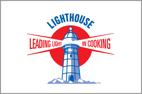
ORIGIONAL LOGO
ORIGIONAL PACKAGING
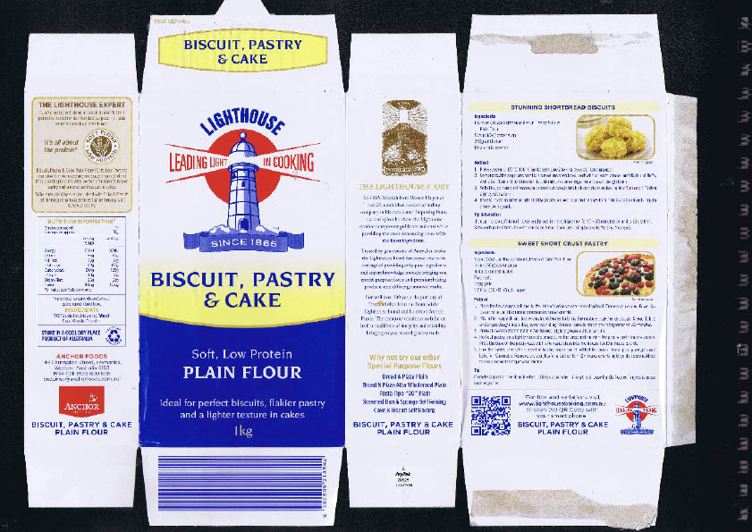

Diagram of Current Package Template with Dimensions
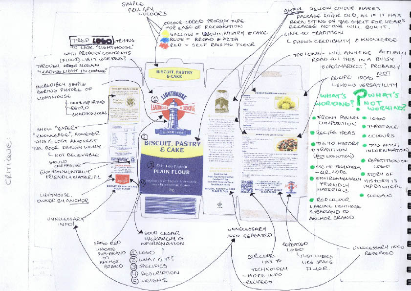
Analysis of Current Packaging
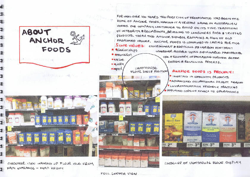
Anchor Foods Market Research

Product Mind Map

Experimentation with Die-cuts and origional logo

Lighthouse Logo Redesign Thumbnails

Lighthouse Logo Redesign Thumbnails
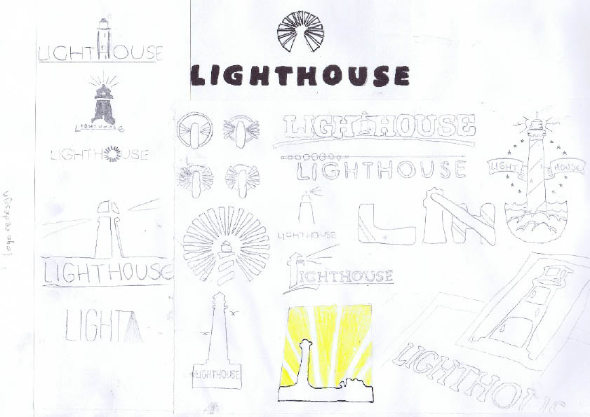
Lighthouse Logo Redesign Thumbnails

Lighthouse Logo Redesign Thumbnails

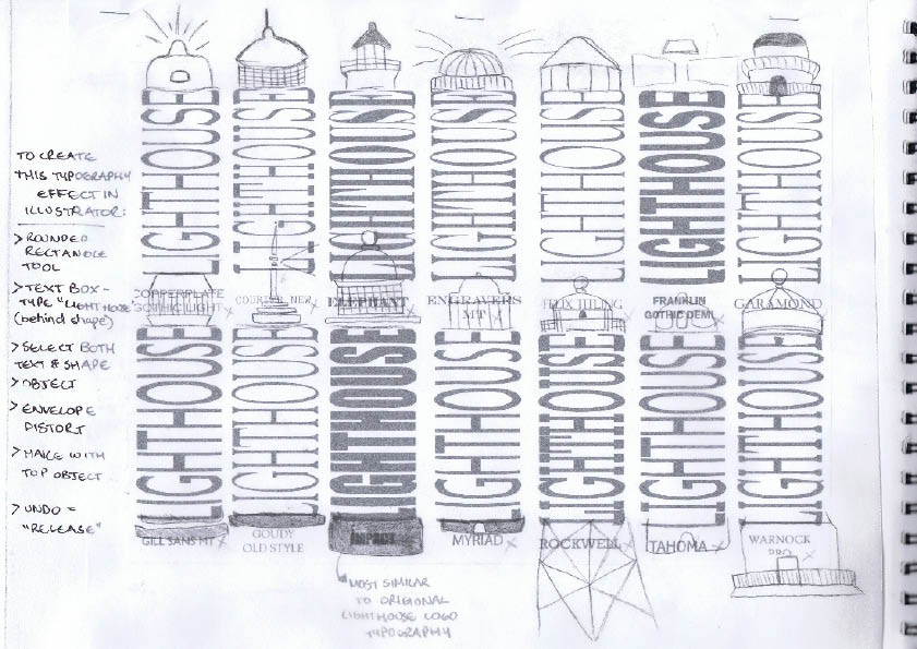
Lighthouse Logo Redesign / Typography

Lighthouse Logo Redesign / Typography
Lighthouse Logo Redesign / Typography / Incorporating Lighthouse Shape

Lighthoise Logo Redesign / Typography / Incorporating Lighthouse Shape
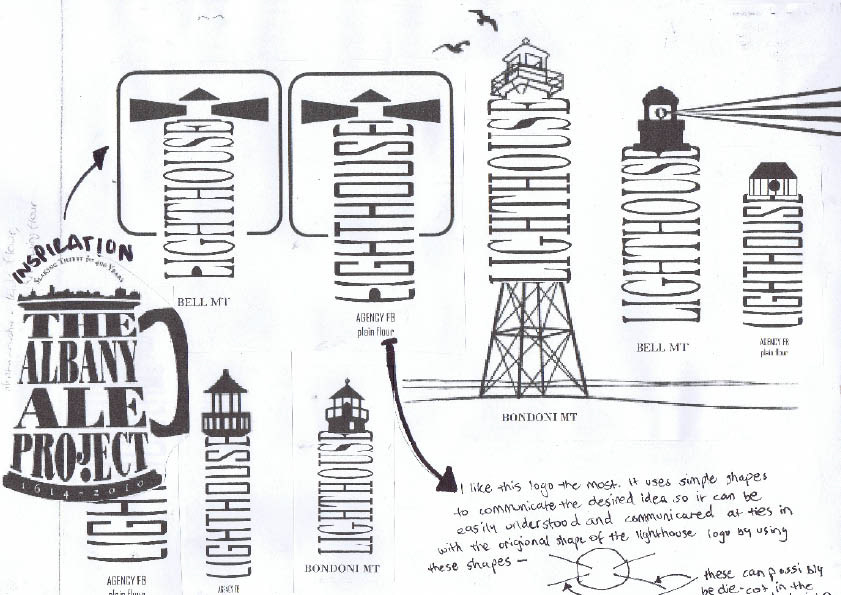

FINAL LOGO REDESIGN

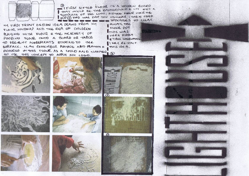
Flour Physical Experimenation
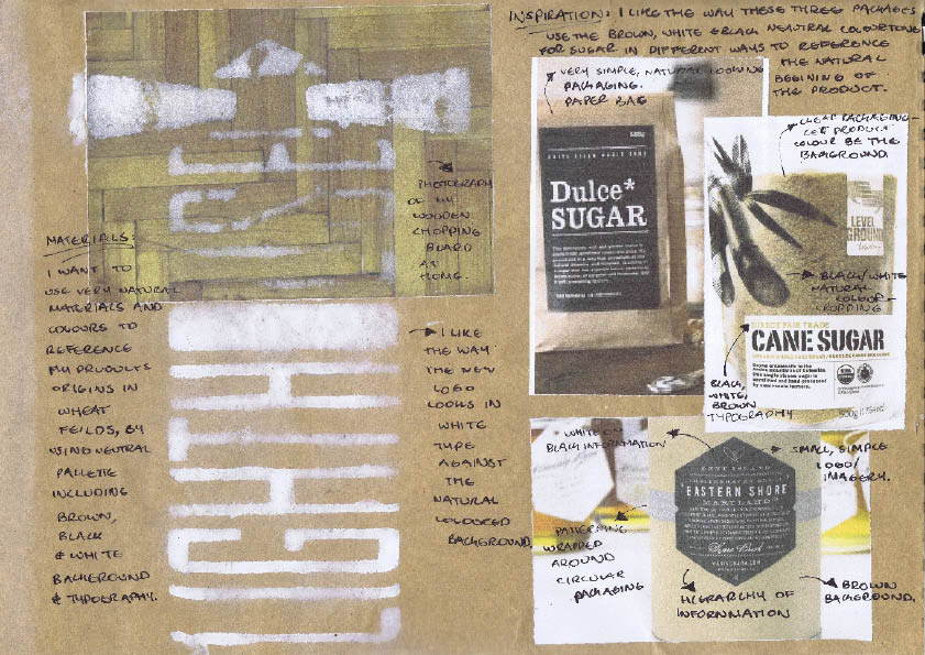
Colour Pallette


Throwing flower idea stemmed from my origional brainstorm of "flour." These images can be used to present the product to the consumer in an alternative way, rather than just using its practical use as a kitchen staple.
Many of us have the memory of playing with flour as a child, helping their mother or grandmother in the kitchen and spreading flour on the bench with your hands and usually ending up with it in your hair or whipped unknowningly on pants. Flour is an ingredient that we cannot help but be messy with, so why not have fun too..


Layout Rationale
> LARGE ELONGATED
PHOTOGRAPHY
This will stand out against the plain matte white/red packaging of other competior brands as we saw from the previous supermarket shelf photography
> CLEAN, SIMPLE WHITE
TEXT OVERLAPPING
IMAGE
There doesn’t need to be a large amount of text explaining the product- most people are familiar with what flour is. This way we can let the imagery and "fun" motif be the main focus for the redesign
> MINIMALISTIC


Barcode Redesign

Title and Logo Layout Experimentation


EDITED IMAGE USING CLIPPING MASK AND GRADIENT TOOL


TEST Print
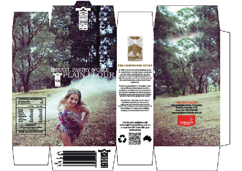
Final Flour Package Redesign

Origional Design Comparison


