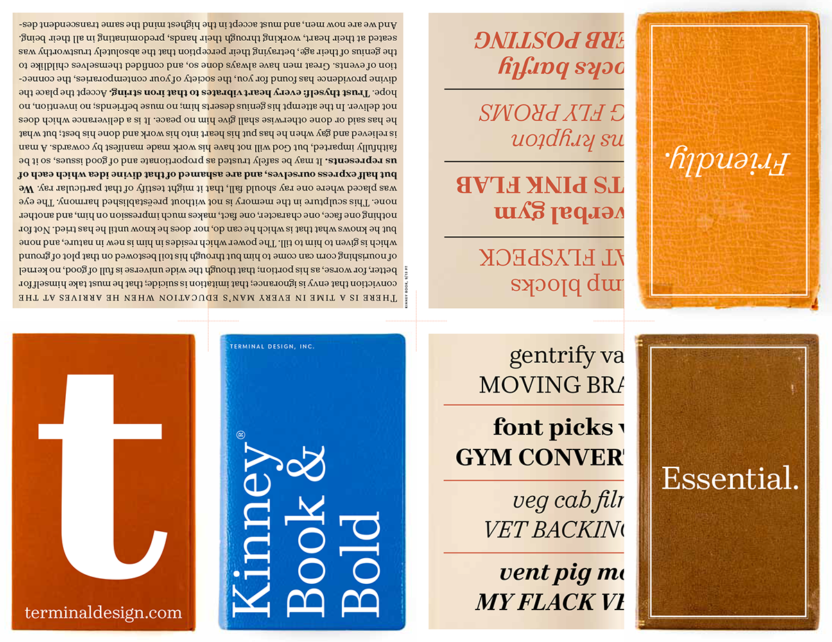
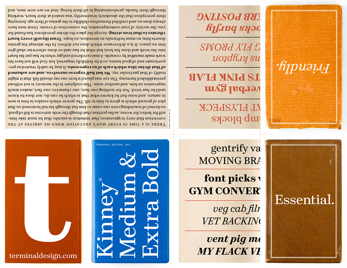
Over the years, I’ve heard a lot of designers endlessly sing the praises of the “Neutral Sans”. You know, something strong and clear, but without a lot of overt personality. What I have never heard, is anyone talk about a nice “Neutral Serif”. So I decided I would make one. I’ve alway been a fan of C. H. Griffith’s work, especially the newspaper faces he designed for Mergenthaler. So with that in my head, I went ahead with something I thought would fit into that vein. Strong, legible, devoid of overt personality, but not totally boring. It helped that I had a client going on and on about e-books and something that would look good on the screen. Well, the client lost interest, but I went ahead anyway, and I’m quite happy with the results. I hope you are too.
All the fonts contain small caps, ligatures and lots of different figure styles. All of those OpenType features you’ve come to expect from our fonts.
Kinney is available exclusively from Terminal Design