Ki-Ki
Illustration & packaging design
Illustration & packaging design
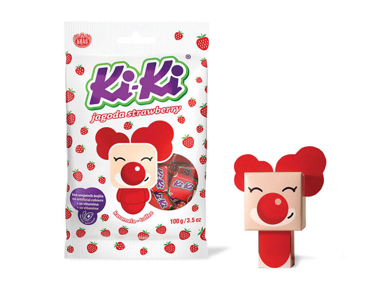
Ki-Ki is a brand established in 1920’s and it isone of the most popular candy brands in former Yugoslavian countries. We weregiven an assignment to modernize packaging so it can keep up with nowadays kids.
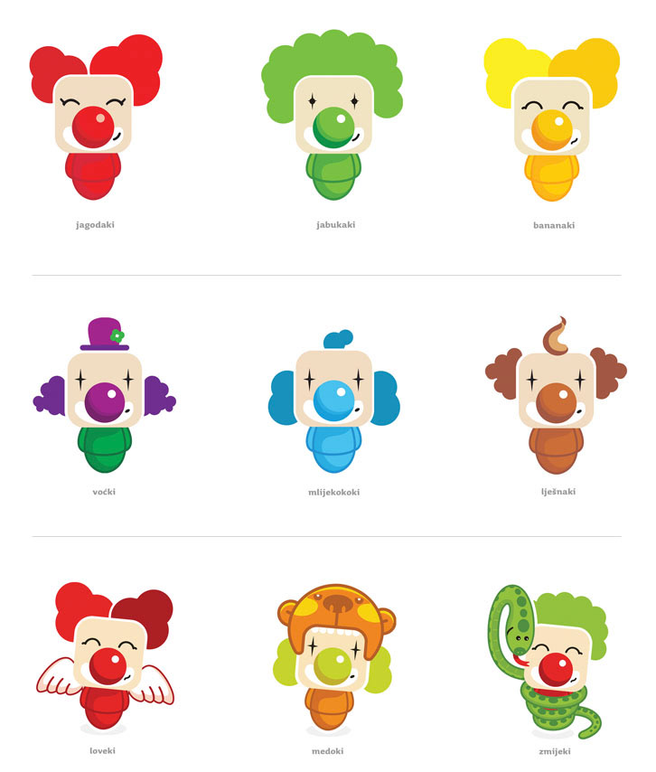
The task for packaging redesign was tomodernize the mascot of Ki - Ki clown and to redesign complete packaging, but withresemblance to previous visuals (pattern and white background). Consideringthat apart from two basic flavours, several different were introduced, our ideawas that it is not necessary to have only one clown, but ideally, each flavorwould be represented by its own clown i.e. lemon is sour, so clown’s eyes are squintedand also his character matches the flavor.
Every Ki-Ki clown has a head shapedas a kiki candy and additional extensions like hair and various props are addedto evoke certain flavor. The Client approved creative concept and packagingredesign was successfully implemented.
This creative idea has set the flow forentire campaign, therefore Ki-Ki clowns are basic visual elements for allmaterials.


Agency:Bruketa & Žinić OM
Concept,art direction & character design/illustration: Imelda ramović & MirelHadžijusufović
Packaging Layout design: Imelda Ramović, Ana Belić
Illustration(fruits and character extensions): Davor Rukovanjski, Imelda Ramović


