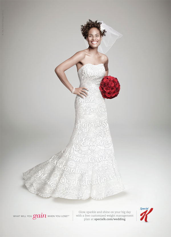
This poster for Kelloggs' Special K was published in the US in March 2012, on posters and in the bridal press.
Despite having some misgivings about a campaign encouraging women to lose weight for their wedding (I don't approve of whittling yourself 'tiny' for your 'big' day!), I really liked the visual concept and thought it would be overwhelmingly pretty. I also liked that the model was a normal healthy-sized woman of colour, with a beaming smile and what seemed to be a robust attitude!
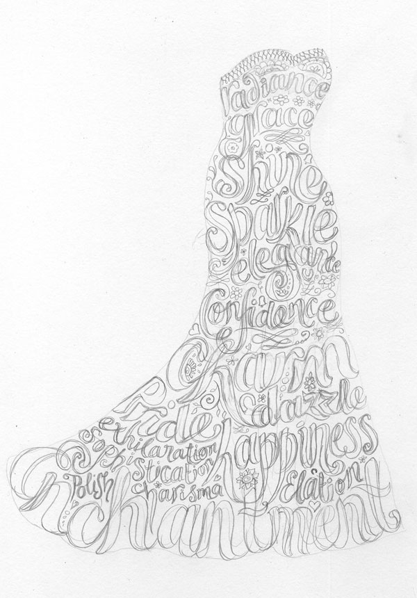
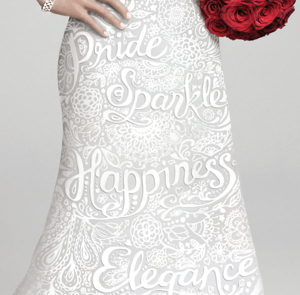
Although it's one of those that looks easy, the job was extremely tricky and involved many rounds of development and changes. A LOT of attention had to be paid to the 'sensitive' areas of her body - bosoms and crotch area - as we could neither draw attention to them by making them too dense nor leave gaps where the body might be perceived to 'peep' through. In the end, because of the speed of change and the minute details required, the end result was a combination of ink and digital drawing. I think it works, and I'm pleased with the result.
A triumph of perseverance and patience for all concerned! It's often the hardest jobs which yield the best results...though it can be tricky to keep that in mind at 3am with your eyeballs falling out of your head!
Despite having some misgivings about a campaign encouraging women to lose weight for their wedding (I don't approve of whittling yourself 'tiny' for your 'big' day!), I really liked the visual concept and thought it would be overwhelmingly pretty. I also liked that the model was a normal healthy-sized woman of colour, with a beaming smile and what seemed to be a robust attitude!
Although it's one of those that looks easy, the job was extremely tricky and involved many rounds of development and changes. A LOT of attention had to be paid to the 'sensitive' areas of her body - bosoms and crotch area - as we could neither draw attention to them by making them too dense nor leave gaps where the body might be perceived to 'peep' through. In the end, because of the speed of change and the minute details required, the end result was a combination of ink and digital drawing. I think it works, and I'm pleased with the result.
A triumph of perseverance and patience for all concerned! It's often the hardest jobs which yield the best results...though it can be tricky to keep that in mind at 3am with your eyeballs falling out of your head!